31 Oct
   Filed Under: Unfiled   

October 2007 has changed a lot around here; the blog redesign, a whole new series of posts and a very large increase in traffic for the fourth time (in the short while it’s been around). A small roundup of articles of the last month and thoughts on the ‘transition’.

The Delicious Library 2 preview I posted up has been followed up today by new screenshots over at Wired. I can’t say I am too impressed looking at the screenshots, but I guess only actually using an application makes for a good judgement.

My graphical look at Final Cut Server was followed up by quite a few emails concerning Apple’s ‘icon rage’ lately. It seems Leopard’s gotten a lot of love (save perhaps the Expose and Spaces icons) but some applications were left out with pretty bad icon work.

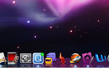
And then there was the Dock frenzy after Leopard hit the stores; in the meantime, we’ve seen large-scale customization and even complete disabling of the newfangled Dock. Some (slightly) acceptable modifications struck my eye on Macthemes’ forum today (click images to go to the release in question);

I still have my fingers crossed for a nice application that lets you customize the Dock easily – perhaps I’ll even start using it again.

With a few other minor posts this month, I’d say it has been a very nice lineup of news, curious little developments and interesting things. Your input on how I have been changing the blog is welcome as always, although I’ll mention in advance that I intend to keep up the posting as you’ve seen lately, with occasional personal bits in between a succession of the things that pique my interest.

comments off
30 Oct
   Filed Under: Interface Design   

This is a demonstration of Skyrails, a new visualisation system for datasets. It struck me that this is awfully similar to the scene from Hackers where they flew through that ‘city’ of ‘databases’ with all sorts of fancy eyecandy going on, but this is actually useful in plotting data and navigating it (or so it seems, judging from the short demo). Edit; Jelmar of Typehigh pointed out it’s eerily similar to EVE Online’s ingame star chart and overall camera work. Perhaps it was an inspiration.

If you’re pleased by what you see, you might be interested in checking out some of those fancy fantasy interfaces for the silver screen over at Mark Coleran’s portfolio.

29 Oct
   Filed Under: Announcement, Design, Personal Work   

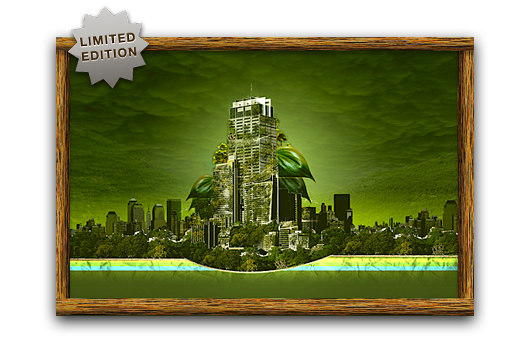
unveiling.png

Coinciding with a new freeware icon release and a very large batch of client work, Cocoia will soon start selling a series of prints in line with the work I used to make before I started this blog. If you are unaware of what kind of graphic work I did, this might be a nice chance to explore the expressive prints in my ancient deviantART gallery (this work is not representative of my current quality standard, please keep that in mind).

The recurrent theme in the prints is nature conquering our technological leaps. The icons I shall be dealing out will remain shrouded in mystery, for now.

comments off
29 Oct
   Filed Under: Design, News   

Since the release of Leopard, a huge movement has already sprung up to change its look. Check out this colorful glass surface (ugh, is that a truck crashing?).

picture39592c.png

Apparently, people are flocking to the new Dock as a means to customize OS X even more. I see a market for an app that does this, guys.

29 Oct
   Filed Under: Apple, Design, Icon Design, Interface Design   

Poorly designed folder icons aren’t the end of the world, but it’s the context that’s so maddening. Here’s an interface element that maybe could have used some freshening up, but it was far from broken. Apple’s gone and made it worse in a way that’s obvious in seconds to anyone who’s ever given any thought to interface design. It boggles the mind. The rumor is that Jobs likes them. Great.

Some people on flickr apparently thought the same and quoted a recent article from me. I still think Apple is well aware of this; they went as far as to make alternative icons when you drag these ‘mundane’ folders into the 16-pixel only Finder sidebar;

sidebartononsidebar.png

I don’t think it was such a thing that ‘Steve liked them’; I think Apple’s engineers liked them in Coverflow, and much less so any other generic folder or icon. When you look around the entire interface, it’s obvious the focus is on Coverflow and large icon view; heck, Coverflow actually comes with a list view to help you drop the standard list view. What do you think?

Read the rest of Siracusa’s in-depth review of Leopard here

.

comments off
28 Oct
   Filed Under: Apple, Design, Icon Design, News   

I must once again graciously bow and thank Apple for taking mundane work out of my hands. Via Matt Legend;

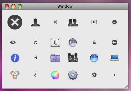
We’ve all stolen Apple’s icons for things; now we’re officially allowed to. There are lots of new standard images available via NSImage -imageNamed:, including the Safari bookmarks image, all kinds of arrows, the gear icon, the Computer icon, Bluetooth and Bonjour logos, user account icons, the Info icon, and many more. The size of your app could drop significantly, as could your icon-design expenditure.

picture5.png

As could my monthly income! But no, I’ve got more than enough interesting work on my hands. Matt has a fantastic (and that’s a horrible understatement) write-up of some highlights in the Leopard feature lineup of developer tools and API’s. Read his long and bookmark-worthy post here.