


Poorly designed folder icons aren’t the end of the world, but it’s the context that’s so maddening. Here’s an interface element that maybe could have used some freshening up, but it was far from broken. Apple’s gone and made it worse in a way that’s obvious in seconds to anyone who’s ever given any thought to interface design. It boggles the mind. The rumor is that Jobs likes them. Great.
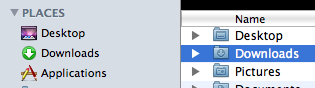
Some people on flickr apparently thought the same and quoted a recent article from me. I still think Apple is well aware of this; they went as far as to make alternative icons when you drag these ‘mundane’ folders into the 16-pixel only Finder sidebar;
I don’t think it was such a thing that ‘Steve liked them’; I think Apple’s engineers liked them in Coverflow, and much less so any other generic folder or icon. When you look around the entire interface, it’s obvious the focus is on Coverflow and large icon view; heck, Coverflow actually comes with a list view to help you drop the standard list view. What do you think?
Read the rest of Siracusa’s in-depth review of Leopard here
.