


Final Cut Server, Apple’s solution for a centralized video workflow has been highly anticipated since the unveiling of the revamped Final Cut Studio 2. I’ve found an article on unflyingobject with several screenshots and information about the program, so I decided to share my thoughts on the graphical (icon / UI) side of the app with you. In case you want to know what Final Cut Server does and if it’s good at it, I recommend the linked article.
First of all, the icon. In my opinion, there’s a great set of new icons coming from Apple lately. Take a look at the icons for Apple’s Logic Studio 8, another recent ‘Pro-application’ software release; an impeccable line-up of ‘classic’ photorealistic icons with clever metaphors. I looked at icons in Leopard a post or two back; in general, a very positive development there as well.

Which is why the Apple’s Final Cut Studio icon struck me with so much disgust when I saw it.

It borders on Aqua, it borders on Lego, and it really is neither. I am not sure what effect or metaphor they were trying to achieve with this, but it most certainly fails to deliver. Apple; we’ve seen it in the Numbers icon before, stop with the overly odd-colored icons in a weird perspective. So much for that.
Apple also decided to go out on a limb and fight its own quotations of the WWDC Interface sessions this year (in particular, “Don’t use interface elements with over 75% black” echoes in my mind) with the completely custom interface for the software. A screenshot, courtesy of the unflyingobject blog;
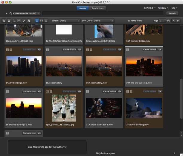
“Now, this looks alright, appealing”, I hear you say, and I tend to agree, it is alright indeed. However, looking at Aperture and Logic Studio’s interfaces, it’s a grand deviation, and it is hard to think of a justification of the interface. Oh, wait, what was that? Adobe Bridge?
I think Final Cut Server’s interface looks a whole lot better, but it almost seems derived from the overly ‘dark’ style the Adobe CS3 apps have been using. There is a complete absence of gloss in the interface, which makes it stand out a lot from all other Pro applications and general aesthetic of OS X.
What also seems a bit out of place for an Apple interface, is the completely custom toolbar lacking any explanatory text. Almost all toolbars in OS X are of the standard flavour, with appropriate labels. It soon feels ‘un-Mac-like’ to ditch these labels and just put icons in a row, like Microsoft Office has been doing for years. Fortunately, it is just a small group of icons, and the application is aimed at professionals, but I still think it is surprising to see them create such a custom toolbar anyway.
![]()
Overall, I think Final Cut Server seems a very graphically alienating application. One might argue that this was perhaps intended, but I still think they could have paid a little bit more attention to the application’s look, in particular making sure it doesn’t stand out like a metal plate in a lineup of wooden planks.
That was it for the peek at Final Cut Server’s new interface and icon; drop your thoughts in the comments.
“ut it almost seems derived from the overly ‘dark’ style the Adobe CS3 apps have been using. There is a complete absence of gloss in the interface, which makes it stand out a lot from all other Pro applications and general aesthetic of OS X.”
I work in the film industry and the 50 percent grey to black look of interfaces is pretty much everywhere. Neutral value in the interface as to not have colour bleed when colour correcting.
Of course now it doesn’t really have much of an impact since usually there’s more light bleeding from the workspace (or from the half of dozen monitors sitting around). Still, an interface that doesn’t grab attention is essential here.
It’s a convention in higher-end video apps, from shake to toxic to combustion. The next update of Nuke is shifting it’s interface to a darker feel. CS3 did the same thing, makes it look like they are playing in the same sandbox.
more of a fad, if you ask me.
All these custom interfaces are really starting to get on my nerves. I wish Apple and Adobe both would get back to using the system defaults (especially Adobe since I use way more of their apps).
‘I wish Apple and Adobe both would get back to using the system defaults’
As aesthetically horrible as the Shake UI is, it is functional. If it were to use the HIG-compatible, standard UI, it’d be unusable.
That said, there are some really annoying bugs in the shake UI (Like the “Show images only” setting that remains when you try to open/save scripts, even though there is no way to change that setting from inside the open/save script dialog..)
To someone actually using Shake, it’s way way more important the interface ‘works’, rather than complies to the HIG, or fits in with the rest of the Apple products.
Of course your looking at the software from a purely visual point of view, but for the higher-end applications, functionality comes a long way before aesthetics. Take any high-end visual-effects/3D application as an example, like Houdini, Maya, Flame etc.
As for the dark interfaces, ignoring the fact colours other than neutral-grey will alter the perception of colour (bad for colour-correction and such – although I imagine it will only be an issue if your interface happens to be bright pink or something) – A lot of compositing happens in dark rooms… A brighter interfaces means more light coming out your monitor, and when you’re looking at that screen for long hours, in the dark – it’s going to hurt your eyes.
Your link to unflyingobject.com is broken. The only story of theirs I see regarding Final Cut Server is from 2007, which was prior to Final Cut Server’s official release.
The task bar is “custom” because Final Cut Server for the most part uses a completely different mode of operation than your standard apps like, say, iWork or even Aperture. Final Cut Server is a network-based client-server setup, so most of your standard icons don’t apply.
As far as the dock icon, if you were familiar with Apple’s higher-end software, especially server software, you’d see that it maintains the same server metaphor as Server Admin, Workgroup Manager, and Xsan Admin. In fact, Final Cut Server looks very much like a colorized version of the Xsan icon. Apparently this isn’t enough to keep you from being filled with disgust however. Oh well.