15 Jun
   Filed Under: Announcement, Commercial Work, doubleTwist, News   

On March 30, I raised quite a few questions on Twitter when I changed my handle from the old @cocoia to @sdw — a shorthand for my full name, Sebastiaan de With. I also bought (and put some pages up for) domains like dewith.com and sebdw.com. I mentioned that I’d announce my motives sometime in the future. Some people speculated I was going to expand Cocoia, others (interestingly relevant today) assumed Cocoia was acquired.

It’s none of the above. I’m putting Cocoia in carbonite for a while as I start my first full-time job in the United States: I will be joining doubleTwist as Chief Creative Officer, responsible for overseeing and working on the design, interaction and polish of all their apps and services. I’ve been working with the awesome people at doubleTwist as a freelancer for years now and I’m really, really stoked to give them my full attention. We’ve been working on some extremely cool stuff.

I’ve interviewed with over a dozen companies early this year, and my joining doubleTwist is the conclusion of a long period of weighing all the awesome opportunities I had. You may have seen me traverse all the valley campuses on social networks as I ‘shopped’ around. A luxury problem if there ever was one: picking a job from all these kickass companies. doubleTwist is undoubtedly the best choice, though: working with Jon (– of ‘DVD Jon‘ fame) and Monique has always been a pleasure, and the other staff are some of the most detail oriented and talented I’ve known in the industry.

In related news, I will be moving to San Francisco soon. As a city, it’s a fantastic place to live. As a place, it’s where I truly feel at home out of all the places in the world. I can’t wait to be living and working there.

What does this mean to you, my reader and / or customer, and my ‘behavior’ online? Icon Resource and other Cocoia products will still be supported and developed. I will still work on side projects, UI breakdowns, speak at conferences and (loudly) voice my opinion on things. I will be working more with Android (and possibly, as they emerge, more mobile OSes).

I will, however, no longer accept freelance work. After six years of freelance designing, this is truly the end of an era. Thanks to all my awesome clients, large and small, and my ‘competitors’ for being awesome inspiring designers I was proud to share a market with. You know who you are. I’m sure we’ll work together again in the future. For now, goodbye.

And, of course, I’ll be showing off some of the awesome things I’ve been working on for doubleTwist very soon.

29 Apr
   Filed Under: Announcement, IconResource, Personal   

Some doubted it would ever come. Some said it had been seen riding unicorns in misty valleys in the Scottish highlands. Others had seen it teaching design techniques to Duke Nukem, seemingly Forever. But today, the vapor has condensed.

Icon Resource 2 is actually here.

It’s great, because today is also my birthday. The best present I could give myself is bringing Icon Resource 2 to all existing members and welcome new members to the website.

As interest for techniques in iOS icon design has grown considerably, Icon Resource now has a small sibling in iOS Resource, which (for now) teaches you iOS icon design techniques, but will soon rise up next to its brother with full fledged tracks on scalable UI design and other techniques that are essential in designing for iOS.

If you are an existing members, you will get several new advanced level courses in icon design for free. You should get an email soon with new login information that gives you access to the member area. If you have not received an email by tomorrow, do drop me a line (twitter also works). I hope you enjoy all the new content, and I will update this new platform more this year with free new content.

03 Jun

It’s always a huge leap for a designer to come up with designs for a platform you’re not familiar with. I remember feeling extremely uncomfortable at first when I designed my first iPhone icons and interfaces, and while the iPad was a logical extension of the iPhone UI, it still felt like a significant step to take.

Androids and doubleTwist

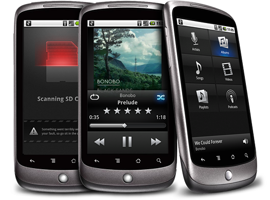
Imagine how I felt when I was sitting at my desk, Nexus One in one hand and pen in the other, after being asked to design doubleTwist’s media player for Android. Android doesn’t have a very nice media player in terms of design (I’m carefully picking my words here – I don’t want to offend the undoubtedly hard working people at Google) and it was easy to just go the way some developers go: make an iPhone app, shoehorn it into Android, and call it a day.

We wanted something that actually advanced the state of the art. I sure as hell wasn’t going to use an entirely new platform for months just to ape another. It was a mixed blessing to have so little limitations on what constituted a ‘native’ user interface.

Android has its guidelines, but most apps (even the Google-sanctioned Twitter app) have a very ‘custom’ appearance. We opted for a look that works well on the various devices and custom ‘shells’ (notably, HTC’s terrible “Sense” interface) and arrived at this muted, native-looking yet polished visual scheme, which also helps users navigate the app in direct sunlight, where OLED screens like the Nexus One’s tend to be hard to read. Subtle usage of textured surfaces in the application also help prevent color banding on the color-limited OLED screens.

I’m happy to have this in the hands of Android users. It’s sometimes depressing to read comments on tech websites of people exclaiming: “Why would you even care about how a media player looks or works? You play music and turn off the screen!”, but I am sure there’s a lot of people who will appreciate the thought and details that went into this app. And that makes it all worth it.

The player is available on the Android Marketplace for free for a limited time.

25 Jan

In August last year, I decided to hold a limited sale period for Icon Resource, since I was about to upgrade it with new content for existing members. I like giving people free upgrades whenever possible: Icon Resource was always meant to be an ongoing project, and it still is. However, it’s taking longer than expected to roll out the new websites. It’ll certainly be worth the wait, though!

Here’s a brief a look at the new Icon Resource – and its new brother, iPhone Resource. There’s something new for previous and new members in the works, but I’m not ready to release it yet. This only means that there’ll be that much more content for you if you’re a member: two entirely new courses on Mac / Windows icon design, including intermediate and advanced techniques.

iPhone Resource, a separate and new set of courses, focuses on making amazing iPhone icons and interfaces. It’s shorter and more concise than its big brother, but from what I’ve seen in the App Store, it’s certainly sorely needed.

You will also get a brand new member area, where you can watch course videos, review lessons and download files. An iPhone application is also in the works, but I can’t tell much about that yet. It’ll be released a bit later than the actual upgrade.

Much design love went into this new version, and all pages have been redesigned from the ground up. The new login page went through over a hundred iterations. Click on the image to view it at full size on Flickr.

I expect to roll out the entire new Icon Resource upgrade in late February or March. As an existing member, you will be notified by email (and only this time! I hate newsletter spam) when the new content arrives. The price will remain unchanged.

01 Jun
   Filed Under: Announcement, Design, Drawing, Personal Work   

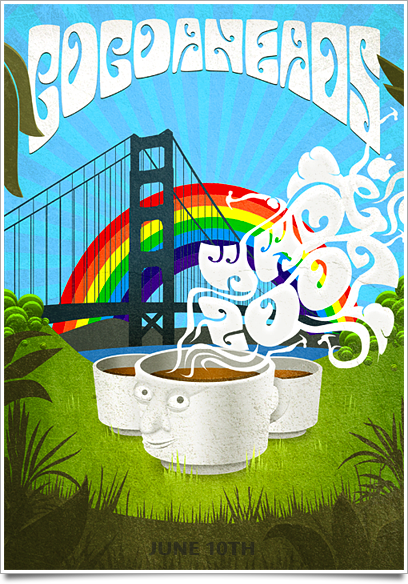
It’s official: I never had as much giggles in an evening designing this poster for Cocoaheads WWDC. Scott asked me if I’d like to speak at the well-known Mac developer event, and I happily obliged. I also did a bit of poster art for the presentation screen and for, well, fun.

cocoaheadswwdc

The lineup of speakers:

It’ll be held Wednesday June 10th, 7-9PM, at the Stockton St. Apple Store in San Francisco.

I’m really looking forward to WWDC this year. Hope to see you all at Cocoaheads or elsewhere during the week!

And yes, those are little Xcode hammers in the smoke.

24 May
   Filed Under: Announcement, Icon Design, iPhone   

As I alluded to earlier today, Sean Patrick O‘Brien and I are working on the very first Mac application that will be released under the Cocoia ‘brand’: Composition. Composition allows you to take any image and get a pixel-perfect preview of iPhone’s default effects at regular home screen size and Settings/Spotlight small icon size. It also lets you look at your icon in a virtual home screen to achieve a native look (and yes, both iPhone and iPod touch home screens will be represented), and export it for further usage on websites and other materials.

compositiom

Composition is not an icon generator or designer in any way; it is made for people who care about the way their icons look, and want to get a break from the horrible workflow of mashing previews of icons together in Photoshop. There will be several easy-to-access Photoshop templates accessible from the app, but the actual design work is left to applications that are excellent at that kind of work. It will also be completely free!

I will announce more news about it as the application nears the beta milestone; in the mean time, drop an email to this address to get a spot on the list.