Latitude.

February 26, 2008 on 11:32 pm | In Cocoa, Design, Graphics, Interface Design, Personal Work, Uncategorized
latitudeheader.png

It’s been a while since I released the first mockups and some explanation behind my ‘Dream Browser’. Several developers have contacted me with the desire to develop it, and some have already actively begun programming whole aspects of it. I’m very pleased with the activity, and to help the efforts, I have decided to create a design document and a centralised website to manage the project development. There’s also a working name; Latitude.

Latitude: Filtered History.

Latitude fullscreen mode: Single page.

Latitude fullscreen mode: Tabs mockup.

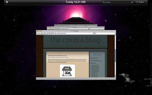
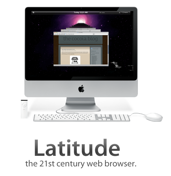
For now, I have created some mockups of the full-screen browsing mode, with an automatically hiding toolbar and an image with a roughly mocked up set of tabs for the full-screen mode. Additionally, I’ve made a mockup for the history feature, activated with the ‘Time Machine’-like, which also shows the ‘expanded’ mode, which is quite similar to how Safari looks.

To get some critique and mostly misunderstanding out of the way; one of my primary goals in this browser interface is to minimalise the amount interface clutter, although it may not seem that way. I don’t want to eliminate tabs or add some sort of permanent sidebar; a browser should still be usable as we use it today. However, having multiple sidebars, menu’s, or even full overlapping views that are opened with widgets that are in wildly varying positions in the interface. This browser, as I outlined in the previous post, uses a sidebar to consolidate various features that are now scattered throughout a browser, and helps to reduce clutter by also adding elements like the conventional ‘tabs’ to the sidebar. The ‘expanded’ viewing mode, as shown in the ‘history’ interface mockup without a sidebar active, will be your preferred state for viewing content.

I’ll update this new category when the document finishes or to keep tabs on community activity. Thanks for all the input and hard work so far!

The first Photoshop icon.

February 23, 2008 on 7:13 pm | In Design, Graphics, Icon Design

While I was doing some research for one of my upcoming projects today, I found the very first Photoshop icon. It’s actually a tiny little photo shop! I love it, and if I have some free time I’ll see if I can recreate it in a more modern style.

photoshop.png

What particularly strikes me is that they’ve gone through great lengths to let anyone be able to determine what it is; the ‘1HR’ signage obviously indicates the ‘photo’ part in ‘Photoshop’ and the man with the teller is the ’shop’ part. Very, very cool.

Edit: Addendum with the History of Photoshop, and color versions of these pre-Photoshop 1.0 icons. Be sure to check out John Knoll’s response in the comments down here.

colorpsicons.png

Master rig.

February 21, 2008 on 9:20 pm | In Ramblings

IMG_1200_copy.png

The wireless whips that tame the octocore beast on my wooden office desk.

On a calm afternoon of working with my intern in the office, I got a call from my girlfriend; my Mac Pro was finally coming home. I had ordered one of these workstations when they were updated, and I was delighted to move up from my first real Mac workstation, my dated, damaged and dented rev. A Macbook Pro. It’s fast, it’s blazing, and it locks up at occasions. Read on for the verdict.

Continue reading Master rig….

My dream browser.

February 16, 2008 on 9:55 pm | In Apple, Cocoa, Design, Graphics, Interface Design, Personal Work

I got inspired by the iTunes sidebar today to mock up a browser interface that I had thought about for the last few weeks. In iTunes, a ‘hub application’ approach is taken to music and video content, simplifying and streamlining the experience from acquiring content, to organising and viewing it. I am aware of several ‘new generation’ browser projects, but none really line up with my ideas.

Let me show you what I came up with.

Continue reading My dream browser….

Click and Drag to your nowhere.

February 13, 2008 on 10:47 pm | In Interface Design, Ramblings

Where the Firefox 3 Beta is going, interface-wise. My opinion is; it’s going nowhere. Fortunately, Mozilla backs me up with proof.

Afbeelding 2.png

Robert Seidel’s Phyletic Museum.

February 13, 2008 on 10:22 pm | In Design, News

What may sound like the title of a horror movie directed by Ed Wood is really a fantastic application of motion design disciplines to create public installation art. An absolutely engrossing, almost hypnotic installation.

installation.jpg

Check out some video’s here, stills don’t do it justice.

Aperture 2.0; custom everything.

February 12, 2008 on 10:16 pm | In Apple, Design, Interface Design, News

aperturelcd.jpg

Following up on my previous post showing a few design novelties in OS X 10.5.2, here are some quick observations on novelties in Aperture 2.0, which Apple released just today, on flickr. The Apple Pro Apps design team has gone far on customizing the look and feel - you’ll barely recognize the Aqua interface!

Mac OS X update brings icon good- and uglyness.

February 12, 2008 on 6:58 pm | In Apple, Design, News

After playing around a bit in the newest version of Mac OS X Leopard, I was delighted to hear that there were several nice improvements to icons and interface elements. Here’s what I’ve found and seen so far;

timemachine.jpg

- Time Machine menu bar icon; when backing up, shows a beautiful animated clock with hands turning backwards, or when unable to back up, presents a tiny caution sign. Very nicely designed, clean, clear, and a great way to keep tabs on Time Machine’s activity.

5t2h.png

- iCal icon now localized; whereas the iCal icon got a new feature in 10.5, namely, dynamically showing the correct date on the icon, in 10.5.2, the three letter initials for the month in the top-left corner of the icon is also changed according to your locale. Via Fernando Lins.

sharepoint.jpg

- Sharepoint icon debacle; And then there’s the uglyness. The Share Point icon, first a folder with a globe overlaid, has been changed to a rather cheesy lineup of weird child-human-like shapes.

Apart from that, I’m glad that we now have an option to turn the menubar non-transparent (although I like transparency and would like to see that design concept mature like it did on the iPhone, i.e. a contextual menubar) and that drop-down menu’s are now slightly more opaque. Overall, this update brings some very nice new designs and details to grace your Mac interface.

Projects opening up.

February 10, 2008 on 8:16 pm | In Announcement

iconlog.jpg

In the next few days, a few recently acquired domain names will open teaser pages. I hope this whets your appetite for the upcoming surprise. As of today, IconLog went public, and I’ll edit in more in this post with an explanation as the next sites follow. I expect to launch these websites no later than March of this year.

Cocoia Blog upgrades.

February 9, 2008 on 10:30 pm | In Announcement

Well, since there were comments without line breaks, the sidebar went weird, and the typography was getting less pleasing by the day, I decided to do some weekend work on fixing the blog. You’ll find that there’s numerous improvements, including a real about page, and several preparations for a big new plan. So what are you waiting for? Get out of that RSS reader and give ‘er a spin!

Next Page »