21 Jun
   Filed Under: Apple, Interface Design, iPhone   

There’s been so many iPhone OS 3.0 feature roundups that I’m not even going to bother doing a roundup of UI changes, as most users are quite familiar with this newest version of the iPhone firmware already.
3oh

This is a post about the details, but there’s a few things I won’t go into. For instance, please don’t get me started on those pinstripe icons. Seeing them on a huge banner at WWDC was painful enough, and then having to recreate the same stripes for this blog post’s graphic was the proverbial needle under my fingernail.

However, it’s worth a blog post to look at those nice little touches that have been added to the already impressively well-designed iPhone UI.
Continue reading…

24 May
   Filed Under: Announcement, Icon Design, iPhone   

As I alluded to earlier today, Sean Patrick O‘Brien and I are working on the very first Mac application that will be released under the Cocoia ‘brand’: Composition. Composition allows you to take any image and get a pixel-perfect preview of iPhone’s default effects at regular home screen size and Settings/Spotlight small icon size. It also lets you look at your icon in a virtual home screen to achieve a native look (and yes, both iPhone and iPod touch home screens will be represented), and export it for further usage on websites and other materials.

compositiom

Composition is not an icon generator or designer in any way; it is made for people who care about the way their icons look, and want to get a break from the horrible workflow of mashing previews of icons together in Photoshop. There will be several easy-to-access Photoshop templates accessible from the app, but the actual design work is left to applications that are excellent at that kind of work. It will also be completely free!

I will announce more news about it as the application nears the beta milestone; in the mean time, drop an email to this address to get a spot on the list.

24 May
   Filed Under: Apple, Icon Design, iPhone   

iPhone icons are gorgeous. The home screen is a beautiful display of icons that have been extremely carefully designed to achieve a stylistic balance. On the desktop, the same applies, but icons have far less ‘rules’ imposed on them, and are generally very diverse in their appearance. One could conclude that there is less consistency in the design of desktop icons than there is in iPhone application icons.

iphone-icon-macro

As a result, icons in the Mac OS X dock also generally have less trouble looking good and blending in with the system icons. There’s simply more room for creative freedom and slight stylistic differences. The iPhone is a different story. I keep all third-party application icons (apart from a few notable exceptions) off my home screen, because they stick out like a sore thumb. Why is this, when it is so seemingly simple to fit into the consistent design standard, and what can Apple do about it?
Continue reading…

13 May
   Filed Under: Giveaways, News   
billingssplitz

My Billings license giveaway had a great reception. A big shout out to all of you who participated on twitter, the blog, or on their own blogs; I hope you will also enjoy the set of giveaways that are coming up this year, including at least one with some actual, physical, sent-to-your-doorstep hardware!

The winners of the two licenses are Ben Jacob and Matt Farrugia. In an interesting stroke of events, the first random draw selected two Marketcircle employees as winners, but I have taken the liberty to assume that other people were more in need of a license then them :).

I also want to thank the guys at Marketcircle for lending themselves to a great interview and giving out these licenses, and I am eager to see what they’ll have in store for us in the future with improvements to Billings and iPhone applications.

Congrats to Ben and Matt, and thanks for participating!

24 Feb
   Filed Under: Apple, Interface Design, News   

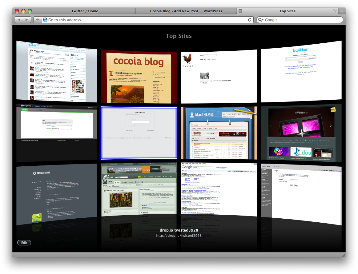
Well, another day, another major browser beta; Safari 4 went public beta today, with a lot more UI changes and additions than we’d all expected from the limited developer preview that was released months ago.

picture-8

Notably, Safari adds tabs to the top of the window (seemingly ‘aping’ Google’s Chrome, which isn’t out for Mac yet) and several new features for visual browsing (nevermind my own ‘top sites’; I haven’t used Safari for months). It sort of took me back for a second to the time where I mocked up the ‘dream browser’.

Using it casually, I found there’s also some other, more subtle changes and additions that made me really enjoy giving this beta a spin, and perhaps will sway me into using Safari a lot more (provided I can find a working Adblock extension).

Continue reading…

07 Jan
   Filed Under: Apple, Design, Icon Design, Interface Design, News   

Of course, I watched the Macworld SF keynote yesterday, and apart from noticing the iWork.com icon, I also saw all sorts of nice UI changes and icons. I skimmed through Apple’s new online guided tours and walkthroughs and I’ve compiled a (far from exhaustive) roundup of all the fancy new UI stuff in the iWork and iLife ’09.

I’ve divided this post into areas of interest, and not by application, as I have no access to iLife ’09 yet, and I think that the changes and additions to the interface design serve themselves much better to being divided into logical groups that go beyond just the product itself.

Continue reading…