


Of course, I watched the Macworld SF keynote yesterday, and apart from noticing the iWork.com icon, I also saw all sorts of nice UI changes and icons. I skimmed through Apple’s new online guided tours and walkthroughs and I’ve compiled a (far from exhaustive) roundup of all the fancy new UI stuff in the iWork and iLife ’09.
I’ve divided this post into areas of interest, and not by application, as I have no access to iLife ’09 yet, and I think that the changes and additions to the interface design serve themselves much better to being divided into logical groups that go beyond just the product itself.
Icons
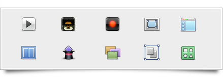
iWork ’09, the software package that is available to me, has drastically altered the style of its toolbar icons. I downloaded the trial and took these screenshots of the old and new icon sheet of Keynote (images open in current page).
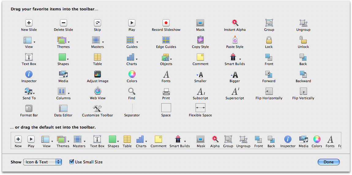
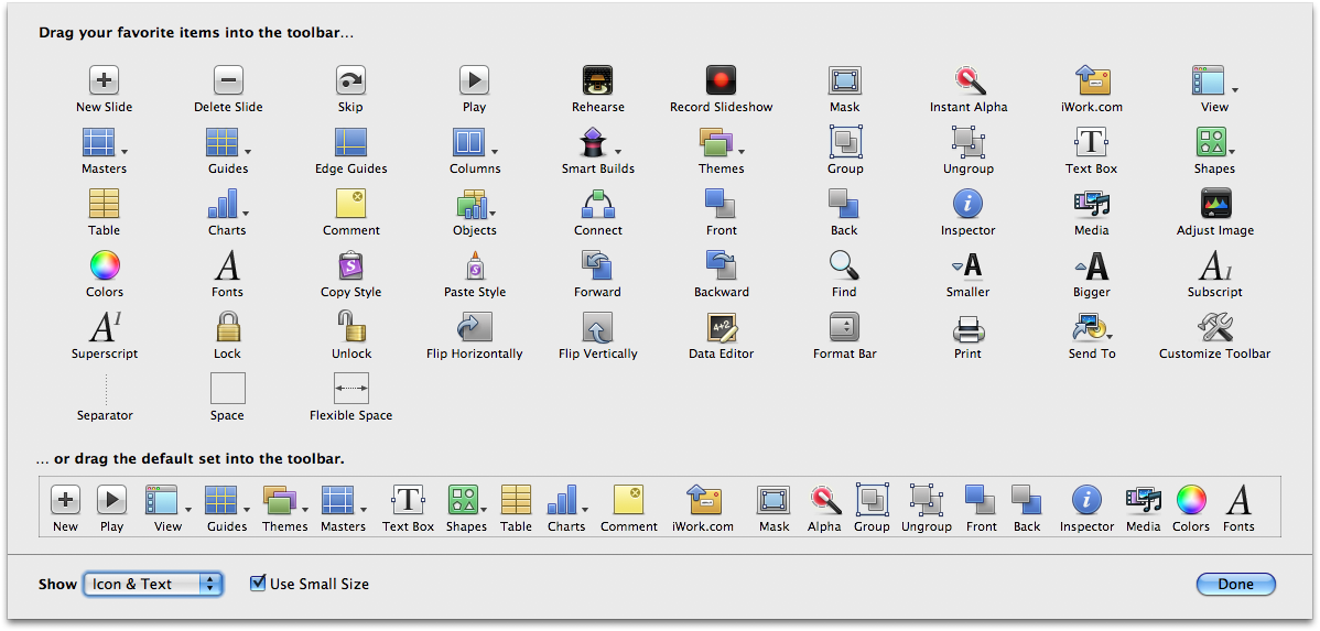
It’s quite clear to see by these images how Apple seems to have chosen a different style. It’s consistent between all apps; I also have some images of Pages’ old and new toolbar icon sets, but this side-by-side comparison of the Keynote preferences also shows the differences effectively (top icons are the new ones);

What I really like most about this all, though, is that the design team left nothing untouched. They even critically looked at the application icons and their low-resolution equivalents. I particularly enjoy them further improving Keynote’s smallest icon (Top is iWork ’09);

iLife ’09, especially iWeb, shows some other stylistic changes that go well with the changed toolbar icons; a very atypical (dare I say ‘non-Leopard like’?) folder icon and a globe that’s devoid of the highly saturated colors and gloss we’ve come to expect from Apple. I haven’t been able to extract these images from anywhere, so here are images of them that were taken from the guided tours:

I can’t say I dislike the new icons, I might actually prefer them if they push this whole style through. As you can see in the other changed widgets, the whole subdued stylistic direction of the UI in the new iLife / iWork apps works quite nicely. It does seem awfully strange to have a very glossy Dock to go with this style, though. Here’s to hoping they change that in Snow Leopard.
General widgets and styles
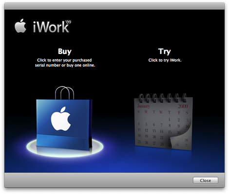
iWork’s got but a few drastic UI widget changes, but they’re enjoyable. I like the fresher ‘trial’ screen that’s presented on startup. Jan van Boghout noticed the button in this window actually has a different ‘clicked’ state than the system-standard ‘metal’ textured button. I wonder why.
Keynote’s presenter display has seen some gorgeous changes. I can’t name one element in this screenshot that I don’t love. Intensely. Very, very nice.
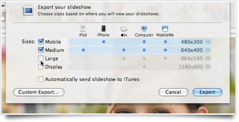
While I haven’t used the exporting features of iPhoto a lot in the past, I believe this very intuitive and nicely designed slideshow exporting sheet is new. It’s quite effective and looks great.
We had seen a few controls that used a lighter highlighted style in iLife ’08, but iPhoto ’09 goes the extra mile and applies it everywhere. I enjoy it, barring that the style remains consistent. It’s a less harsh and contrasting highlighted state that looks better in the subdued interface of iPhoto.
General UI changes
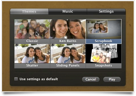
The two suites also saw some general interaction and UI changes, mostly in the animation department. The iWork apps, all showing a template picker on startup, now discretely animate a transition from the template thumbnail to a full application view. It’s subtle, not overpowering, or useless; quite a nice example of tasteful Core Animation usage. I really like it.
Skimming, the feature introduced in iLife ’08 for quickly ‘skimming’ large collections of photo’s or movies, has also turned into a veritable standard, being used in all the template pickers of iWork, and much more places like the new Places and Faces views of iPhoto. iMovie’s obviously also using a lot of skimming. I think it’s bordering on useless in the template picker of Keynote, but it does show more content in less space, I suppose.
HUD Panel changes
Last but certainly not least, the HUD overlay panels have seen some changes too. I’ll start off with iPhoto, which has some very sweet adjusted overlay panels. This little bubble that pops up when iPhoto asks you to confirm its facial recognition has a very nice highlighted and pressed state;

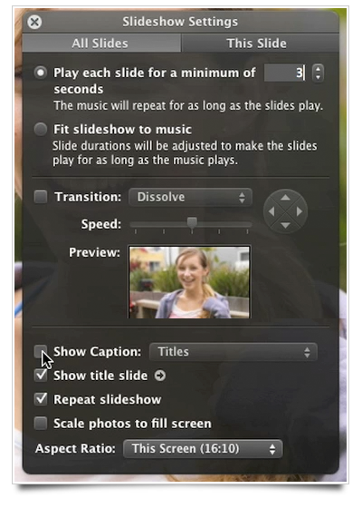
In general, the elements of the HUD panels have a different style. It’s completely in line with the other subdued elements I’ve presented so far. In two words: ‘Less flashy’. Here’s a screenshot (composed of multiple, smaller screenshots) of the demonstrated iPhoto slideshow settings overlay;
I like it, and hope to see it in more third-party apps. Same for this titlebar tab control. Interestingly, this one is actually glossy. I think it would have looked equally nice if it’d been in the same subdued gradient style as we’ve seen so far.
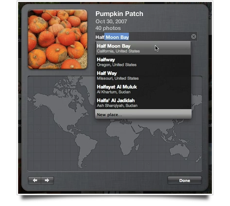
And finally, while not really being a HUD overlay control, this autocomplete field has some very nice styling. The gray selected style has something quite unique. But I noticed Lucida Grande being used at the bottom of the autocomplete list, and Helvetica in the list itself. Make up your mind, people!
And that concludes my roundup. As I mentioned in the beginning of this post, it’s hardly an exhaustive list of all UI changes and additions, but these stood out to me and I felt like sharing them with the world. Godspeed to all those developers about to dive into Xcode to make some custom controls!
I just want to add my opinion on the scroll bars:
– Aqua: too shiny
– iTunes: good
– iTunes black/blue: looks like it doesn’t have a clue what it’s doing.
great post, as usual.
Hi sebastiaan,
Great writeup!
By the way, can you guide me how to make a picture that has shadow at the left and right corner like in your article, its look great, kinda love it! ^.^ Picturesque cant do that :((
Thanks mate!
I so have to agree with Stilgherrian about the whole icon meaning issue, I mean yeah not many people still use white-out. I would have to say that Apple usually does a good job with picking icons that best fit the meaning of their apps/programs/features but as for auto-correct, I think they were more focused on bring the recreating the past rather than having one that better describes what the feature actually means. I mean the white-out bottle looks neat and all but that’s pretty much it. I do have some non-English friends who have said that the reason it seems that Apple is so popular is #1 their stuff just seems to work and #2 they try their hardest to make their stuff easy to navigate, especially with the help of their icons. I’m not harsh on Apple for their new auto-correct icon but I do wish that they would go back to the ’08 icon or at least make something similar. Also about the whole issue of the scroll bars, I just don’t see why they keep the aqua bars around when it sure seems like they are trying to get away from aqua (probably aqua takes up too much space and for Snow Leopard they want to reduce the overall footprint). The iTunes bars are so nice looking and they really look sharp upon the iPhone themed OS and so if they could merge those together with their current darker non-aqua/non-metal theme that would be awesome, would sure beat Microsoft Vista/Windows 7’s theme. Even though you might think that overall appearance isn’t important, well what would you rather look at, something that looks professional and well thought-out with style to it or something that is an eye sore?
I will eat someone if Snow Leopard doesn’t include iTunes-style scroll-bars. Literally.