Well, another day, another major browser beta; Safari 4 went public beta today, with a lot more UI changes and additions than we’d all expected from the limited developer preview that was released months ago.
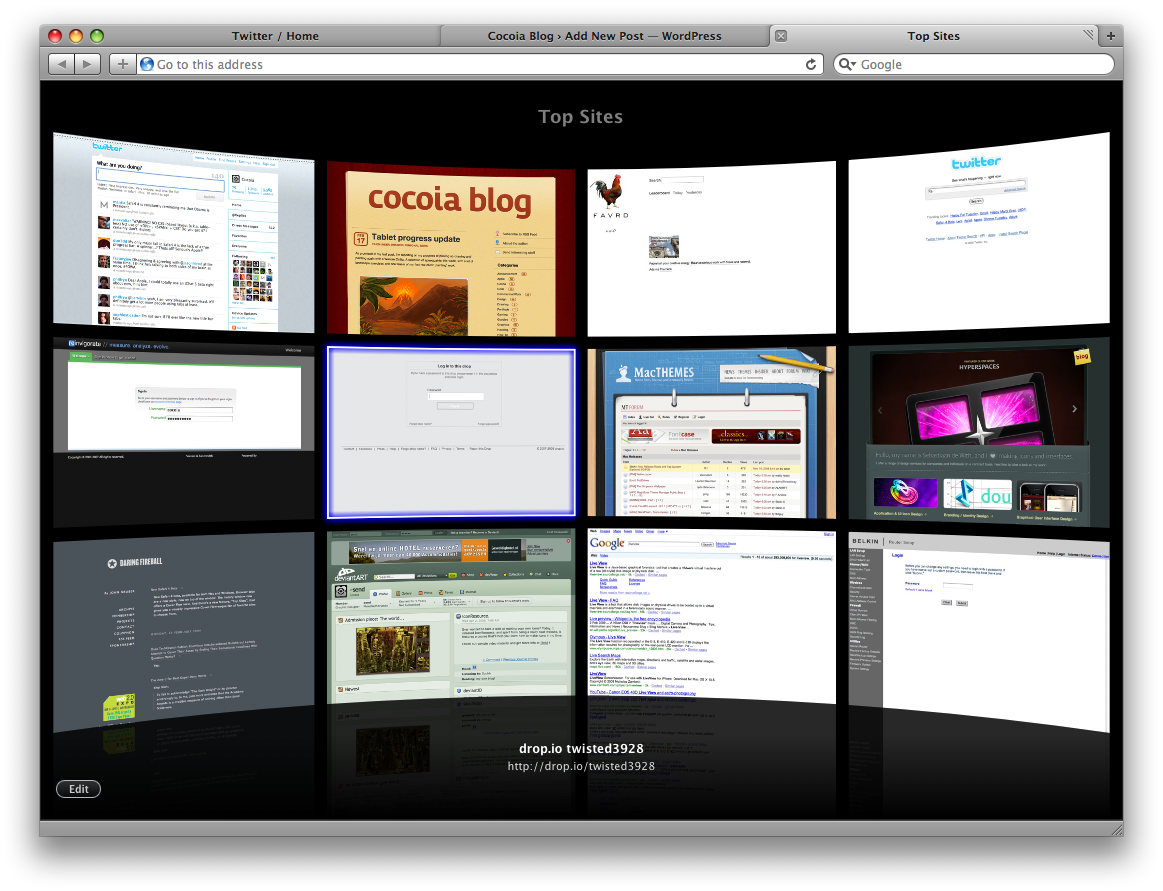
Notably, Safari adds tabs to the top of the window (seemingly ‘aping’ Google’s Chrome, which isn’t out for Mac yet) and several new features for visual browsing (nevermind my own ‘top sites’; I haven’t used Safari for months). It sort of took me back for a second to the time where I mocked up the ‘dream browser’.
Using it casually, I found there’s also some other, more subtle changes and additions that made me really enjoy giving this beta a spin, and perhaps will sway me into using Safari a lot more (provided I can find a working Adblock extension).
Safari is representative of a ‘smooth’ browsing experience; it starts up quickly, and presents you a very Apple-like intro movie (yes, an intro movie, with a fancy animated Safari icon, and I’ve heard that it seems the intro is largely composed using images and CSS. Very neat).
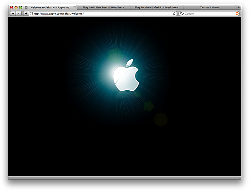
Upon going from the pretty grid of your favorite and most visited pages to a website, it seamlessly animates and ‘fades in’ the webpage after it’s been loaded. It sounds ever so simple, and perhaps useless, but it’s a genuinely pleasant feedback for page load completion, and it just feels right. It’s a very nice way to get ‘acquainted’ with the Safari experience.
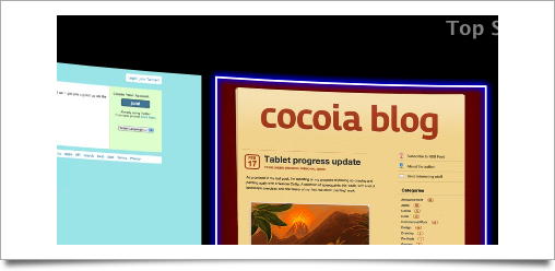
Interesting to note is that the blue glowing highlighted style of pages in the grid is very similar a the style I described in my UI breakdown of iLife / iWork ‘09. I like it; it’s less turquoise, a bit more blue, and a whole lot more subtle.
But this is all trivial compared to the dramatic changes to tabs. Having tabs at the top is a very logical thing to do; tabs do take precedence over other controls, and are relevant at the top; but two things are possibly confusing; having no title bar to drag the window around with, which you are used to, and the ‘travel time’ of bringing your cursor to the top of the window to switch tabs is greater. I found it uncomfortable at first; I’d like to know what you think. I think it’ll grow on me, though.
The tab dragging behavior has also been normalized; previously, as John Gruber reported, you could only drag the tabs left and right if you started your dragging motion in a horizontal direction; if you started dragging vertically, it also allowed you to ‘tear off’ the tab and easily create a new window out of it. In the new beta, you can actually move the window by clicking and holding the tabs (which takes some serious getting used to) and move tabs, as well as tear them, by touching the little ‘textured’ zone at the right side of each tab.
Apple’s also mitigated the Chrome ‘ski mountains’ problem by adding the ‘more’ button when a lot of tabs are present. There’s still no fancy scrolling of all tabs using the touchpad, though, which I love in Firefox 3.

They do, however, have a nice trick in the drop-down that appears when tabs are overflowing:
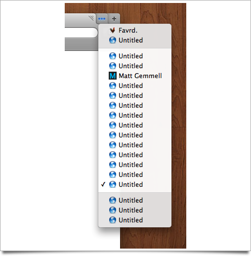
It’s a subtle touch, but the darkened items are not visible in the current window. This way, you can easily see which tabs are currently hidden from view (thanks to Matt Gemmell for this one).
Then there’s also the demise of a new button, the reload / stop button. Whereas Firefox, even for Mac, still uses two of these buttons in the toolbar, one for stop, and one for reload, Safari now has zero. Yep, zero. Safari now uses an iPhone-style, tiny reload arrow in the address bar. We’ve seen this change come to the iPhone in the lastest major firmware update, and I’m not a fan of it on either platform. It does add to the clean interface, though.
Very notable, when taking Apple’s previous approach to ‘theming’ Windows applications in mind, is Safari 4’s native look on Windows. It yes, actually looks quite different, as opposed to a ‘fake’ Mac app. I wonder how this will affect the adoption rate of Safari on Windows (barring of course any show-stopping bugs). It even uses Windows-native text rendering.
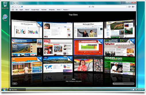
If you’re a Windows user, feel free to leave your thoughts on this.
It’s not all good; Safari’s abandoned the in-address bar progress indicator (it used to ‘fill up’ the address bar as an indication of page loading progress) for a tiny spinning indicator, similar to what Firefox uses.
I also thought the ‘Tabs’ icon looks rather strange; almost similar to a metal hat. They also put the text label ‘Tab’ on it, for good measure. A good standard for icon design is that if you have to put text on it to describe what it is, it’s probably not a good icon. My friend Sean did these changes, from the original icon far left, to a possibile re-interpretation, and to a possible redesign far right:

Makes a bit more sense, in my opinion.
Some other, less show-stopping issues are the dislocation of the ‘back’ button’s black arrow glyph (it’s offset by a pixel! Argh!), and the strangely changed inset bevel style of the address and search bars in the toolbar. It’s a subtle set of changes, but enough to make me feel… unheimlich. Takes getting used to. Detect a pattern here?
Other than that, Safari’s newest public beta is a really nice browser. Give it a try and leave your thoughts!


Thanks Sebastiaan! Great overview, and the details you noticed were very intersting. I wrote a more broad review covering some of it’s newer features also: http://blog.debeasi.com/2009/02/safari-4-review/
Sweet post, has a few flaws but is a rather good browser.
Also note that there are two bugs that I have found. The new version of WebKit crashes my Mail.app constantly, and 1Password needs a plist file tweaked to work.
It’s really faster, and I am happy that they switched from the curious cmd-alt-[ and cmd-alt-] to juste ctrl-tab for tab switching.
The CoverFlow features seem useless to me, as they need to much time to preload pages… Even though these features are beautiful.
About the blue glowing highlighted style, in my opinion it’s really ugly, as it looks too much like the browser’s default link color, and not enough like Mac OS’s controls default highlights.
This version of Safari seems to correct a recurrent bug in text boxes, where when switching from the currently edited paragraph to the next one, the previous paragraph’s text spell check would go disabled… And that’s good.
Anyway, kudos on the fast and nice blog post, as usual ;-)
@Brendan:
If you have GrowlMail plugin installed, remove it and restart your Mac.
I’m less enthusiastic about the prevalence of Coverflow everywhere in history/bookmarks. When the CF is shrunk, the search area remains, but as an ugly black bar. The tab behavior is quite nice when you have a large amount of tabs open – the “More†button shows the current chunk you’re within.
I hope they bring back the progress bar (within the location bar), but that seems unlikely. A combined location/search/progress bar would be nice as well.
It’s strange and telling that there is no longer even the option for a stop/reload button in the toolbar. I’m used to the keyboard commands but I wonder how many other people are?
Also, the Stop/Reload button has been moved into the Address Bar, in the same position as the loading animation.
@Brendan 1Password uses a haxie approach to integrate with Safari as there is no public API for an official plug-in to access the keychain. This isn’t a bug with Safari, but one to file with 1Password, and there isn’t a way around it unless Apple changes their API to allow that functionality (which seems unlikely – but you could register with ADC and file a bug report on Safari). It’s annoying but the way of the world, right now.
I tried the beta on Vista before my Mac. The Windows impressions: too much Chrome without BEING Chrome. The design is slightly different than the Mac version; it’s going out of its way to look like a Windows browser, more specifically, Chrome. I think it’s visually more appealing and less threatening to a native Windows user, but for me, it’s just like Google’s browser, but not as snappy, with a few new features. I’ll stick with Chrome on Vista. However, on the Mac, Safari is very quick and uber-smooth. It truly is meant for the Mac. I just wish the Windows people could get the same experience.
I also hope all the CSS3/etc. support will help push the new tech to the forefront. I’ve been waiting forever for CSS3 and Animations, Effects, etc.
Yeah, the hat is weird. And the hat + RSS icon doesn’t really fit in with the rest of the icons in the toolbar. How about Apple just giving in and use the “standard” RSS feed icon that we all are familiar with nowadays?
My take:
http://ratafia.info/post/81101200/problems-and-complaints-for-the-safari-4-beta
Did you notice that the window doesn’t have the same shade of grey like all other Leopard applications? I think it’s a hint on what Snow Leopard might be going. Also, the title bar is using a font different than other windows.
All in all I really like the improvements, even the Top Sites which I always thought sounded pretty lame on other browsers. Apple does it with style. Should we expect anything less? The thing I do miss the most is the progress loading indicator filling up the address bar. This was much more obvious than the tiny spinner to the right of the address bar but as you mention it is more consistent with the Safari Touch and a bit cleaner.
I’m not sure about the new tab positions. As an avowed devotee of Fitts Law, I can’t help but feel that it hurts usability by slowing down target acquisition. However, whatever time delay I currently experience will probably disappear as I grow more accustomed to the new action.
The larger issue is, I think, more conceptual. The address bar always represented a sort of “upper boundary” for me visually, since it’s the only place where I would point, click, and type. Everything below it is a pure mouse interaction. Now, however, there’s an important mouse-based navigation system set above the address bar, which forces me to maintain awareness of a larger percentage of the screen.
I’m just thinking out loud, of course. Maybe it’s nothing. But then again, maybe it isn’t. This is why the internet has comments, right?
I am sorry if this has been already mentioned in other comments, but SafariBlock http://code.google.com/p/safariblock/ does a decent ad blocking job. Works even after the Safari 4 beta upgrade.
The new way of loading (specifically the Top Sites) where you are shown a placeholder which looks exactly the same as the page you are loading is really cool.
It seems Apple wants to make the web feel totally smooth (without loading) for exceptional snappiness…
p.s. page rendering is really fast
FYI, a 1Password beta that works with Safari 4 has just been released. No plist editing required. Enable beta versions in your updates to get it.
For ad blocking, I HIGHLY recommend GlimmerBlocker (http://glimmerblocker.org). It uses a system wide proxy that will never break with browser updates. It works with every browser on your system, so I have ditched Ad Block for Firefox as well. Best of all, it’s free!
I dind’t get to see any intro movie ! Does this show every time the apps start? or am I doing something wrong?
Safari 4 on XP looks extremely nasty. I loved the what the other versions looked like, but 4 is just like another generic windows app. :(
For those who dont like the new tabs and the new way of loading just visit http://pastie.textmate.org/398861 to get the terminal commands to restore the old tabs and blue loading bar behind the URL and bunch of other stuff known in Safari3!
Danny, visit http://www.apple.com/safari/welcome
Isn’t anybody angry about the shameful ‘cookie management’. Apple does nothing in this area. Just eye candy. Delete all or do it with every single cookie. No favorite sites. I think it’s anxious that Apple seem to have no interest in helping to protect the users privacy.
I love that Safari now use the native look on Windows. I’m a mac user so it’s not that I dislike the design but it doesn’t belong in Vista. Having a mac theme felt really fake…
I kinda hate the native look on Vista.
I was used to the elegant look of Safari 3, now it looks like a Chrome rip-off.
They should’ve made Safari 4 look like iTunes, with the whole “Marbel” look.
I hope they fix this in the final version, otherwise i’m gonna be very disappointed on Apple Designers.
P.S: I love the Mac Version of Safari 4.
GlimmerBlocker’s what you want (glimmerblocker.org, I believe?). It’s very powerful and very effective.
I think Safari 4 should have a line between the zoom button and the first tab for better differentiation.
Does anyone know anything about the Mail/GrowlMail interface issues now WebKit has been updated? I finally removed GrowlMail, but Growl has not been updated in some time, and I don’t know how active the developers are. From all guesses a fair number of people use Growl, and I hope a fix is released soon!
Re: the address bar bevel, look closely: it’s almost exactly the *same* kind of bevel that the address bar has on MobileSafari.
If you use the terminal commands to switch the tabs back to safari 3 style the icon in the prefs switches as well and looks much better.
Safari AdBlock works just fine with Safari 4, I’ve been using it the past two days with no issues.
I really like the new browser, I’ve had no issues, I like the tabs on top, I like that the reload button is incorporated into the address bar (although I am annoyed that snapback is gone), and the speed is amazing. I’m a fan.
Check out Glimmerblocker: http://glimmerblocker.org/ for system-wide ad-blocking using a HTTP proxy.. Very nice..
I posted my ideas and solutions for tabs to my blog at http://explodingplastiq.wordpress.com/2009/02/26/safari-4-tabs/ , it’s in Dutch, but I think you can handle that ;)
The developers just forgot to include the progress bar, it will be included in the real version. That progress bar is one of the coolest features of Safari and Apple would never abandon it.
@Manoj: the developers didn’t forget the blue progress bar…it’s now a “past” feature. But if you’d like it back and you’re on a Mac it’s really simple to add back…as is changing the hideous “tabs on top” back to where they should be. Following are the simple fixes.
1. To revert back to Safari tabs, in Terminal type:
defaults write com.apple.Safari DebugSafari4TabBarIsOnTop -bool NO
2. To get the blue progress bar back a little more work…but worth it. In Terminal type:
defaults write com.apple.Safari DebugSafari4IncludeToolbarRedesign -bool NO
defaults write com.apple.Safari DebugSafari4LoadProgressStyle -bool NO
Restart Safari. This will give you exactly the same Toolbar as Safari 3.2.1.
Then enter into Terminal:
defaults write com.apple.Safari DebugSafari4IncludeToolbarRedesign -bool YES
Then restart Safari again. Reverse NO and YES on Terminal commands to get back to the hideous Safari 4 settings if you want.
I haven’t try to look for the previous windows screenshots by Apple, but I like how they take those shots:
– 2 icons: Recycle Bin and Safari
– 2 trays: Volume and MobileMe
– maximized state similar to zoomed mode on Safari, stretched from top to bottom
Other applications screenshots usually didn’t remove the tray icons which makes me feel strange, in fact they are promoting their product…
Sadly, I already accustomed to chrome omnibar search. Its hard to switch back to safari.
Is it me or does the glyph on the right hand side of tabs mean “resize” while it functions as “move tab”? Very confusing.
Cool it guys. I found that after using it for a few days, I began to like it more and more. Sometimes change is good.
I don’t understad why Safari still does not have the option to remove the search bar – I mean, every modern human uses Keywurl, right? ;) (searching and doing other stuff from the location bar)
Thanks for an interesting breakdown.
lots of others have talked about various problems with tabs-on-top but one that i haven’t seen mentioned anywhere is the fact that the window title now has no fixed place. for 20+ years we’ve had window titles consistently (!!) top-center in pretty much all mac apps, and now apple seems ok with the idea that the title can be on the left, or on the right, or somewhere sort of in the middle. and it’s ok if that position changes from window to window, or even within one window. and of course if you’re using tabbed browsing then 50-75% of the text in the “title bar” is not actually part of the window title (as it belongs to other tabs). i guess they figure window titles are irrelevant now because, on top of all this, most sites get a title that’s truncated if you have more than a couple tabs open.
i am using windows 7 however it’s a matter of time (GOD willing) to switch to Mac , but just hope that my end users see the websites i developing and desinging just like how it looks on the Mac , and i was using Safari 3.x and it was great and make just wanna got a Mac , now using safari 4 beta and it’s better , but :
– why apple made the default font rendering as “windows native” !!!!!! , i got bad impression after just installing it , and i was about to switch back to safari 3 …. before discovering the old font rendering option ……
– even the old option is existed , but , apple no longer using “Lucida Gr” as a default font for safari in windows … they are using the windows native fonts !!!!!!!!
– i don’t know why the fonts sizes in safari 4 for windows looks smaller and thinner , even after enabling the apple rendering way !!!!! , and with ” submit ” buttons looks bigger !!!! , and for me to have somthing the fonts smoothing i had with safari 3 , i have to choose STRONG not medium ….. actually fonts got many troubles after apple removed “Lucida GR” …. please give it back …..
– the web inspector looks as ugly as in google chrome after : not usnig the “Monaco” font for code it in the web inspector …. so the code looks unreadable , what a fail !!!!!
– and we still have the same trouble after installing the “Monaco” font in windows , if you want to know the problem install “Monaco” then see how the code in the css and js files files looks like in safari web inspector !!!!!!!!!!!! , i wonder if it becomes byte code :) !!! ….. now , i am asking : the web inspector in safari 4 don’t use “Monaco” (how ever we still need it in the web inspector , and i hope that windows render Monaco like safari did ) why we still have the same problem after installing it ???!!!
– The forms widgets looks pretty ugly , why using native widgets , the aqua widgets for safari 3 was one the biggest features that that make any windows user uses safari , it just make the web prettier …… actually it make many web developers don’t have to css these button , because they already have the best looking …… so, ok make windows native aero borders but, just let the Aqua widgets or whatever you’ll use for Snow Leopard .
– where is the rounded search box !!!!!!! look at the search box in apple’s website …. how ugly it is !!!!! and i was using in my web site it as a native webkit form element , so now thinking in just using images to figure it !!!!!!
– the animated drop-down alerts and windows when bookmarking a site or reporting a bug or checking the cookies …….. was pretty nice in safari 3 , they removed it now , just normal small windows , i think it’s a must have feature for safari , i think it has nothing to do with being an Aero application ………
– i agree with you that the progress indicator in the address bar must return ….
– old light blue color to highlight the selected text was away better …
– the url text on the address bar is vertically aligned and need to be a little bit bigger , and the links in the bookmarks bar should be bolder a little and with the old dark hover .
Hey. I like the new safari layout. (Im a Vista User). However, i will point out one thing. If you happen to be on a useless spec’d work laptop, and dont have Aero Running, you can forget about Safari’s nice new look. it looks horrible. hehe. Looks good with Aero enabled though. :)
I have just stumbled upon this site, and so far have found it informative and interesting.
Safari’s layout does look really good but have noticed from the above comments not many people are too happy with it and its missing some features, wonder if they will hear the people and rectify this problem??
Suddenly my Safari is not working, ends up that Safari AdBlocker could not receive a feed anymore so Safari only display a 1 pixel by 1 pixel gif no matter where you attempt to surf unless you disable ad blocker and then all is good. Except that nothing is blocked again!!
Anyone else running into this issue?? Suddenly popped up this morning on 3-5-2010.
Thanks, Darius