There’s been so many iPhone OS 3.0 feature roundups that I’m not even going to bother doing a roundup of UI changes, as most users are quite familiar with this newest version of the iPhone firmware already.
This is a post about the details, but there’s a few things I won’t go into. For instance, please don’t get me started on those pinstripe icons. Seeing them on a huge banner at WWDC was painful enough, and then having to recreate the same stripes for this blog post’s graphic was the proverbial needle under my fingernail.
However, it’s worth a blog post to look at those nice little touches that have been added to the already impressively well-designed iPhone UI.
Let’s begin with some of the new additions to the iPhone. Take the Voice Memos application, for instance. Apart from its icon and general UI, which I kind of dislike (there’s quite a, hum, elaborate story behind the design, supposedly, but I’m not sure if I can share that here), it has some of those small details that make you smile.
For instance, try holding the iPhone upside down (microphone side up) while the app is open. The UI rotates to let you point the microphone in your iPhone to any desired direction. A very small detail, but quite a nice one, just like the subtle texture on the bottom bar: very reminiscent of actual audio equipment.
And yes, just like a regular ‘Sinatra’ microphone, slightly tapping the microphone chrome will make the decibel gauge jump.
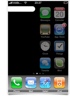
Spotlight and the regular home screen with icons feel very integrated with each other, but as to maintain a logical separation, the icons will fade out to black as you move towards the Spotlight screen. Conversely, if you move from the Spotlight view to the first page of icons, the Spotlight view fades out in the same way. With normal usage, it’s practically unnoticeable, but if you leisurely slide around, it’s nice to see.
However, there’s an annoying detail: the icons on the home screen don’t just fade out, but actually become transparent. I have no quarrel with that, apart from badges on icons and the day of the month on the Calendar icon becoming translucent. Probably not noticeable for most people, fortunately.
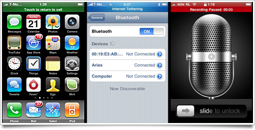
Whereas the home screen got pushed down a bit only by the green ‘Call Active’ top bar in previous releases of iPhone OS, in the new OS it can also be displayed with a different color to indicate an audio recording in progress, or whenever tethering is active. I love the glowing colors of the tethering bar, although it’s been ‘toned down’ since its first incarnation, where it glowed towards a Mediterranean green-blue-ish hue to turquoise. In the final release, it simply fades from turquoise to bright turquoise.
One of those applications a lot of people move off their home screen, Stocks, gets even more almost undiscoverable features, like a landscape mode and news items. Very nice and equally undiscoverable is its new graphing delta feature, which uses multi-touch input to let you figure out how much value has been gained or lost over time:

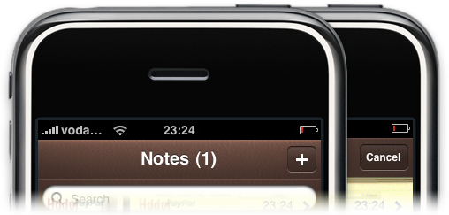
Also search-related: the search widgets in particular applications do get a ‘native’ treatment, like the Notes search bar:
The App Store itself actually got a few nice additions, like a Safari tab overview-like scrolling view of application screenshots. It’s sort of unsuited for landscape-oriented screenshots, but I found it quite nice to use regardless. You can also log into a different account or sign up for a new account from it (and the iTunes application) directly. The App Store and Youtube get a very pretty new comment/review area, as well.
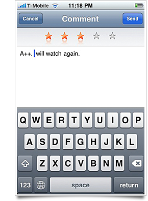
I love the top rating area. Very subtle and in line with the convention that was set in the iPod application. I still can’t figure out why it uses a black, semi-opaque keyboard background in the App Store, though.
Touted as a bigger feature in most roundups: the scrubber bar on audio and video now lets you drag up and down (vertically, that is) to change the speed of the scrubbing. It radiates a nice white circular glow as you scrub it to give it a better ‘feeling’ (it felt a bit like you were playing psychic if you moved the metal ‘knob’ while not even touching it in the previous point update).
Safari for iPhone gained a lot of features, one of which is EV (Extended Verification) certificate handling. As required by Paypal, EV certificates (supposedly) allow an even greater degree of secure communications. When a website is confirmed to be ‘genuine’, the title bar text of Safari turns a dark shade of green:
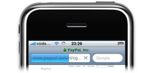
I find it very unpleasing, aesthetically, and suggested some other options to some of Apple’s iPhone team when I met up with them at WWDC, but they did make the valid argument that if a website is verified to be genuine, it’s not as important to expose it to the user. In fact, the green text is easily overlooked. I haven’t been able to test a situation in which the EV certificate is found to be invalid, so if you have a website to test that on, do pass it on in the comments section.
Speaking of Safari, the team at Apple is clearly interested in reducing visual footprint. During the developer betas of 3.0, the bottom bar was semi-opaque for a few builds:
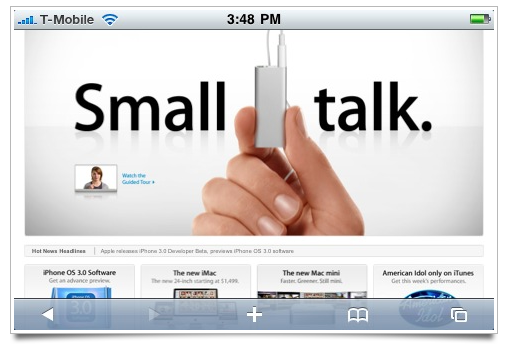
I’m glad this was removed, though, as it served very little purpose.
Of course, there’s also the usual imperfections. Tip of the hat to Neven Mrgan for this ‘gem’: the screen-filling action sheet in the Photos application turns into a rather… bold alternate design when in landscape mode. It feels like this particular area of the application has been overlooked, just like the (new 3GS) Compass application’s settings backside. The stark contrast and lack of visual polish is just very unlike Apple.
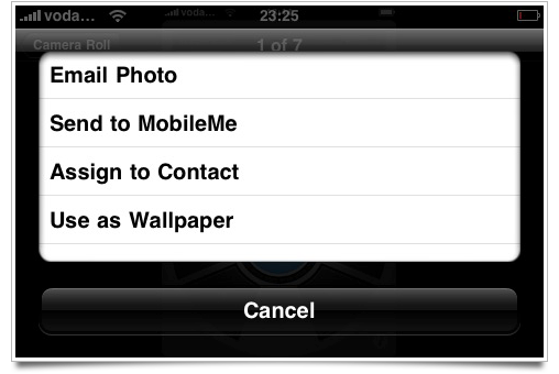
However, this does little to detract from these great little details (and there’s probably a lot that I haven’t even covered) that Apple rolled into this release like they usually do. Sometimes, I’m considering if other companies in the cellphone / personal media player market have caught up to Apple’s care to details and design sensibilities, but then things like these make the reality very obvious to me:
Apple’s still the leader of the pack by several tail lengths.


nice to see you looking into ui stuff again!! the microphone turn-around bit is nifty, will try that for myself ^^
Awesome article Sebastiaan! :)
Nice overview. For the record, that landscape action sheet in Photos is normal if there are only three options. I don’t have a Mobile Me account on my iPhone, and it looks normal. Although the Photo solution isn’t ideal, fitting four or more action sheet button options in landscape mode is an interesting challenge.
In the landscape sheet, think I would have tried to use the extra width for a custom, two-column matrix of buttons.
I can’t wait to get my new Iphone. I reserved my new Iphone 3G S last Friday. I am the first one so hopefully I get him on June 26th. Nice article anyway!
Interestingly enough when I slide to Spotlight my Calendar date doesn’t look like yours.
See: http://grabup.codegenocide.com/IMG_0006.PNG
Also I noticed a couple odd design choices.
When I went to download an app from the AppStore it said I needed to agree to new terms of service and also wanted me to verify my address. After entering my address it asks which County in the state (AZ) my address is in.
Take a look at: http://grabup.codegenocide.com/IMG_0001.PNG
Unlike EVERYTHING else they placed the Toolbar right below the content instead of all the way at the bottom like normal.
Lastly, when setting up my iPhone 3G S I was entering my email info and when I clicked to verify the settings, it started and then brought up a screen that looked liked when a call is coming in (everything blacked out with some text in the middle and two colored buttons at the bottom), only the text simply said, “power off/on” nothing more. No explanation what it was about or anything. The buttons at the bottom were something like “Cancel” or “Accept” (I don’t remember exactly, but basically a yes or no option). I pressed the accept button and the screen disappeared and I was back at the screen with my email info being verified. My device didn’t power off or anything and I have never seen it again.
Unfortunately I didn’t think to take a screen capture until after it was gone, but I got a response on Twitter that some other people have seen the same screen, and also have no idea what it is or why it showed up.
All that aside I have to full agree with your statement that Apple is still the leader of the pack!
This is a comment about the details, but there’s a few things I won’t go into. For instance, please don’t get me started how the Fusion Ads breaks the clean right hand line of the sidebar.
The comment portion of the page has clearly been carefully thought out. Each post includes a speech bubble bottom. Unfortunately there doesn’t visually seem to be enough padding around the post text, so the effect is definitely diminished. Also the leading seems particularly tight for comment text, not really matching the leading elsewhere on the page.
The Search blog entries field is a bit of a mystery, it just sort of hovers above and between “the Cocoia Blog” and “Icon Resource”. It doesn’t seem to align to the sidebar or any of the bottom nav.
Overall the post is clean, well presented and really show off Cocoia’s care to details and design sensibilities.
I love this kind of posts. :D
Interesting… I had noticed that the quirks with the Spotlight fade-out were actually fixed. I assumed it was something they fixed in the final 3.0 build, but it turns out it is only fixed on the 3G S!
A couple other “nice” touches to the recorder app (as in “gee, it would be nice if I could do this in my own app”) is that it records when the app is no longer running and even when other apps are running. Heck it even records when the iPhone is put to sleep.
In contacts app, I noticed if you add a number, one of the labels is “iPhone” (ala Home, Work, Mobile etc). This might have been there in earlier OS but I dont remember seeing it.
Also while addressing the SMS (with MMS enabled, hello from sunny HK!), the bottom row of the keyboard is _123, space, @ . and return.. all almost equal button in size. I find that annoying as I keep hitting the wrong buttons but am not sure why. Also no idea why we need an “@” when addressing an MMS.
For testing certificates try https://test-sspev.verisign.com/
Um – whilst we’re nitpicking, it irks me greatly that some of your screenshots are taken on a phone with a battery indicator that’s in the red ! Please charge your battery next tim :p !
any news when it is launching in India as I am very desperate to buy one.
Mark said:
“Also no idea why we need an “@†when addressing an MMS.”
You can send MMS to an email address as well as to a phone number.
Interesting detail I noticed at the gym yesterday: the stopwatch app has been slightly reconfigured. Now when you tap “Lap”, the main display keeps a rolling tally of how long you’ve been using the stopwatch, with the lap time in smaller type above. This is really nice- you don’t have to use both timer and stopwatch/add up all of your laps to know how long your workout was.
There’s also a top bar push-down if you have a Nike + run active and switch to the home screen. It’s red, I believe (I saw it last night on my first attempt at running with a phone strapped to my arm).
I noticed that App store changed within the first day of the 3.0 release. The “more” section was removed from the bottom leaving the old layout. Redeem and the ability to log into an account seem to have been removed (but can still be found in the itunes app). Interesting that they are able to update that app remotely.
@cocoia: that’s what a scrollable acion sheet looks like, unfortunately. Saw it before when composing a message (I think) to someone with a rather long list of contact options.
@Mark: you can send an MMS to any e-mail address I think. Why you would want to do that at cost is beyond me but it’s possible.
One change that I am having difficulty getting used to is the way text messages are sent. I liked the old way how the message text would be placed in a speech bubble, placed in the conversation thread, and the sent confirmation sound would all happen at the same time. Now the sent confirmation sound comes after the message appears in the thread. To me if feels disjointed. Also, I’m not crazy about the progress bar’s new location, covering the recipient’s name. There is a macrumors.com forum with user submitting mockups for alternatives. I like the idea of using the speech bubble as the progress bar itself. (http://forums.macrumors.com/showpost.php?p=7899550&postcount=67)
Voice Notes: Best new 3.0 addition in my opinion. One gripe, flipping around the phone so you can hold it like a microphone – the UI rotates. Great! but the buttons (start/stop) are still at the bottom of the screen making one handed operation more difficult.
I’ve always guessed the “black, semi-opaque” keyboard in the App Store was to indicate that you were typing text to be sent securely, as when you type your Apple Account password to install an app on your iPod/iPhone.
I figured the distinct keyboard was necessary because–unlike Mobile Safari, where as you note there are several indicators of a secure connection–the user should have some way of knowing whether the input they’re supplying is being encrypted. Since some forms of input behave like they live “outside” of particular apps–as is the case when you enter your App Store password to install an app–the user ought to know what they’re entering isn’t being sent as plaintext.
So my guess has always been that the color of the keyboard can be a convention for indicating–in absence of other visual cues–that the user’s input is being encrypted before being sent.
Tufte makes mention of the need of a semi-opaque Safari bar in his original iPhone review video: ( http://www.edwardtufte.com/bboard/iphone-video.adp ). Unfortunate that it didn’t make 3.0 GM.
Also note that the apps that allow for widescreen operation (Notes, Messages, Mail) basically spin the entire UI, whereas Safari still works as it did since day one. It kills the menu and button bar and then fades them back in, while the content rotates.
Most of the changes you’ve mentioned are pretty interesting, Sebastiaan. I’ve noticed most of them on the 3.0 beta builds previously.
The SMS sending is an interesting move but it’s grown on me and I’m pretty used to it now – interesting that while you’re sending, if you leave and go back to your overview of messages, then return to the message thread while it’s still sending, it will flash the name of the contact before indicating that it is still sending. Only Apple would pay attention to detail like this.
I suppose they believe if you’re writing out a text, you’re not gonna need to check who it’s going to once you’re writing. It’s quite annoying, though, that if you write a long text, it pushes previous messages off of the screen where they are unretrievable until the message has been sent.
Also, with the Photos app, it seems a little odd that everything goes landscape, other than the gallery view. I suppose they either don’t feel it’s necessary (which kinda isn’t true when everything else goes landscape anyway) or they have a genius idea for a better way of doing it that isn’t quite ready. Or they couldn’t be bothered.
Nice round up anyway. As usual!
One note about the EV certs: It’s required that ALL items on a given page be served over https for the page to “show green” to the user.
Here’s an example of a green image (since it is delivered entirely over SSL)
https://www.lcfpd.org/images/quick_link_26266.jpg
While the main site fails to show green, because some of the content is served over standard http:
https://www.lcfpd.org/
additional to my previous comment: It appears that safari (mobile or otherwise) shows green for the main site I gave, while firefox does not.
Yay for conflicting implementations
When you slide to spotlight on the original 3G, icons become transparent. If you do it on the 3GS, they instead get a black overlay (which looks a lot better). I’ve been told it’s because fading to transparent is a lot smoother on the 3G hardware than overlaying the black, so it’s done that way to preserve frame rate at the cost of a barely-noticeable visual issue.
Hi,
I can see a reason for the new Messages progress bar, MMS. These take far longer to send and so need to be sent asynchronously, the new design allows you to do something else why this goes on. It still has a fail fall back with a ! icon next to the failed message, I live in a phone blackspot so see this quite often.
I love the improvements to the phone app including outgoing call icons and call time, but best of all is you can now click on the blue arrow to the right of a phone number and edit the callers details (useful if you have inadvertently set their mobile as home.
I delved into the Photo app after reading the post and confirmed as well, that the usual Action Sheet comes up in landscape mode; I don’t have a MobileMe account either.
Also, I discovered that if you access a photo album and tap the Action button, a subtle button grid comes up on the tab bar for synced albums (‘Share’ and ‘Copy’) and ‘Saved Photos’ (‘Share’, ‘Copy’ and ‘Delete’), to act upon on each photo/image you want by tapping (‘Share’ limited to 5 images, ‘Copy’ and ‘Delete’ unlimited).
I live for software refinements.
I’m with John (et al) who dislike the new SMS behaviour. It used to be synchronous and make sense (the whoosh as the bubble jumped up into the thread) but now it just seems wierd.
And the way it covers your previous messages as you write (due I suppose to the shorter width thanks to the Camera icon) is very annoying.
D.