


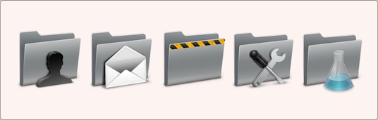
Bobby Andersen’s short talk on icon design and 3d icon design (at C4[1]) is now up on viddler, and I challenge you to watch it. Unlike Wil’s talk, it’ll consume about 20 minutes of your day – plus, you get to listen to one of the best icon designers around.
 Apple has just revealed the new, open Software Development Kit for the iPhone. It’s an exceptional program, which had been pre-seeded to developers. It allows developers to create native applications for the device, which had been highly desired since the start.
I was reasonably tight-lipped about this because I got a stash of email from companies a while before the keynote of today. I’ve been working on iPhone apps with developers for a few weeks now, and as such, I had been expecting a reasonably fully fledged SDK to appear. A device that already astonished people worldwide will now perform almost any desirable function, in a beautiful and revolutionary way. We truly stand at the brink of a user experience and software development revolution.
An online friend, Leonardo Cassarani, said:
Imagine something like Delicious Library’s barcode scanning on iPhones. You could read users’ reviews of the product you’re considering buying. Or auto-update your delicious library via the web. How about keeping a wishlist as you go out for shopping, maybe record the store names and addresses so you can get back to it and buy it or integrate it with something like Amazon’s wishlist?
This is a perfect example of why this is going to change a lot of things in the software industry. Not to mention, the target audience of people owning an iPhone will soon be much larger than the audience of desktop software – especially Mac software.
Although it’s not looking great for application icons, currently (the ones in the presentation were mediocre at best), you can imagine my enthusiasm about creating interfaces for all these great new applications, with a more interactive usage model than ever before. New applications are even promised a way to poll the iPhone for its location, it’s acceleration and tilt – making a game that responds to the way you hold the device an ‘obvious idea’. Where there was a limited model of development first, it seems the only boundary right now is the creativity of the designers and developers working with this.
I would say I expect to see a lot of cool apps coming out in June, but fortunately, I won’t. I know for sure that we’ll see a lot of great apps in June.
Edit: Thomas made this funny point:
Your shopping-oriented examples are really just slightly modified versions of the same hoary old “imagine if you could buy a soda..with your phone†that we’ve been hearing forever… (entire comment)
I think that if you feel this way, you’re failing to see the implications to anything in the web and desktop application spectrum today. Social networking, content exchange, collaboration, and more of such concepts in software are about to be reinvented in ways oriented at the most pleasant interaction model in existence. There’s bound to be some great rethinking of rusty conventions and repairing of broken implementations of good ideas.
I’m having a silent week or two before the launch of my biggest projects. I haven’t a lot of stuff to write about either, so I don’t expect a lot of posts until March 14th. At least I can give a tiny teaser of the smallest project, which is still… quite sizeable. I plan to release a ton of stuff at once, so check back soon.
I’ll see you all when this place goes boom!
While I was doing some research for one of my upcoming projects today, I found the very first Photoshop icon. It’s actually a tiny little photo shop! I love it, and if I have some free time I’ll see if I can recreate it in a more modern style.
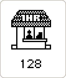
What particularly strikes me is that they’ve gone through great lengths to let anyone be able to determine what it is; the ‘1HR’ signage obviously indicates the ‘photo’ part in ‘Photoshop’ and the man with the teller is the ‘shop’ part. Very, very cool.
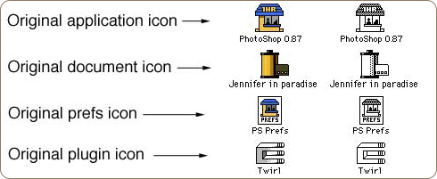
Edit: Addendum with the History of Photoshop, and color versions of these pre-Photoshop 1.0 icons. Be sure to check out John Knoll’s response in the comments down here.
I was talking with a friend about the definition of icons the other day, sparked by this blog post from Khoi Vinh. In this short post, Khoi shows his dissatisfaction with the way icon design has gone.
… the majority of commonly accepted and commercially functional icons in use today are visually literal — they represent objects or combinations of objects, even if they are intended to stand in for abstract concepts — and they’re almost exclusively dimensional.
By contrast, I like incredibly abstract and minimal graphical elements. For me, a simple, one-pixel straight line is practically a revival of the Rococo style. If I had my way, the only pictorial components of my design work would be the pictures: photographs or illustrations. Everything else would be simple and elementally native to the browser, or whatever other rendering mechanism I’m working with. Which is to say, you’d only ever see lines and boxes — and flat ones at that. No shading, please, and no three-dimensional modeling.
While this notion isn’t new, and the post isn’t new either, the ball really got rolling when I was overtalking it. I think everybody has a notion of what an icon is; a representation or pictogram to represent a certain feature or object of the software world. This could be an application, opening a new tab in your browser, or a folder on your hard drive.
In today’s world of the OS X Aqua and Vista aesthetic, this means giving icons a close-to-real-life (dimensional) appearance to conform to platform style. I can’t see how goblets of glossy liquid in the interface fit into this, but it’s clear the icons long since have headed to the photorealistic appearance we got accustomed to. However, this notion is countered the pictograms in the signage we all know from subways, airports, and other major public places, which Khoi advocates in his post. This offers the question of my blog post; “have we swerved too far from traditional pictograms to really define the (particularly, application) icons we use today as ‘icons’?”
Since my office walls are awfully empty, I decided to design one of my favorite Mac OS X icons by Apple at 2 by 2 meters. Although the Photoshop file got awfully big (the original is rendered, but I redid it in Photoshop), it works pretty well as a wallpaper. Making it took about a day and a half (I haven’t worked on it ‘full-time’, as I’ve got client work too) I’ll post new pictures in this post next Tuesday when I expect the print to be put up in the office.
For now, check out the wallpaper version preview at Flickr.