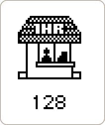
The first Photoshop icon.
February 23, 2008 on 7:13 pm | In Design, Graphics, Icon DesignWhile I was doing some research for one of my upcoming projects today, I found the very first Photoshop icon. It’s actually a tiny little photo shop! I love it, and if I have some free time I’ll see if I can recreate it in a more modern style.

What particularly strikes me is that they’ve gone through great lengths to let anyone be able to determine what it is; the ‘1HR’ signage obviously indicates the ‘photo’ part in ‘Photoshop’ and the man with the teller is the ’shop’ part. Very, very cool.
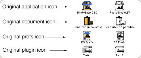
Edit: Addendum with the History of Photoshop, and color versions of these pre-Photoshop 1.0 icons. Be sure to check out John Knoll’s response in the comments down here.

65 Comments »
RSS feed for comments on this post.

Hey, what’s even stranger is when i saw you write the words “photo shop” with a space character there, it looked totally weird and even wrong.
Comment by Mischa McLachlan — February 23, 2008 #
I’m totally using this instead of the CS3 icon.
Comment by Adam — February 23, 2008 #
I don’t get the 1HR reference ?
Comment by Moitah — February 24, 2008 #
Oh wow. That’s quite an icon for an image editor… :P
Comment by Chris Thomson — February 24, 2008 #
Ah, but do you also have a line on the first Digital Darkroom icon?
Comment by Eric Meyer — February 24, 2008 #
Oh, that’s just fabulous :-)
Comment by Marie D. — February 24, 2008 #
Moitah: The “1HR” means “One hour”, as in a “One Hour Photoshop”
..I mean a “one hour photo shop”
Comment by dbr — February 24, 2008 #
The 1HR thing is indeed clever!
Comment by Manuel Martensen — February 25, 2008 #
Since there was some discussion whether this is genuine, I may refer you to the source: Wikipedia.
Comment by sebastiaan — February 25, 2008 #
That thing is practically cute. I wonder what you come up with.
Somehow it even reminds me of SimTower. Hmmm… good memories.
Comment by Sebas — February 25, 2008 #
I remember when those little booths were all the rage in the 70’s to mid 80’s. Remember when one of those was destroyed by the Libian VW Van in Back to the Future? You would often see these in Mall parking lots. I’m seeing a bit of a revival of these parking lot kiosks but in the form of coffee shops or cheap hamburger stands.
Comment by linkerjpatrick — February 25, 2008 #
wow, this was the first icon? it’s come a long way … i wonder how you’re going to update it. :D
Comment by NetOperator Wibby — February 25, 2008 #
WoW never thought photoshop icon can be that old LOL! I have seen that feather icon only. nice find!
1HR i think maybe the time which anyone would on an average take to edit photos on this software? just a silly guess :P
Comment by imagenest — February 25, 2008 #
“… the man with the teller”
You mean the man with the _till_. A “teller” is a person — “one that reckons or counts”:
http://www.merriam-webster.com/dictionary/teller
The man himself is the teller.
I think the item on the right might be a till.
I don’t see a man myself. I think the item on the left is meant to be a photographic enlarger. The rectangle at the top could be the enlarger head that slides up and down on the upright to change the size of the image. If that rectangle was a man’s head, then the lower bit of the vertical bar would have to be his neck and the upper (above the rectangle) his hat. So he’d have to be wearing a hat indoors, and a small one at that. Bet you it’s an enlarger.
Comment by Nick — February 25, 2008 #
In the old days, ET would phone you when your prints were ready.
Comment by sfenerule — February 25, 2008 #
The feather Icon itself is relatively new (introduced with CS1). Before that the PS icon had a theme of an eye looking through a photo filter (UV probably) or a lens aperture. The move to the feather was somewhat controversial at the time, more so even than the new Ps Icon.
Comment by Patrick Gunderson — February 25, 2008 #
@imagenest:
wow, you *are* young (or I guess I am old). When I was a teenager, 1 hour photobooths were pretty common (east coast USA) - PhotoMat was one of the chains. You would drop off a roll of film and come back in an hour to pick up your prints. Plus, for years, the photoshop icon was the eye looking through a filter - very cool, and it made a lot more sense than a feather (same sort of thing for Illustrator, too - but I digress).
http://www.storyphoto.com/multimedia/multimedia_photoshop.html
here is the set of the commercial release photoshop icons from 1.0 to the present (almost)
http://www.guidebookgallery.org/apps/photoshop
Comment by greg — February 25, 2008 #
Ah, yes - the days before anyone cared about internationalisation :)
Seriously, this is a terrible icon by any measure save nostalgia. Interesting as an historical artefact, yes, but come on - let’s save the adulation alone, shall we?
What amuses me most is that we’ve come full circle - the current PhotoShop icon is about as impenetrable as this one.
Comment by Jonathan — February 25, 2008 #
Remember the old joke about Cinderella hanging around the FotoMat singing
“Some day my prints will come…”
Comment by Tim — February 25, 2008 #
As cool as this is from a historical point of view, I’m a firm believer that the Photoshop 7 icon was the best icon Adobe produced for PS (I also think Illustrator 10’s was the best as well). When they moved from those it was like when Apple removed the colours from their logo.
Comment by Martin Pilkington — February 25, 2008 #
Please do make a modern version of this icon. I think it would be really bad-ass to have a classic.
The ultimate project would be coming up with similar style icons for the main apps like Illustrator, InDesign, Acrobat, and maybe the newly acquired Macromedia apps too.
I agree that this was not a well designed icon, but I still find it novel.
Comment by OwlBoy — February 25, 2008 #
I assure you that icon is genuine, it’s the same icon that was on the Photoshop 0.96b version that I got personally from John Knoll.
What is probably not so obvious is that back in the late 1980s, there were drive-up photo processor kiosks all over the Southern California, where John worked at the time. That’s what the icon is showing, it would have been a familiar sight, but now it’s almost completely forgotten.
Comment by Charles — February 25, 2008 #
Great piece of history right there. Thanks for sharing!
Comment by Hamish M — February 25, 2008 #
that is a rather culturally limited fucking icon
Comment by mark — February 25, 2008 #
In the first version of Photoshop, it probably DID take an hour for anything to happen…
Comment by Mister Snitch — February 25, 2008 #
I think this is the icon for a Photoshop prerelease (0.6). The icon for 1.0 was a bitmap version of the eye that we’re more familiar with - i.e. Photoshop versions thru to 6.0. The Photoshop document icon for 0.6 is of a roll of film. I sent them to the proprietor of this site.
Comment by David L — February 25, 2008 #
we should be like the first to know if you get the time to do the modern version …
thanks …
Comment by subcorpus — February 25, 2008 #
Yes this is not a great icon by today’s standards but really, look at it in context. I’m guessing the 128 is for the size its’ little rendering engine could handle on the OS it’s running on? I think it’s a really cool find; one that I’d never seen before, and I go *almost* all the way back (I remember what a major breakthrough it was when 3.0 came out). Anyone know if this is copyrighted material? I’d love to see it show up on busted t’s or threadless or woot t’s.
Comment by SteveT — February 25, 2008 #
It’s not a man, it’s a woman. i’m sure!
Comment by jean-paul — February 25, 2008 #
I made that icon. Sorry if you don’t like it. It is 20 years old now, so you might want to bear in mind the era it came from.
It was intended as a 1 hour photo booth, similar to a Fotomat booth, which were a very common sight in the late 80’s when we were first developing Photoshop. It’s meant to be a person manning the booth and a cash register inside the booth.
At that time, application icons were 32×32 pixels, 1 bit per pixel. The “128″ is the resource ID number. That image is a screen snapshot from ResEdit, the common resourse editor at the time.
Whether you like it or not, it’s much more representative of a “photo shop” that the eyeball icon that Adobe finally chose.
There were other icons that went with that. The re was a document icon that looked like a roll of film, and a plugin icon that looked like a “rectabular extrusion bracket”
-John
Comment by John Knoll — February 26, 2008 #
Martin, not only do I think Photoshop 7 and Illustrator 10 had the best icons, I think they were the best versions of those apps.
If I could buy PS7 + Ill10 for Mac OS 10.5 / Intel, I would, in a second.
(They work under Classic emulation, mostly, but it’s pretty slow, and several of the more common keyboard shortcuts don’t work, which is kind of a dealbreaker. Ill10 doesn’t even install on an Intel Mac, but you can copy the application folder from a PPC Mac and run it, if you have a PPC Mac around still. You have to be sure to disable auto-update, or else it’ll download an “upgrade” from adobe.com which kills the app.)
Comment by ken — February 26, 2008 #
One of the guys that works on Expression Web used to work at Adobe during the Photoshop 1.0 days. He mentioned that the product *almost* got called “photo hut”. This icon is further proof of that, I think. :)
Comment by Jonathan Snook — February 26, 2008 #
http://en.wikipedia.org/wiki/Image:PS_%C3%9F_icons.png
Comment by Wiki Peida — February 26, 2008 #
obviously “shopped”
Comment by Brian — February 26, 2008 #
@SteveT: Surely the 128 is the icon resource number in the Photoshop application? Traditionally that was where the main icon resource was stored in the resource fork.
//Way too many hours wasted in ResEdit…
Comment by Tim Jarrett — February 26, 2008 #
i don’t understand why it’s culturally limited? were there not 1-hr photo booths outside the US? did photos take longer than an hour to develop in other countries? is “hour” abbreviated differently in other english speaking countries, or is it because it’s english? can somebody explain please??
Comment by bob — February 26, 2008 #
Wow that’s really neat lol great find
Comment by Rekzai — February 26, 2008 #
Delightful!
I miss the old days (read: early 90’s, late 80’s) of computing
What a wonderful time
Comment by Jesse the Space Cowboy — February 26, 2008 #
LOL Photoshop 1989
Comment by phpAdNetwork — February 26, 2008 #
I guess the modern day version of this icon would be a boarded up 1 hour photo shop.
Comment by Bob Holness — February 26, 2008 #
This icon looks classier when come to the new ones. Simple and elegant. Old is gold.
Comment by Venkataramanan S — February 26, 2008 #
It beats the CS3 ones.
Comment by kristoff — February 26, 2008 #
I agree with kristoff. At least they tried harder than just a square with a letter in it.
Comment by devolute — February 26, 2008 #
amazing to me how many people on this comments page don’t seem to be reading any of the posts. I pointed (not patting myself on the back, but just saying…) to a page that shows all the PS icons from 1.0 to CS2 and several (including myself) have pointed out that photobooths like that were common at the time. Also, the guy who made it and was part of the pair that made photoshop chimed in with what has to be thought of as the definitive word.
BTW, John Knoll, very cool to have you add to the comments.
Sheesh, kids these day…
;-)
Comment by greg — February 26, 2008 #
I remember coming across this early version of PS when I was temping with MacTemps in the late 80’s in San Francisco and Silicon Valley. I probably still have it on some floppy in a box in my attic. Those were the wild west days of digital design; buy a used MacPlus, spend some time temp-ing and playing around in the evenings and in no time, you could become an ‘expert’. Happy days.
Comment by Strandoo — February 26, 2008 #
“What amuses me most is that we’ve come full circle - the current PhotoShop icon is about as impenetrable as this one.”
how is the original icon impenetrable? its as literal as an icon can get. its actually a photo shop.
some people are really stupid.
Comment by ron — February 26, 2008 #
This is a great icon series and (at the time) was a top notch idea. Heck, 20 years later, it still holds its own. If you don’t know what a 1 hour photo booth is, you’re just too darn young to be in this conversation. ;)
Comment by Lonnie — February 26, 2008 #
For all you youngsters reading this and thinking “that icon is lame!” Let’s see YOU try and communicate the idea of a “photo shop” in a 32 x 32 pixel, 1-bit icon. It isn’t easy. You get 1024 pixels, now decide which ones are black and which ones are white. Sounds easy, doesn’t it. Go ahead and try it…
I remember designing 1-bit icons for applications, but I had the luxury of 64 x 64 and 88 x 88 resolutions, and it still wasn’t easy. This is truly a lost art.
Well done John Knoll…!
Comment by pmsg — February 26, 2008 #
@John Knoll:
I think the icon is *brilliant*!
(I have my copy of BMUG’s “Zen and the Art of Resource Editing” right here…)
It was so difficult to convey an image in 32×32x1bit. Not only does this icon do that, it tells a story. Very nice.
Comment by Boyd Waters — February 26, 2008 #
@ken
“If I could buy PS7 + Ill10 for Mac OS 10.5 / Intel, I would, in a second.
(They work under Classic emulation, mostly, but it’s pretty slow, and several of the more common keyboard shortcuts don’t work, which is kind of a dealbreaker. Ill10 doesn’t even install on an Intel Mac, but you can copy the application folder from a PPC Mac and run it, if you have a PPC Mac around still. You have to be sure to disable auto-update, or else it’ll download an “upgrade” from adobe.com which kills the app.)”
No, they don’t need classic emulation - PS 7 and IL 10 were the 1st OS X native version of those apps. They were REAL Carbon apps, in that they worked on BOTH OS X and Classic - back in those days we would often reboot in the other OS.
I have both working just fine on my 2008 Mac Pro running 10.5.2
As per the issues with the auto updater, yeah, that is a pain in the ass….
Comment by Eytan — February 26, 2008 #
Oh, just to clarify, I migrated them over 1st from my PowerBook G4 to my MacBook Pro using the migration assistant, and then from my MacBook Pro to my Mac Pro using migration assistant migrate from Time Machine drive… So I have not tried to install either on the machine - but they are clearly NOT classic apps but rather Carbon apps, which is I think what you were trying to say :)
Comment by Eytan — February 26, 2008 #
You dinks that don’t know what 1-hr photo shops were are obviously way to young to be taken seriously. Come back when you’re grown.
Comment by David Mills — February 27, 2008 #
Hi.
At the time the original PS icon was designed, there were not only technical limitations on icon design to contend with.
We may look back at a 32×32 black and white icon and think “I could have done better given the same restrictions”, but there are other things you need to think about.
We’re all looking back after nearly twenty years of evolution in icon design. Over the last two decades there have been a lot of conventions established about how icons should look (applications should look like applications, documents should look like documents, etc). There have also been a lot of advances in methods of representing ideas in the form of icons, all of which we now take for granted.
Give the old PS icon a break. It does its job, and compared to other application icons of its time, it does it very well.
Comment by Russ — February 27, 2008 #
Well, I gave it a shot.
http://www.lazymoon.org/upload/one_hour_photo.png
Comment by Lachlan — February 27, 2008 #
Any chance of compiling some sort of evolutionary chart of the Photoshop icon?
Comment by Tom — February 27, 2008 #
@Tom:
Dude, you really need to READ the comments instead of just spouting gibberish - greg links to it in his comment: http://www.guidebookgallery.org/apps/photoshop
Comment by Dan — February 28, 2008 #
Lachlan - I gotta say - first thing I though when I saw that was “cool”… I even uttered the word under my breath!
Why does everybody hate on the new logo? I love it - love the minimalism - love seeing it on my dock - love how the Adobe product icons all work together visually.
But hey, I liked the CS1 icons, and I liked the PS 7 icon - but things get old - and you have to move forward - a couple of years time people will say the current icon looks ancient - and when they produce a new one there will probably be people bemoaning the change - saying this was the best ever icon, bring it back.
Comment by Ger — February 29, 2008 #
Brett Wickens designed the Adobe CS & CS2 boxes/icons. For a great interview on the BeADesigncast about them, go to http://www.beadesigngroup.com/blog/archives/2008/01/be_a_design_cast_49_brett_wick.php
He discusses some of the methodology behind the CS & CS2 designs — very interesting!!
Comment by andy///respire — March 1, 2008 #
Yes, these are real.
It is kind of funny that Adobe Photoshop help kill off the drive-through photo shop that inspired its first icon.
I still really like the original plug-in icon, BTW.
Comment by Thomas Knoll — March 2, 2008 #
« I still really like the original plug-in icon, BTW. »
Is that an E for Escher?
Comment by Mark Thomas — March 2, 2008 #
> It is kind of funny that Adobe Photoshop help kill
> off the drive-through photo shop that inspired its
> first icon.
How did Adobe help kill them off? Adobe didn’t run competing stores and they didn’t invent the instant/digital cameras.
I still see 1hr photo places all the time, just not as booths, Wal-Mart, Walgreens, Ritz, etc…
Comment by Rashime — March 2, 2008 #
I thought the 1hr reffered to the time it took to apply any filters with the slow computer we had back then!
Comment by Craig — March 4, 2008 #
Ah, memories. I still think the plug-ins icon is one of the most brilliant software icons I’ve ever used.
And as for folks getting negative on these icons: remember, there’s nothing more boring than an icon snob. Well, except for a font snob.
Comment by Daniel Sroka — March 4, 2008 #
I think the cs3 icon is brilliant. Ps - so functional when it comes to tutorials and such on the web.
Comment by Henrik — March 5, 2008 #
“i don’t understand why it’s culturally limited? were there not 1-hr photo booths outside the US? did photos take longer than an hour to develop in other countries? is “hour” abbreviated differently in other english speaking countries, or is it because it’s english? ”
Yes you moron, “hour” is an English word and there are other languages. Amazing, isn’t it?
Comment by Sebhelyesfarku — April 14, 2008 #