


I was talking with a friend about the definition of icons the other day, sparked by this blog post from Khoi Vinh. In this short post, Khoi shows his dissatisfaction with the way icon design has gone.
… the majority of commonly accepted and commercially functional icons in use today are visually literal — they represent objects or combinations of objects, even if they are intended to stand in for abstract concepts — and they’re almost exclusively dimensional.
By contrast, I like incredibly abstract and minimal graphical elements. For me, a simple, one-pixel straight line is practically a revival of the Rococo style. If I had my way, the only pictorial components of my design work would be the pictures: photographs or illustrations. Everything else would be simple and elementally native to the browser, or whatever other rendering mechanism I’m working with. Which is to say, you’d only ever see lines and boxes — and flat ones at that. No shading, please, and no three-dimensional modeling.
While this notion isn’t new, and the post isn’t new either, the ball really got rolling when I was overtalking it. I think everybody has a notion of what an icon is; a representation or pictogram to represent a certain feature or object of the software world. This could be an application, opening a new tab in your browser, or a folder on your hard drive.
In today’s world of the OS X Aqua and Vista aesthetic, this means giving icons a close-to-real-life (dimensional) appearance to conform to platform style. I can’t see how goblets of glossy liquid in the interface fit into this, but it’s clear the icons long since have headed to the photorealistic appearance we got accustomed to. However, this notion is countered the pictograms in the signage we all know from subways, airports, and other major public places, which Khoi advocates in his post. This offers the question of my blog post; “have we swerved too far from traditional pictograms to really define the (particularly, application) icons we use today as ‘icons’?”
It’s a hard nut to crack. In the last years, we’ve seen quite some experimentation in icons. I think the most major ‘leap’ (if that’s the right word to use) in icon design we have seen in a while is Adobe’s ‘Wheel o’ Icons’ – something that was intensely discussed last year. In my definition of icons, Adobe’s already stepped out of line when they started putting text on the CS3 icons. Once you put a prominent textual label on something, it’s obvious that it is just that; a labeled graphic. Apple certainly doesn’t write ‘file browser’ all over the Finder icon, just like the quite textual Internet Explorer icon doesn’t bear any signage indicating it’s a browser. What if you’d swap all your icons for text, like in this dock? Are these icons? Do they become icons when you reduce them to a few letters and add a colored square? Technically, yes, they are, but in my opinion, it’s beyond the purpose of making an icon.
Then there is the functionality remark. The text and colors allow for quick identification and distinction. I admit, it’s functional to people who spent about $5000,- on Adobe software; you get this nice line of colored squares in your Dock (or on your desktop, in the case of Windows). It’s also less confusing than the previous system of nondescript flowers and butterflies in three colors. Photoshop aside, to the uninitiated, however, InDesign may sound like something that has to do with interior design, and ‘Ai’ may not communicate ‘Adobe Illustrator’ as well as ‘Ps’ communicates ‘Photoshop’. The icons are as nondescript, or perhaps even more than the previous. If you were to think up a consistent set of metaphors, I think it would be possible for the ‘uninitiated’ to guess what the application does, while maintaining a distinct set of identifyable, colored icons.
This is where the issue of simple pictograms and symbols comes into play; it tends to be very hard to express complex messages with them. Although the person I discussed this with previously remarked that some icons in OS X almost seem like a glorified rebus of three-dimensionally rendered objects, pictograms tend to have the same problem when they have to represent something that you can’t describe with a few words. When it comes to the photorealistic icons we have grown so accustomed to, it’s up to the designer to make a coherent metaphor with one or more objects. Pictograms are generally straight depictions; stylistic representations of real-life objects, where using the object as a metaphor is more or less an exception.

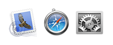
In the icons of OS X, for example, the metaphor of a mail stamp is used for the Mail application, the metaphor of a compass is used for the browser, and a metaphorical set of gears represent the System Preferences utility. Putting these three next to each other, I can see that they share a coherent style, and remain identifyable (due to the very down-to-Earth metaphors used) without having to resort to using different colors or textual labels.
Looking at these two ‘categories’ of modern day icons, it’s clear the CS3 ‘icons’ don’t fit in our current definition of icons. The best way to put a name on them would be to say that they’re interface widgets; basically, glorified buttons using the real estate of an icon. With falling out of these ‘standards’, the icons show help us gauge what you can call an icon. Although nobody apparently bothers to make an official definition. Here’s what Apple’s Human Interface Guidelines say about the matter;
Aqua offers a photo-illustrative icon style—it approaches the realism of photography but uses the features of illustrations to convey a lot of information in a small space. Icons can be represented in 512 x 512 pixels to allow ample room for detail. Anti-aliasing makes curves and nonrectilinear lines possible. Alpha channels and translucency allow for complex shading and dimensionality. All of these qualities allow you to create lush, vibrant icons that capture the user’s attention.
To represent your application in Mac OS X, it’s essential to create high-quality application icons that scale well in the various places the icon appears—the Dock, Finder and Quick Look previews, alert dialogs, and so on.
Hrmpf. This doesn’t help us define an icon. Wikipedia perhaps?
Icon (computing), a pictogram, used in graphical user interfaces, to represent a program, file, user, or other computing function, upon which one may click, with one’s mouse, for example (Wikipedia).
Before I go off quoting what a pictogram is, I can say that a pictogram is a picture that resembles what it signifies. Basically, the hieroglyphs of the ancient Egypt are pictograms (take into mind a stylized set of wave-like shapes representing water). Pictograms are the counterpart of letters, which goes to show once again why it’s such a bad idea to make icons such as Adobe’s for the CS3 suite.
If this shows anything, it’s that the icons we know, use, and see daily aren’t yet contained in guidelines or definitions. Khoi’s argument that pictograms would create a more abstract, but clearly defined field for designers to work in, is certainly a fact. However, as I have tried to point out, pictograms won’t suffice for the icons we need today. Icons no longer signify real-world objects, but abstract software paradigms, and thus have to use complex metaphors, colors, and dimensionality to translate these concepts into something a bit more appropriate for the human’s mental model – just like our modern, dimensional, and realistic interface helps us logically work with instances of applications on our computer screen. His view of a world of icons consisting of lines and boxes is not just impractical; it’s impossible.
I think Apple has created a clear definition for icons when they internally developed the icons for OS X; it’s a pity it’s never seen the daylight. If we push for a clear definition, we may avoid design horrors like the CS3 icons in the future. But who am I to say?
Nice piece Sebastiaan. I agree with you that Khoi’s dream of a 100% pictogram world is both impractical and actually unwanted. The answer for this is more simple that you or he realize… the client.
Clients don’t generally want their product’s icons to be represented by abstract lines, shapes and symbols 90% of the time. For better or worse, thanks to the likes of Microsoft and Apple, they want shiny, realistic, highly literal images of every day objects. As icon designers, we can sometimes steer them in other directions, but as they say in the food industry “the customer is always right”.
But this isn’t necessarily a bad thing either. Sometimes a happy medium can be reached I think. Take on of my favorite icons we’ve done to date: Coda. The Coda icon is in fact a real-world object, that of a leaf. But that object bears no actual relation to the software functions of the program it represents. It is meant as a symbol of growth and creation of the underlying functions of Coda and I think it works well for exactly that reason. Also, it is visually simple and almost serves as one of Khoi’s pictograms he speaks of. In my mind it is the essence of what an icon should be. A simple picture that represents something much more complex that the user can quickly and easily associate by sight.
Sitting in the OS X dock, once you know what it is, Coda is one of the most easily recognizable and quickly spotted icons anywhere. It’s color, shape and rendering all contribute to this, and I give Panic heaps of credit for letting us go in this direction when we designed it. If all clients were as open to ideas as they were, computer desktops would be a much better place.
Great post and comment guys! In my opinion today’s application icons serve both identification and branding purposes, whereas the classic pictogram (like Mijksenaar’s for Schiphol Airport shown above) excludes the branding function.
I’ve been thinking about this whilst reading, i am yet to read Khoi’s piece, but to me an icon or logo should serve a different purpose to a pictogram.
Pictograms convey information quickly, visually, and multi-linguistically. Take the airport signs above, they show a plane landing and taking off.
However and icon or logo is a piece of branding which should invoke the feel of something, along with it’s function or heritage. Just looking at my dock i still get confused whether i need a feather (photoshop), butterfly (in-design) or flower (illustrator)…as a student i cannot afford the hardware needed for CS3 but i know them well and they do look quite nice all lined up but still something a little more imaginative would have been nice.
thanks for such and interesting article, i’ll bookmark this blog for future referenece