![]()
Feast your eyes on some icons yet to come. I’m almost literally breaking my teeth on adding details and perfecting a new icon aesthetic. More updates on several interesting February developments soon (before the end of the month).
![]()
Feast your eyes on some icons yet to come. I’m almost literally breaking my teeth on adding details and perfecting a new icon aesthetic. More updates on several interesting February developments soon (before the end of the month).
I got some astonishing material in my hands today. It’s Apple’s material, and it is quite old – but I can assure you that the images are no less revealing and eye-opening. What I can’t figure out, for the life of me, is why Apple did not include this in the latest incarnation of their Human Interface Guidelines, as it is probably the best insight into the design of Aqua icons ever. Get a glimpse of the inception of Aqua inside.
I was contacted by Acqualia – the creators of the Apple Design Award-winning application Picturesque – to design a new icon. Picturesque, an application I already use on my blog, is stunningly simple in its purpose and product; it beautifies images, but not in the typical Core Image-filter like fashion you see most of the time. The true power is the simplicity; there’s no ugly distorting filters to get in your way, but a few tools catered to your needs which provide instant satisfaction.
Read on for the inside process in this ‘Making the Icon’ post.
As the holidays are approaching, I have decided that I am better off spending a few days not working in the year and taking the time to perfect my icons and the details in them. I will be blogging a bit less, and I probably won’t release much, if anything in the rest of 2007. But January 2008 will certainly be the date of the extended Orion iconset, and another set that I am working on in my spare time. I decided to show that off to whet your appetite for the holidays and the new year. Work in progress!

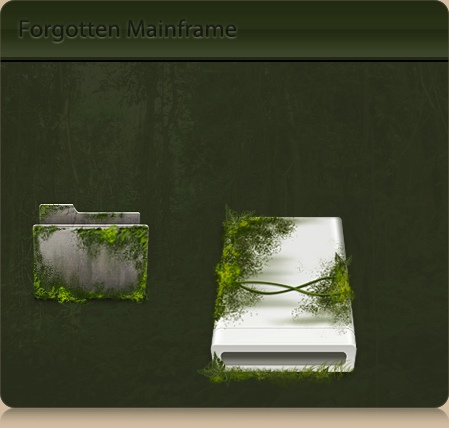
Apart from a good system-replacement set, I will release a set of icons in a theme of my first portfolio website; the ‘forgotten mainframe’; overgrown electronics from damp rainforests on alien worlds. I don’t want to make the same mistake as I did with Orion, so sound off in the comments if there is any motivation for this to be a system set instead of just a small icon set.
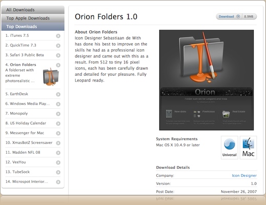
My, what a few insane days it has been. Orion hit the Apple website, while also being linked from other major sites like the Iconfactory. At the moment of writing, Orion just exceeded a grand total of 300 GB in downloads, with well over 150,000 new visitors on my websites. Actually, it’s the fourth most downloaded thing on Apple.com, just under iTunes, Quicktime, and Safari.

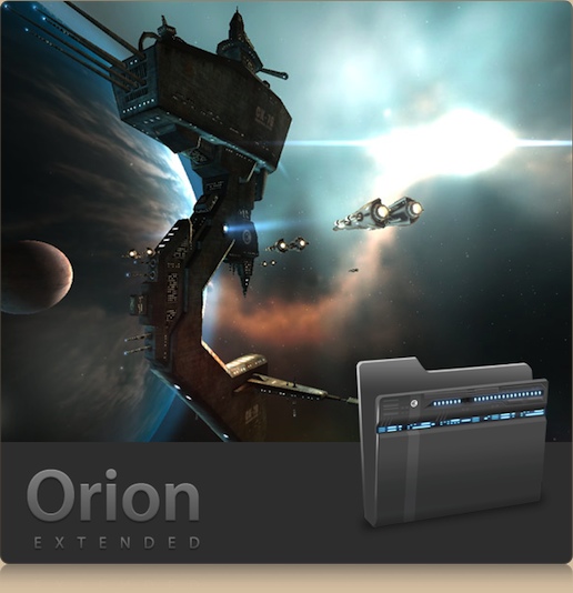
I got a lot of email asking how to use the icons, and I gladly replied; Kupuk’s great tutorial of the ‘good ol’ manual way’, and Panic’s awesome Candybar 3. Of course, your downloads are flattening and the kind emails and comments have been very encouraging. Work on the extended set of Orion, with all system replacements for Mac, Windows, and Linux, along with several creative new folder motifs, has commenced already. I will push out a new volume with a complete system replacement icons, and a dock for OS X, late in December or in January. What’s that? A sneak peek? Okay, one of the ‘fantasy’ microsets in the extended Orion is… a ‘sci-fi’ themed, highly detailed EVE Online architecture set.

Permission from CCP Games pending.
What is most important in all of this, is your feedback. You want more folders? What kind of folders? Your vote counts! As the cumulative comments of this blog are reaching 500 fast, there is chance that your comment will be the 500th – which means prizes, baby!
Drop your requests in this post’s comments and have a fair chance of winning a full license for Noble, my stock icon set, and a single folder icon request for the upcoming extended Orion iconset that will be fulfilled – guaranteed!. Of course, comments on all posts are eligible – be sure to use your actual email address.
From the same source as the stack drawers, I found that a new little application had been released that turns Leopard into the premiere point release of OS X when it comes to desktop customization. Susumu Yoshida, a talented icon designer, released his very elaborate set of brightly colored and nicely textured stack drawers, which I tested during the last week and thoroughly enjoyed. See this desktop screenshot;
I found that a software company, CocoaMug, has put together a tool to customize every aspect of your dock. It’s called Palette, and costs a mere $6.90 for a full license. It doesn’t just allow you to choose a color for the background of your 3D dock, but it also allows you to set these beautiful ‘drawer’ icons for individual stacks – making using stack drawers as simple as drag and drop. Click here for an impressive video demo on Susumu’s blog. Thanks for sharing, Susumu!