13 Feb
   Filed Under: Design, News   

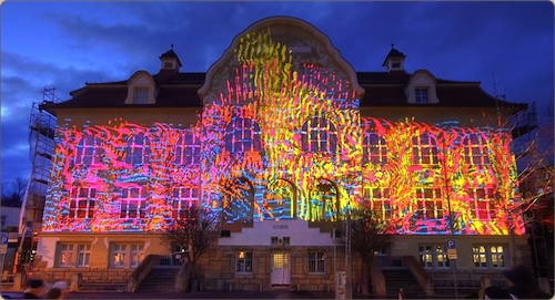
What may sound like the title of a horror movie directed by Ed Wood is really a fantastic application of motion design disciplines to create public installation art. An absolutely engrossing, almost hypnotic installation.

installation.jpg

Check out some video’s here, stills don’t do it justice.

12 Feb
   Filed Under: Apple, Design, Interface Design, News   

aperturelcd.jpg

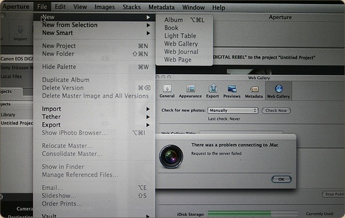
Following up on my previous post showing a few design novelties in OS X 10.5.2, here are some quick observations on novelties in Aperture 2.0, which Apple released just today, on flickr. The Apple Pro Apps design team has gone far on customizing the look and feel – you’ll barely recognize the Aqua interface!

12 Feb
   Filed Under: Apple, Design, News   

After playing around a bit in the newest version of Mac OS X Leopard, I was delighted to hear that there were several nice improvements to icons and interface elements. Here’s what I’ve found and seen so far;

timemachine.jpg

– Time Machine menu bar icon; when backing up, shows a beautiful animated clock with hands turning backwards, or when unable to back up, presents a tiny caution sign. Very nicely designed, clean, clear, and a great way to keep tabs on Time Machine’s activity.

5t2h.png

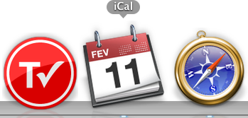
– iCal icon now localized; whereas the iCal icon got a new feature in 10.5, namely, dynamically showing the correct date on the icon, in 10.5.2, the three letter initials for the month in the top-left corner of the icon is also changed according to your locale. Via Fernando Lins.

sharepoint.jpg

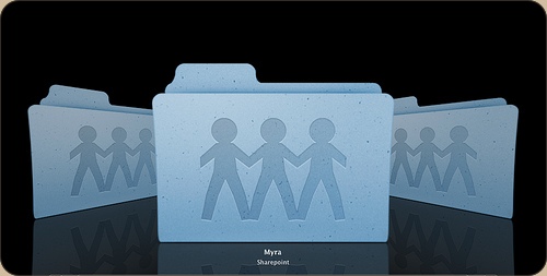
Sharepoint icon debacle; And then there’s the uglyness. The Share Point icon, first a folder with a globe overlaid, has been changed to a rather cheesy lineup of weird child-human-like shapes.

Apart from that, I’m glad that we now have an option to turn the menubar non-transparent (although I like transparency and would like to see that design concept mature like it did on the iPhone, i.e. a contextual menubar) and that drop-down menu’s are now slightly more opaque. Overall, this update brings some very nice new designs and details to grace your Mac interface.

09 Feb
   Filed Under: Apple, Design, Icon Design   

I was talking with a friend about the definition of icons the other day, sparked by this blog post from Khoi Vinh. In this short post, Khoi shows his dissatisfaction with the way icon design has gone.

… the majority of commonly accepted and commercially functional icons in use today are visually literal — they represent objects or combinations of objects, even if they are intended to stand in for abstract concepts — and they’re almost exclusively dimensional.

By contrast, I like incredibly abstract and minimal graphical elements. For me, a simple, one-pixel straight line is practically a revival of the Rococo style. If I had my way, the only pictorial components of my design work would be the pictures: photographs or illustrations. Everything else would be simple and elementally native to the browser, or whatever other rendering mechanism I’m working with. Which is to say, you’d only ever see lines and boxes — and flat ones at that. No shading, please, and no three-dimensional modeling.

While this notion isn’t new, and the post isn’t new either, the ball really got rolling when I was overtalking it. I think everybody has a notion of what an icon is; a representation or pictogram to represent a certain feature or object of the software world. This could be an application, opening a new tab in your browser, or a folder on your hard drive.

In today’s world of the OS X Aqua and Vista aesthetic, this means giving icons a close-to-real-life (dimensional) appearance to conform to platform style. I can’t see how goblets of glossy liquid in the interface fit into this, but it’s clear the icons long since have headed to the photorealistic appearance we got accustomed to. However, this notion is countered the pictograms in the signage we all know from subways, airports, and other major public places, which Khoi advocates in his post. This offers the question of my blog post; “have we swerved too far from traditional pictograms to really define the (particularly, application) icons we use today as ‘icons’?


Continue reading…

09 Feb
   Filed Under: Apple, Design, Icon Design, Personal Work   

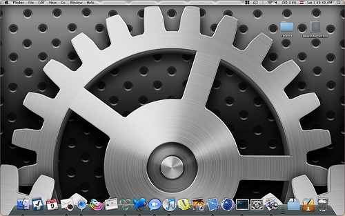
Since my office walls are awfully empty, I decided to design one of my favorite Mac OS X icons by Apple at 2 by 2 meters. Although the Photoshop file got awfully big (the original is rendered, but I redid it in Photoshop), it works pretty well as a wallpaper. Making it took about a day and a half (I haven’t worked on it ‘full-time’, as I’ve got client work too) I’ll post new pictures in this post next Tuesday when I expect the print to be put up in the office.

image.jpg

For now, check out the wallpaper version preview at Flickr.

27 Jan
   Filed Under: Announcement, Design, Personal Work   

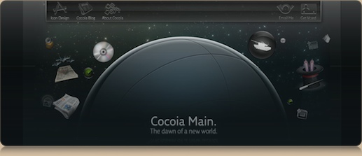
Well, the old Cocoia.com has been retired forever. For the sake of history, here’s the old website design, which I did in the third quarter of 2007;

oldcocoiacom.jpg

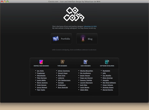
In its place will be this teaser page, until the new, dynamic combination of Icon Designer and Cocoia will be opened. I will assure you, it will finally be a logical place where you can easily find a lot of downloads and resources to download. The release be accompanied by the release of my Forgotten Mainframe and Orion Extended set – and oh, some extra’s.

Check out the new design and my favorite internet places on Cocoia.com – and I’ll see you all when the new site goes live!

newcocoiacom.jpg