12 Feb Aperture 2.0; custom everything.

aperturelcd.jpg

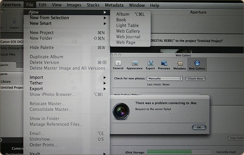
Following up on my previous post showing a few design novelties in OS X 10.5.2, here are some quick observations on novelties in Aperture 2.0, which Apple released just today, on flickr. The Apple Pro Apps design team has gone far on customizing the look and feel – you’ll barely recognize the Aqua interface!

Unrelated posts:

    Bricky Shirt

    By no means a replacement of the Cocoia Exploded Settings tee, but I wanted to wear this and I was told others enjoyed it as well. Represent the...

    the Cocoia WWDC shirt

    It's often said that there is great value in having a distinct shirt at WWDC, and while I'm not very preoccupied with that notion myself, I do...

    The first Photoshop icon.

    While I was doing some research for one of my upcoming projects today, I found the very first Photoshop icon. It's actually a tiny little photo...

    Snow Leopard UI roundup

    It's that time again: A new big cat is upon us, and while it hasn't brought about the rumored ‘Marble’ aesthetic, there's been a lot of...

You can follow any responses to this entry through the RSS 2.0 feed. You can skip to the end and leave a response. Pinging is currently not allowed.

3 Responses

  1. Aperture 2 looks nice!

    I love that you left the “There was a problem” prompt in the picture. ;)

  2. Well, Chris, I also had to demonstrate they customized modal alert dialogs ;)

  3. The buttons are aqua-metallic?

Trackbacks

Leave a Reply