


After playing around a bit in the newest version of Mac OS X Leopard, I was delighted to hear that there were several nice improvements to icons and interface elements. Here’s what I’ve found and seen so far;

– Time Machine menu bar icon; when backing up, shows a beautiful animated clock with hands turning backwards, or when unable to back up, presents a tiny caution sign. Very nicely designed, clean, clear, and a great way to keep tabs on Time Machine’s activity.
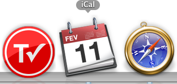
– iCal icon now localized; whereas the iCal icon got a new feature in 10.5, namely, dynamically showing the correct date on the icon, in 10.5.2, the three letter initials for the month in the top-left corner of the icon is also changed according to your locale. Via Fernando Lins.
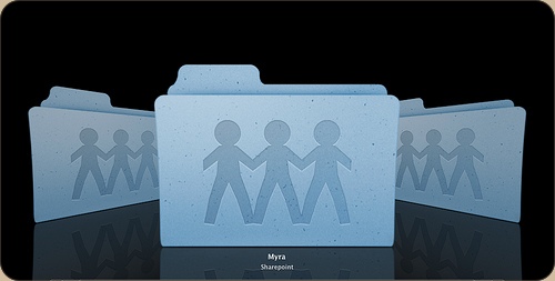
– Sharepoint icon debacle; And then there’s the uglyness. The Share Point icon, first a folder with a globe overlaid, has been changed to a rather cheesy lineup of weird child-human-like shapes.
Apart from that, I’m glad that we now have an option to turn the menubar non-transparent (although I like transparency and would like to see that design concept mature like it did on the iPhone, i.e. a contextual menubar) and that drop-down menu’s are now slightly more opaque. Overall, this update brings some very nice new designs and details to grace your Mac interface.
That Sharepoint icon has to be one of Apple’s greatest downs so far.. loving the TimeMachine menubar though:) Great stuff :)
its funny because I just saw the new time machine icon in action and its a great little feature!
The shareppint folder design speaks again to the uglinesss of all of the system folders in leopard. Personally I’m in the camp of peoplewhp think that the folder shapes should make their purpose clear.
Thanks for this post!
Localized month abbreviation has been there already with 10.5, or at least with .1, as I didn’t updated yet am seeing LUT for Polish word for February, luty.
I really thought they would have ‘fixed’ the stupid ‘Generic blue screen PC’ icon that shows up for SMB shares. Unfortunately they haven’t. Even though the ‘pc’ in question is *not* a Windows PC but a server running Linux with Samba (Windows filesharing protocol).
I like the sharepoint icons. some kind of little people sharing with hands
nice and bold.