09 Jun
   Filed Under: Apple, Design, Goodies, Icon Design, Personal Work   

I’ve updated the iPhone / iPad icon PSD I released not too long ago with some fixes and a 114×114 pixel icon template for designing icons for Apple’s hottest new device.

Download it here. I cannot be held responsible for inaccuracies, flaws and errors in this this PSD I might have overlooked, but if you notice anything please let me know in the comments.

Again, if you appreciate it, tweet this to help your fellow designers and developers make nicer icons for iPhone 4 (and beyond).

16 Mar
   Filed Under: Commercial Work, Design, Icon Design, News   

Interarchy is a Mac app that’s almost as old as I am: it was first created in 1993 as one of the first FTP clients for the Mac, and in 2007 it was sold to its current owner and long-time developer of Interarchy, Matthew Drayton of Nolobe. Matthew contacted me with a request for new icons for the big upcoming version 10. This was no small release, so it had to be worth it.

Like several other FTP clients, Interarchy has always been known and discerned by its icon. By now, it’s a powerful brand. Matthew also expressed his desire to maintain the filing cabinet metaphor in the application icon, and I agreed. Changing the icon now would mean neglecting its long history and evolution.

Continue reading…

13 Mar
   Filed Under: Commercial Work, Design, Icon Design, iPhone   

A while ago Buck Wilson, the designer in a small team of Portland-bound guys, contacted me about icon design for Here, File File!, an iPhone app that lets you connect back to your Mac from anywhere and read, view, and stream your files. As opposed to the popular Dropbox and iDisk apps, it allows full access to all the files on your Mac, instead of just a few hand-picked ones.

I happily started working for them to make a kick-ass icon. There was an additional challenge as multiple icons were required: a Mac icon, a menubar icon, and an iPhone icon, which required a metaphorical connection between all of them. Buck mentioned they had an idea for using a doghouse for the Mac app and a dog with files on the iPhone, but I recommended against using animal motifs. Not only do we have the classic divide between ‘dog people’ and ‘cat people’ to worry about; animal motifs are just not very suitable in iPhone icons.

Continue reading…

01 Feb
   Filed Under: Goodies, Icon Design, iPad, iPhone   

Update: Get the updated version.

As there’s a tendency lately to release lots of (often less-than-pixel-accurate) PSD templates of iPad UI elements, I’ve decided to work with my good friend, Sean Patrick O‘Brien to create a PSD based off the exact overlays, outlines, and masks the iPhone and iPad OS use to mask icons.

This lets you preview the pre-supplied gloss, or modify it. It’s made up entirely of shape layers and layer effects and should be completely pixel-accurate. If you use it, credit is welcome — it’s not required, though.

I’d appreciate it if you let others know about the PSD if you grab it. Tweet this or blog it. Thank you!

iPhone Resource will obviously have templates like this with actual sample icons (and some recreated Apple icons) once it’s out. Consider this a small goodie until iPhone Resource and Composition is out (yes, the latter is in development, but it’ll take much longer than expected).

28 Jan
   Filed Under: Apple, Icon Design, Interface Design, iPad, News   

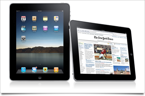
Unless you’ve been living under in a multitude of nuclear holocaust-proofed rocks, you’ve heard all about Apple’s new tablet, the iPad.

As usual with a large Apple product launch, I’ve written up this post to round up the good, the bad, and the ugly of all the new interface and interaction designs that were set loose on the world by the company that’s regarded as the most influential and skilled when it comes to designing experiences. The usual disclaimer applies: iPad hasn’t hit the market yet, and thus its UI may still be subject to change or improvement.

Continue reading…

19 Jan
   Filed Under: Icon Design, News   

Armin Vit posted about the now-in-beta Office 2010 on Brand New, a blog about branding. Naturally, they showed off the new(-ish) Office 2010 branding, and, unsurprisingly, the application icons of Microsoft’s latest version of Office.

office

I wanted to share a few of my observations on the new icons and the history of Microsoft Office and its icons.

Continue reading…