Unless you’ve been living under in a multitude of nuclear holocaust-proofed rocks, you’ve heard all about Apple’s new tablet, the iPad.
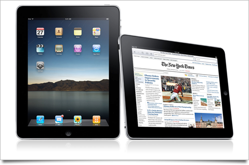
As usual with a large Apple product launch, I’ve written up this post to round up the good, the bad, and the ugly of all the new interface and interaction designs that were set loose on the world by the company that’s regarded as the most influential and skilled when it comes to designing experiences. The usual disclaimer applies: iPad hasn’t hit the market yet, and thus its UI may still be subject to change or improvement.

Man, where do I begin. iPad’s made a huge step from the small and cramped iPhone screen to a crisp 1024 by 768 pixel screen, and instead of going down the road of iPhone’s (or Mac OS X’s) rather sterile and conventional interface designs, uses very ‘earthy’ metaphors that behave like their real-life counterparts. This allows for most, if not all of the conveniences modern interfaces we know from our desktop computers while retaining ease of use.
Let’s start with the home screen, then, and thus, its icons. Ah, icons. The traditional iPhone icons have taken a small step up on the iPad homescreen, to 72×72 pixels. This wasn’t public, but you can calculate this from press images. For Spotlight, the search interface, and the Settings application the icons are scaled down to 48 pixels. The same shape, gloss, shadow and lighting is used for the icons on iPad. This does help a consistently looking platform, but I’m not out on the extra spacing of icons on the home screen yet. They all look so lonely in there.
![]()
What you’ve heard here first, though, is that iPad’s OS also houses as-of-yet unused 64 and 320 pixel document icons, which makes me eager to see how the ‘filesystem UI problem’ will be solved by Apple. Obviously, iPhone OS was a great way to re-imagine computer interaction from scratch, and the whole hierarchical filesystem that confused and confounded users for so long was left out in the cold. The new and simple method was to use automatic saving and persistent data – but with iWork on the iPad as a serious content creation platform, this isn’t an option anymore. I’d love to hear people’s speculations and ideas on how Apple could solve this.
Globally, when compared to iPhone, the biggest obvious change is the relocation of toolbar buttons and controls. For iPhone, crucial controls and toolbars are placed at the bottom, where they’re the easiest to reach with your fingers when held in one hand. The iPad disregards this somewhat, and uses the desktop toolbar model. iPad’s Safari, for instance, has all its features accessible through toolbar buttons in the top toolbar:
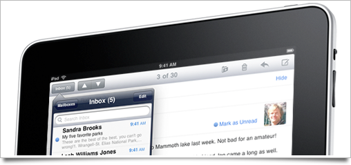
Sometimes controls go on the bottom, though. It seems to vary from app to app, much like on Mac OS X. Interfaces overall are much more tactile though, as I mentioned in the introduction.
iBooks, for instance, uses an interface similar to the one me and David designed for Classics for iPhone. Since it got a bit of hubbub due to the (obvious) similarities, Classics is now free. I encourage you to grab it; it’s still as great an app it once was, but iBooks is certainly how we’d envisioned it to be if we had unlimited engineering power.
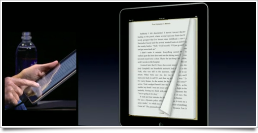
When you tap to switch to the iBookstore, the entire shelf rotates around and shows the store layout. Upon buying the book, the book’s cover moves toward you, the shelf rotates again and the new book gets neatly placed on the shelf, rearranging the other books automatically, and gets a nice blue ribbon to indicate its unread status. As you may expect from such extremely elaborate animation design, picking a book animates opening the book. Every single action is animated to allow for natural interaction with it.

When the discussion of electronic books comes up, people always mention the emotional connection with the feel and look of a real book. Nice typesetting, the sound and feeling of turning the pages are all big factors in this. While iBooks is not a replacement of a real book, I believe it’s certainly close enough – with the added convenience factor of having thousands of books in a device as thick as a magazine.

The natural metaphor of books is reused throughout the OS, such as in the Contacts application and the calendar. Contacts, with its index list of all contacts on the left hand side, doesn’t have page flipping, but the Calendar might. I’ve only seen it being navigated using the tiny arrows at the bottom so far, though, so I assume it doesn’t allow for this type of interaction.
Other touches of animated interaction are equally amazing. Instead of tapping a button to curl up the edge of a map in the Maps application, you actually flip the edge over yourself. When selecting emails, they all get thrown on a stack. Deselecting an email in the stack curls up the top email and sucks the deselected email back into the list. Speaking of stacks: Photos actually has little stacks of photos that you expand with tapping or pinching.
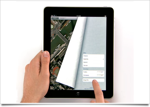
Photos also takes the scrubbing we’re familiar with from iMovie and iLife (see also: my iLife UI roundup) and applies to it to a photo album, to allow for easier and visual navigation of images. I think it’s a nice interface element, and much more efficient than Coverflow, which seems to be on the way out at Apple if you look at iPad’s conspicuous lack of it (it seems to have stuck in the App Store – no other sightings, though).

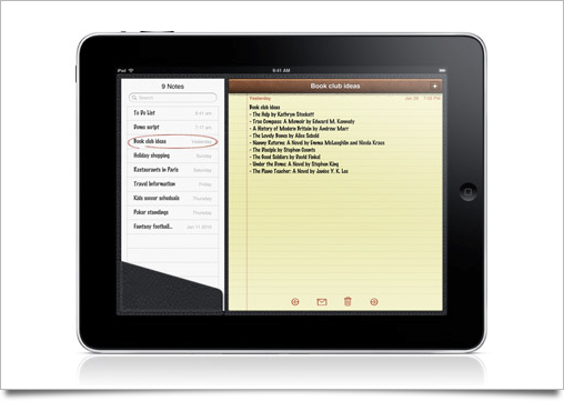
The note-taking application is still a bit of a gimmick playground. The font is still Marker Felt, which hampers legibility somewhat, and instead of a regular selected state, it appears the currently active note is displayed with a red outline in the source list on the left. It’s a friendly touch, but I feel like it’s a bit unconvincing and forced.
The Calendar application looks very nice and seems to be functionally awesome, but the corkboard texture is drab from a distance (I am not sure how this looks in the flesh). The amount of rethinking that’s been put into the calendar makes iCal on Mac OS X look rather bad, though. It looks like the best calendaring app I’ve seen so far.
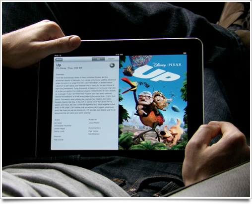
The movies application is surprising and pleasing in its simplicity and amazing in its animations: movie covers fold out like a DVD to show chapters, information, and artwork, and let you play back with a simple tap. It’s gorgeous, top-class design, and so simple and obvious that it’s hard to imagine something that could do a better job at presenting information to allow the user to pick a movie to watch without getting in the way.
iWork for the iPad is interesting: it’s a first in a series of serious applications that you can use for ‘production’ work on such a device mainly geared towards content consumption.
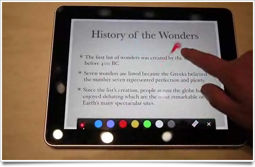
Keynote has a black toolbar with its features accessible through popover inspectors. The presentation view lets you use a faux laser pointer (a neat touch) or draw over the slide to highlight an item. Its desktop interface was already amazing, and they’ve kept it practically intact for the iPad.
Pages and numbers, however, get makeovers in the UI department, making some things a bit more simple and graphically pleasing. Pages, for instance, has a formatting bar that slides out from under the main status bar that lets you manipulate text-editing parameters.
I think I’ll spend more time dissecting the iWork UI once it hits the shelves: there’s very little of it to be found in the galleries and movies of Apple.
The pinch gesture seems to be used a lot more in the entire UI: in Photos you expand grids with it, but you can also go back up the hierarchy by pinching out. The same can be done in books. It’s similar to what Palm did in WebOS: using universal gestures for the hierarchy navigation. Fortunately, Apple still makes going back in the hierarchy discoverable with the regular ‘back’ buttons on the top left, which remain usable. I do like the idea of using gestures for quicker navigation, which is starting to become necessary with such a big screen.
The departure from the pinstripes and blue bars of iPhone OS is something that I’m quite happy with, as it’s the first part of the iPhone UI that has started to look rather dated. In the interface of Mac OS X, the pinstripes were gradually phased out, and perhaps the same thing is happening to the iPhone. Who knows if we’ll see iPhone OS 4.0 introduced at WWDC this year with new ‘metallic’ status- and toolbars and no more pinstripes. I’d be quite happy with that.
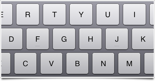
Neat touch: the full-size keyboard of iPad has actual tactile ‘nubs’ on the F and J keys, like a real keyboard.
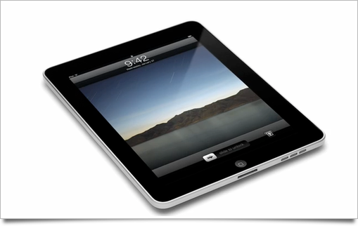
Another neat touch: the (surprisingly bare) iPad lock screen has a little button next to the unlock slider that turns the iPad into a photo frame.

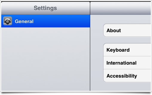
Source lists, as we know them from desktop interfaces, are basically iPhone tableviews on iPad. I’m sure this works nicely, but the way the iPad interface represents them is very detached. In the Settings application and the Mail application, for instance, they are contained in their own ‘view’ of sorts, with rounded corners and all.
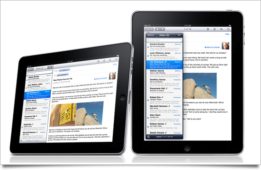
It makes me wonder why the list isn’t simply ‘attached’ to the content on the right. This feels a bit like the iPhone interface elements have simply been shoehorned into a large screen UI. To add to this, in portrait orientation these iPhone-like lists are incorporated into a new UI element called the ‘popover’, where it contrasts harshly against the dark blue. It looks a bit kludgy.
Another tiny nitpick: the tab controls for picking datasets or application modes have an inconsistent active state. When the UI is dark, the active tab is lighter than the other tabs, and when the UI is light, the active tab is darker than the other tabs. I’ll have to see how well this looks on the actual device.
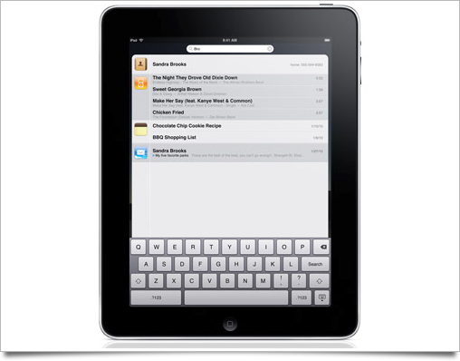
Spotlight is also interesting. While all search fields on iPad go on the right-hand side, Spotlight’s search field is in the middle, since it doesn’t really have an application to go with it. The search results themselves go into a narrow column that doesn’t fill up the entire screen. It doesn’t look as polished as the rest of the OS, in my opinion, and the icons seem rather large. On the iPhone, the icons are as high as one row of search results, but on iPad the icon spans about a row and a half.

The first thing in the keynote that punched me in the face with its repugnant and inconsistent appearance was the iPod application. It resembles a bastard child of the iPhone’s iPod application and iTunes of the desktop, but fails to really take advantage of the innovations either has made. It’s full screen mode is particularly disturbing, which you can see in this image:
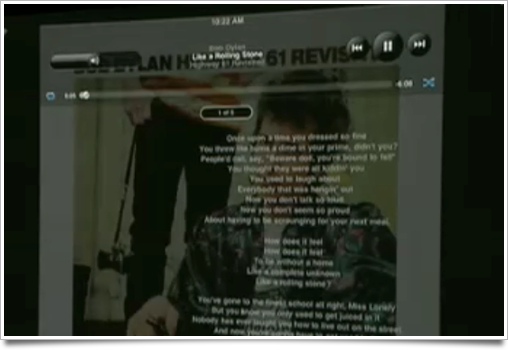
Really, Apple? I can see myself looking at lyrics, but can you imagine using your iPhone to listen to music and having round blobby buttons to control playback instead of a clean, glyphic overlay? I’d let it go if it was consistent with the general control layout of the main application, but those are positioned entirely differently. Let’s hope this one is still in development.
The icons of iWork and iBooks are rather bad, as well. iBooks simply has a strange combination of a glyphic symbol and a strangely textured background, while iWork’s desktop icons were placed into an icon roundrect without too much change. The Iconfactory’s solution to this for their iPhone-like desktop icon set ‘Flurry’ was much nicer.
![]()
iPhone apps can run on iPad without issue. They actually get a nice little iPhone-like frame when running at 100% size (i.e.: not blown up to the screen size).
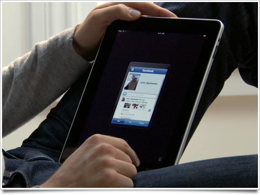
I’m worried, however, of displaying them at this magnified size. They’re blown up to twice their regular size, which wouldn’t be a problem if the iPhone encouraged resolution-independent interface design, but almost all iPhone apps use custom controls that are designed at one size. Blowing them up will create a blurry mess of pixels. I’m curious to see how this problem will be solved – if it will be solved at all, of course.
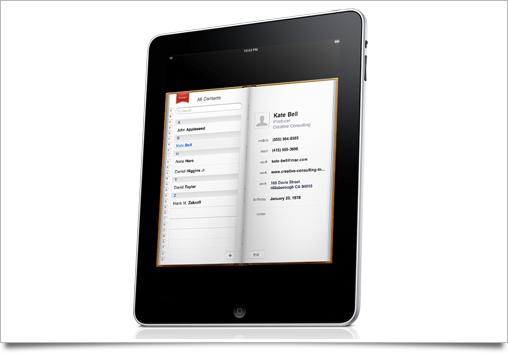
And as a last ‘meh’: the contacts application doesn’t seem to adapt well to a portrait orientation. The book is simply scaled down from the landscape mode, and it feels rather inefficient. This is obviously a trade-off to make the UI still look natural instead of like a terribly elongated book, and I hope it’s being worked on, but regardless, it looks a bit suboptimal.
Fortunately, there’s not that much stuff in the iPad UI that I’d call ‘bad’ or ‘ugly’. Apple has shown once more that they’re at the top of their game, and the interface is sublime. If iPad had preceded iPhone, we’d all be lyrical and hopeful for a smaller device that did even a few percent of its awesome feature set. Instead, this natural evolution of the iPhone OS is being heckled by people that fail to see how extending the underlying ideas of iPhone’s UI helps interaction with ‘serious’ applications like iWork.
This was by no means a full UI roundup: as usual, there are parts I may have missed or overlooked. Feel free to add your observations in the comments. I hope to document some of the most subtle interaction and UI design finesse Apple put into iPad once I get my hands on the final product.
Check back in a few days for several Photoshop files to help you create pixel-perfect mockups of iPad interfaces, a free part of my Icon Resource design resources which will soon feature full lessons on iPhone and iPad interface and icon design.


i;d been waiting for your ui roundup!! didn’t know about the photoframe mode :D
Thanks for this UI roundup, once again very complete!
Very nice post and analysis. The Cocoia Blog really a pleasant place!
Thanks
Great roundup, Sebastiaan. You hit on all the inconsistencies I noticed.
I expect the device to look a lot better in 6 months thanks to amazing designers and developers plus maybe some rethinking by Apple. Right now there is a fair amount that seems half-baked.
Thanks for posting this, it was a very interesting read.
Wonderful, as always.
There is a special File-Sharing Support in iPhone OS 3.2. http://fscklog.typepad.com/.a/6a00d83451c7b569e20128771d25f2970c-pi
It allows for user-transferrable files via USB. Applications can use a special directory to which also users have access to.
Great observations. I couldn’t agree more on the iTunes overlay-controls, very ugly and up-Apple-y.
One nit:
They said in the keynote that it does pixel doubling to blow up iPhone apps, so it’ll look 2:1 with some black bars around it, but the iPhone apps won’t know the difference. OTOH, they won’t look nearly as sharp and crisp due to the doubling. Not a great tradeoff, but I guess that’s why they want everyone to make iPad versions ;)
Great article Sebastiaan, echoes most of my thoughts exactly. I personally can’t understand why the song lyrics appear on the right side of the screen instead of the centre, considering there is only 1 page of lyrics?
As for how the OS will handle filesystems, I expect that the iWork apps themselves will sync somehow with their desktop equivalents (maybe a special folder or smart folder directory, customisable recently opened files, etc?) and simply present a list of files to work on within the app, I can’t see Apple adding any kind of filesystem similar to what exists in more traditional computing for the exact reasons you mentioned.
I am among those that hope / believe that os 4.0 will be debuted with brand new iPhone hardware around or slightly after the iPad is released, and will hopefully introduce some new stuff to the interface at both screen sizes.
Also, you probably already noticed, but it is possible to fit 6 icons in the dock in the SDK simulation – not sure if this translates to the homescreens themselves (although one would hope it would for consistency’s sake).
I look forward to the templates, the possibilities of a multi-tocuh display this size really are only limited by developers imaginations!
Great, that someone who actually knows a bit more about interface design than I do, lists the iPod/iTunes Store under ugly. They are so terrible, I couldn’t believe that this is the best they could come up with.
I’m actually kind of disappointed by the fact that it’s not that different from the iPhone OS. The changes are clearly visible and make sense for a tablet but all in all it still looks blown up and unfit for such a device. many of the controls just look out of place. e.g. the category selectors at the bottom or top of the screen look small, out of place and not really fit for this size.
I wished they would have innovated more on the OS side (the hardware by itself isn’t that stunning but ok I guess). I would have loved an OS which borrows more from the Mac OS X side and not just a tweaked iPhone OS :/
Great roundup indeed.
I was also horrified by the iPod interface. Especially the large volume slider and the usual previous-play-next group of buttons… they’re ugly and just don’t fit there.
“They’re blown up with a factor of about 2.13 times”
Are you sure? This would match the resolution of the iPad, but it seems there’s a border even when blown up. Isn’t it just blown up by a factor of 2?
They are blown up by a factor of 2, there still is space for the 1x/2x button for example.
Any non integer scaling would end up with pixel cracks and not just pixel blockiness as in 2x but either blur or non uniform row and column duplication.
Have you noticed that iWork’s interface is not homogeneous (and the colors are really ugly!)?
the color in iwork are nice
–
and no, I don’t want the interface of a mac in a computer without mouse.
give up that : we can do better than Finder, than menu, than windows.
in short time, many developpers will create whatever applications to create, browse and edit contents and all will be fine.
–
you will be able to share all documents created on ipad with the mac thanks to the Finder. Move, copy, erase, in the finder.
Hi Sebastiaan, I’m glad you brought up the similarities between Apples ebook reader and “Classics.” I purchased Classics when it first came out and thought “wow, this is what Apple would’ve done!” (Hope you guys take that as a compliment, the app is just so well polished and elegant.) Anyways, back to what the original subject. When I saw the iPad ebook reader the first thing I thought was “Oh, the Classic guys must’ve sold their app to Apple/or are working at the company now.” The similarities are “blatant.” I guess imitation is the sincerest form of flattery. More success to you all. You do great work!
The volume control of the iPod app is unbelievable ugly (at least on picture). I hope they fix that before selling the device.
Maybe we should wait until we can actually interact with the thing before conducting a user interface roundup?
Nice roundup!
As of a “filesystem” I think this will be integrated as we see in iWork on the Mac and as shown in Keynote on the iPad, as a “Media drawer”. (OSX: http://is.gd/7hKqJ / iPad: http://is.gd/7hK1f
This way a filesystem isnt needed. All pictures are in “Photos”, all documents are in “Documents” an so on. Add a searchbox on top, and its all you need!
Sebastiaan, nice round-up.
Can’t agree about the ‘Popover’ comment however.
If you glance at the iPad HIG, you will see that first of all this element is governed by orientation. In landscape mode the content ie contact list in Mail, is attached; whereas in portrait mode the list is non-modal and detached, but in a fixed position. There is no need to dismiss the list via a close button, you just click ‘under’ or ‘away’ to view the main relevant content. There is far less view switching this way and removes any possibility of squeezing or cramping the content.
I think it’s actually entirely consistent with the non-hierarchical metaphor they are promoting and a small but important innovation where the ‘modal’ dialogue box no longer demands attention.
Thank you for the overview. I agree with the majority of things. I think it’s just a “beta” of what may come. It seems like a platform to many things that may be possible with the device. Hardware is ok, software needs touches…
Great write up. I really enjoy your putting your design expertise into review the iPad. Question: about the keyboard nubs: when you said “actual” nubs did you mean that they are “physical” nubs on the pad, i.e. that there are 2 nubs sticking out in the middle of the screen?
You missed the background! Not only does the iPad feature a landscape home screen. But instead of stretching the background it reveals whats hidden when in portrait. Each wallpaper is 1024×1024 so it looks great in either position. I thought that was a really nice touch.
I think you didn’t read the iPad HIG PDF as it explains many stuff that you counted as “Bad” ..
for example, the way the Address Book app shows in portrait (leaving blank black areas on top and bottom) is explained in the iPad HIG PDF ..
Get it from the developers section .. or mail me
Jobs’ statements against Adobe Flash have Zero credibility. He acts like the iPhone/Safari NEVER CRASH or the Apps in the App Store NEVER CRASH! What a load of BS!!!! No Flash = No Fun ! Plus no multitasking? These are BASIC features in todays computing!
It seems very strange to me they would put buttons at the top of Safari, rather than at the bottom. It means you are going to be reaching over the content with your hand/arm to navigate.
I think it would make much more sense to have the navigation at the bottom, so you can see what your doing. Perhaps they went with convention (in browsers) over re invention.
I think the iTunes team’s designers should simply be let go. What they did to the iPod app on the iPad is unacceptable. iTunes 9 design on the Mac is a step backwards IMO, but what we can see in the photo of the iPod app on the iPad not only is going backwards, but is going back to the era of Winamp (not that Winamp was/is a bad app, but certainly it looked like everything Apple have so far tried to avoid). The iPod app does indeed look as of not necessarily professional origin Winamp theme.
Don’t get me wrong but I reckon the iPod app is going to be the app that every single one of the future iPad owners will be using on everyday basis. The design of this app should be a priority. At the moment the only app for playing the music left, that has this unique Applesque look and feel, is the iPod app on the iPhone/iPod Touch.
Steve Jobs needs to kick some asses under his own roof. ;)
Hey Sebastiaan,
great roundup mate. I am sure you will be making some awesome interfaces for our new shiny Apple product :)
Anyways, I’ve made a template for the interface, and thought you might be able to use it:
http://emberapp.com/icondesign.dk/images/ipad/
i was struck with almost the same “bads”.
The lowest point to me is the iPhone App porting, it is simply stupid and not forward-looking. I mean, “what’s the point?” Apps in “stamp-mode” are almost impossible to interact with, in most cases you need to lay down the pad; also they stupidly retain all the iPhone limitations, like if they slammed the developer emulator on the Pad. Yeah it is covenient, but if you really want to have a “stamp-mode” please ease my life extracting obstructive elements like the keyboard placing it in the large frame created.
I would have forced the full blown experience, given the fact that developers have 3 months to upgrade the graphics; it would have been just a stimulus for doing it the-quicker-the-better, and in the keynote Apple choose the Apps, so no risk there in putting the product under a bad light.
I think the reason the iPod looks bad is to nudge music publishers to make iTunes LP, which means a custom UI for every album.