03 Nov
   Filed Under: Personal   

Boy, it’s been a while. I really need to update everyone on what’s up and what’s coming up.

– I’ve been working hard for the Mothership for the last months (hence the blog silence) and really enjoying the big workload. I’m very thankful to work with a lot of extremely talented people.

To get misunderstandings out of the way: I have not closed up shop, I have not relocated, and I am not working on Mac OS X Lion. Phew! This is also the reason I am not doing UI roundups and the likes for iLife ’11 or doing elaborate commentaries on Apple products. I’ll announce what I’ve worked on when it’s released, though!

– There will be new designs for Icon Designer, Cocoia and this blog next year!

Icon Resource 2 is still very much being developed! Due to Retina Display and other new developments I’ve added some more material to the curriculum which piled on the delay. I’m wrapping things up for this year, so you can spend 2011 making awesome icons and interfaces. I apologize for the delay, but it’ll be worth it.

– I’ve been doing a video series on Minecraft. Check it out: the newest part, due out this week, will be very intense. A teaser:

Check out the full series here.

– Remember Composition? Vaguely perhaps? There’ll be news on that. It’s out of my hands, since I’ve been unable to complete it, but… well, I’ll save the good news for when it’s applicable.

– Speaking of old posts: I’ll be hitting up Dreamhack Winter 2010 again, thanks to sponsors like Intel, HP and others who are facilitating Pack4Dreamhack (with full press access!). Are you there? Let’s meet! I’ll be doing another ‘packing’ post and a report from the floor.

– And, of course, there’s some neat blog posts coming up. Good Old Games on extremely small touchscreen devices? Check! Pointers on Android UI design? Check! And (hopefully) showing off some work I have been doing for a PC / PS3 / Xbox 360 game.

09 Jun
   Filed Under: Apple, Design, Goodies, Icon Design, Personal Work   

I’ve updated the iPhone / iPad icon PSD I released not too long ago with some fixes and a 114×114 pixel icon template for designing icons for Apple’s hottest new device.

Download it here. I cannot be held responsible for inaccuracies, flaws and errors in this this PSD I might have overlooked, but if you notice anything please let me know in the comments.

Again, if you appreciate it, tweet this to help your fellow designers and developers make nicer icons for iPhone 4 (and beyond).

01 Feb
   Filed Under: Apple, Design   

Mike Matas is a very talented 23-year old designer from the United States, currently living in San Francisco. He’s best known for his design work on the original Delicious Library, and working at Apple, designing key parts of Mac OS X and iPhone OS. He’s even been listed as co-inventor on patents Apple has filed.

In 2009, he left Apple. Lately, he uploads the fruits of his also impressive photography skills to his website and blog, mikematas.com.

I’ve asked him a few questions in this interview to learn more of one of the designers of the most innovative and beautiful interfaces of the last decade. Unfortunately, he wasn’t willing to disclose what he’s working on these days, but I’m sure we’ll see a lot of quality design from his hand in the future.

Continue reading…

28 Jan
   Filed Under: Apple, Icon Design, Interface Design, iPad, News   

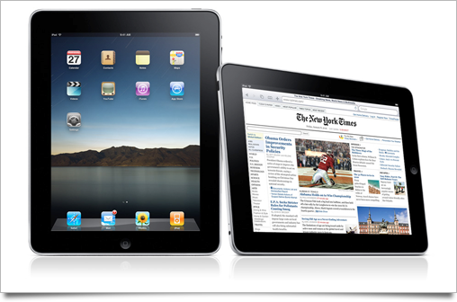
Unless you’ve been living under in a multitude of nuclear holocaust-proofed rocks, you’ve heard all about Apple’s new tablet, the iPad.

As usual with a large Apple product launch, I’ve written up this post to round up the good, the bad, and the ugly of all the new interface and interaction designs that were set loose on the world by the company that’s regarded as the most influential and skilled when it comes to designing experiences. The usual disclaimer applies: iPad hasn’t hit the market yet, and thus its UI may still be subject to change or improvement.

Continue reading…

17 Nov
   Filed Under: Apple, Design, Interface Design, Personal Work   

Perhaps you’re aware that you can connect to a Mac back home with Back to my Mac, a service offered by MobileMe. When I heard of this feature, I did some reading and set everything up right, but I just couldn’t get it to work. I think Back to my Mac is a really cool idea, but it could use some work. It could even tie very well into Apple’s possible new tablet-sized device.

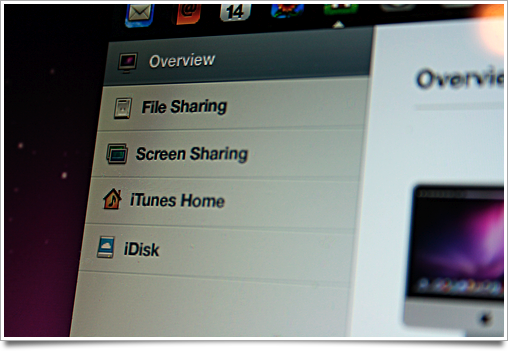
MobileMeHome

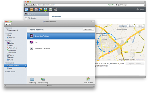
Enter MobileMe Home. After entering your MobileMe credentials on your Airport or Time Capsule, your network becomes accessible when you’re away from home. No enabling settings in some tab in a preference pane or forgetting to put a file on your iDisk: you can connect back home from anywhere with the Finder on your laptop, with an iPhone app, and from public or other computers through the MobileMe web interface.

Webinterface

MobileMe Home’s web interface allows you access to your Mac’s files, use a web-based client to do simple screen sharing, stream a few songs or videos from your iTunes library, and locate, wake, sleep or shut down your Macs from anywhere. On any Mac or iPhone, you can connect to your network to do all of the above, and more, like connecting to a non-Mac server or device on the road.

Even better, since your laptop (and possibly tablet) get on the move, you can track its location thanks to Snow Leopard’s Core Location features.

Check out a larger size of my rough MobileMe Home mockups at Flickr by clicking the preview below:

Home-UI

MobileMe Home is not an official Apple product, nor do I know anything of planned features of MobileMe. You should consider this an idea, or perhaps even a dream, seeing how technically MobileMe Home would probably be incredibly hard to implement. I just wanted to share it with the world.

11 Sep
   Filed Under: Apple, Interface Design   

It’s that time again: A new big cat is upon us, and while it hasn’t brought about the rumored ‘Marble’ aesthetic, there’s been a lot of enhancements, tweaks, and improvements to the user interface and graphics of Mac OS X 10.6, commonly known as Snow Leopard.

After a huge release like Leopard, which brought very radical change to the way our favorite OS looks, feels, and works, including a complete redesign of its icons and UI ‘theme’, Snow Leopard’s (incomplete) roundup of UI changes can only feel minor. Nevertheless, it shows some beautiful classroom examples of what composes true attention to detail.

snowleopard-ui

Since Snow Leopard has quite a few interface changes and tweaks, I’ve organized them into four sections. I’ll kick off with the most visible changes, and round the article up with (very) minor tweaks that are hardly noticeable, but show us that Apple still hasn’t lost its touch.

Continue reading…