31 May
   Filed Under: Personal Work   

Now is the perfect time to comment – if you would only comment once (like uh, you loyal US Courts-domain using RSS-based blog reader, please let me know who you are!) in your lifetime here, do it now. I really want to make a good decision on this.

On Macthemes, there are questions for some alternative formats of the icons, apart from a DMG with an ICNS resource slapped on it. PNG, perhaps a set of Windows / Linux desktop environment icons. How should I go about this? Do you guys want other formats than just OS X compatible icon resources? This week, IE is used by about 6,7% of my visitors, where the Windows-using portion of the readers is about 18%, and the Linux / *nix using crowd an estimated 10 to 16%. There is also someone using OS/2 (who are you, you fascinating individual?).

Now let me know. Comment, email (you can find my address on my site) or let me know by Macthemes private message what I should do in the future with my icon formats.

26 May
   Filed Under: Personal Work   

I came, in my stumbling around for iPod innovation, across this neat snippet of code. It’s by Keith Wiley, who also has a method on his site for trapping fourdimensional objects and counting to 1023 on two hands, and 31 on one. I think he’s awesome already, big credit to him. Now, on to the code.


You will have to pick around some of the Mac-graphics-specific details, but the general math is the same. Note that my code produces final rgb values in the range [0-65535], not [0-1] or [0-255]. Adjust to your requirements. Sorry for the lack of commenting.

What does this do? Well, it essentially reverses everything iTunes does when it stores images on your iPod in the opaque ithmb format. This snippet of code ‘decodes’ the interlaced images of 720*480 (apparently, a TV format for the AV output), and there are a multitude of other sizes present in the files. What does this mean to me? Uh, I got to up the resolution of Timezones to let you be able to check it out in high resolution on a TV. You want that, right?

Now, actually, what I am going to do is reverse the coding of the tiniest thumbnail graphics – the one the iPod displays when you enter your Photo Library. You’ll see why, but it’s obvious that it’s usable for many cool things. I might open-source it.

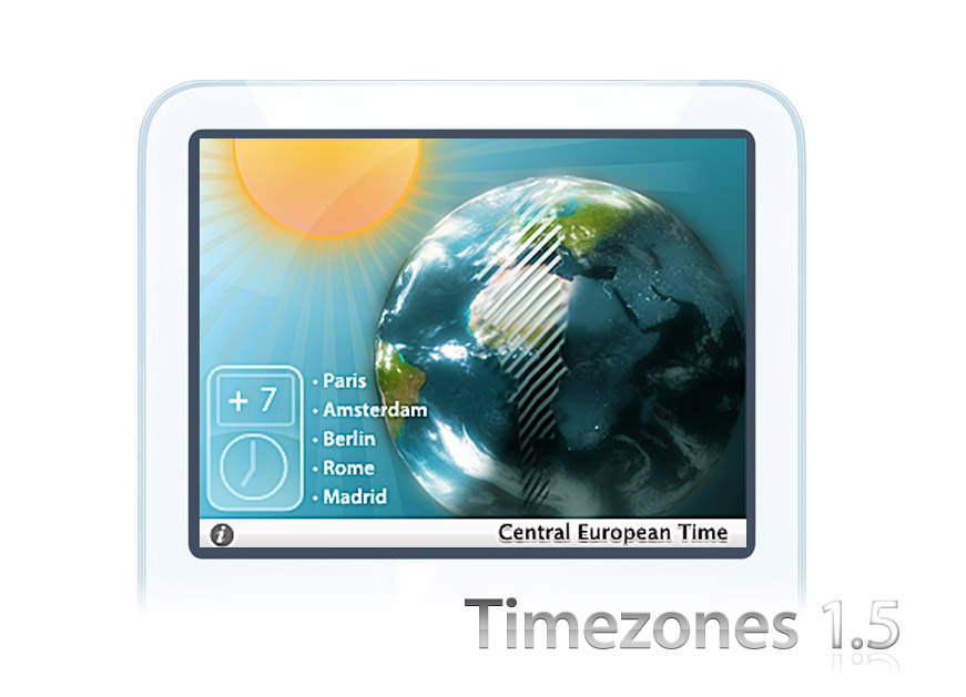
Since the people at Macthemes already had the love, I have to share it with all my subscribers too. Man, I hope you buy in the next week, because you’ll get a beta invite for this;

timezonesonedotfive.jpg

Yeah, we’ve come a long way.

21 May
   Filed Under: Personal Work   

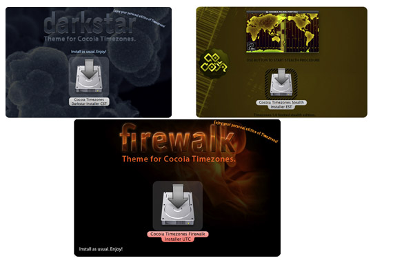
Okay Timezones users, regular blog readers and others; I think we’re gearing up for a great 1.1 release of Timezones in a few weeks, with hopefully the Praetorian beta-ready by the time I specified in April. There were some nice words on the icon on MacThemes and Aidemac (and some hits from other customization forums – thanks for holding up the copyright policy, guys, appreciate it) so I think it can do with a few tweaks to finalize it’s appearance. It seems (hard to notice on low-contrast displays) that the shadows are slightly cut, and the perspective of the images might do better with a different distortion angle. So you can look forward to that with the other tweaks and new themes that Timezones will see.

Timezones 1.1, by the way, will feature the disk image art you’ve all missed (I was doing it erroneously so you guys missed some nice, nice graphics. Ah well, coming up later), some more solid icons, extra timezones (because, unlike many people think, there aren’t just 24 time zones) and the themes are surely something to look forward to. It’s price tag will also see an ‘update’ – we are going from three to four dollars per personalized copy.

0-themie.jpg

Regarding the website, before I am launching Main, I want to appeal to the people buying, so I got that online as a priority. Take a look at the elegant new ‘buying’ page;

0-stepreview.jpg

I look forward to releasing Cocoia Main and the work I did with various developers on icons and interfaces. My own work too, of course, and everything I wanted to share with the world for a long time. It’s going to be an exciting time.

20 May
   Filed Under: Design, Personal Work   

It’s one of those applications that you’ll always find in your dock on OS X; Preview. What does it do? Well, it gives you a way to check out a series of images and do lightweight modifications like cropping and rotating, all for low ‘cost’ (system resources). Needless to say, if it’s an app that will be around a lot, you’ll see it’s icon a lot. In Quicksilver, I see it all the time. It’s always in my dock; I thought, if you can’t live without it, then at least give it a place in your dock instead of always having it inactive on the right. Anyway, I got extremely annoyed with it’s default icon of a happy child on the beach with a sort of eyeglass. The application Mimiphoto makes it easy to put your own image below the eyeglass, so I took Magritte’s ‘Ceci N’est Pas une Pipe’, kind of turning it into a self-referencing ‘Ceci n’est pas un Preview’.

However, I didn’t like it still. First of all, it’s not clean at all, I disliked it in 32 pixels and below (icon sizes that require special care and pixel-pushing for clear images) and well, I started looking for replacements. I swear, once you’ve seen one, you’ve seen them all. I don’t like that damn loupe, eyeglass, whatever you want to call it. It’s stupid. So I made a new metaphor for previewing. Here you go, free for personal use. It’s got it’s own small webpage, a DMG download, and very clear terms stating no commercial use and attribution. If you want to be an ass and use it on your website or whatever anyway, I’ll just take the icon down. I’m that much of an asshole. Of course, you’ll also be in legal trouble.


previcon.jpg

But I trust my loyal readers to just enjoy this, adhere to my terms, and respect the extreme amount of time that went into it (this lamp doesn’t exist, I just made it up along the way) and provide feedback. I hope you enjoy it as much as I did making it and having it done now.

04 May
   Filed Under: Personal Work, Popular   

I thought, go download your own and see if it works out for you. I got mail from Nano users willing to test too, so hey.

The beta of Cocoia Timezones is now public. Be sure to read the readme and follow installer instructions. It allows you to choose a different directory to install to (recommended).

release.jpg

Features excluded in this BETA version:

  • Personalised timezone overlay,
  • New 1.0 themes,
  • Map smooth motion.
  • This is not feature complete. Please test this for me, and give me feedback about bugs, inconsistencies, and suggestions at this address.

    Download now.

    03 May
       Filed Under: Personal Work   

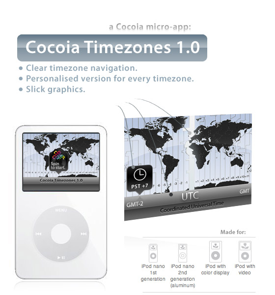
    0-ipod.jpg

    Because I need beta testers for a few days

    I wanted to make an ‘app’, of sorts, for the iPod before the week in which I got it was over. I am going to roll this out very quickly (there is still some stuff to set up, some bugs to iron out) but drop me a line, type of iPod (I need people with Color Display / Video iPods) and time zone of choice, and you can test this before it comes out! I am probably going to make this one a super-cheap donationware.

    Drop me a line.