15 Apr
   Filed Under: Design   

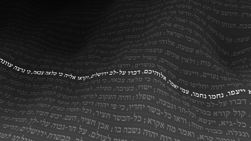
Wohoo, even more purdy images. I just had to show this one. It’s purrrrdy.
Dear iSight Expert and Praetorian Beta testers, there are some good things in the pipeline! I think I’ll do some updates tomorrow or in the next few days, perhaps release a definitive roadmap to releases.

My humble apologies for the extremely salt-less post I did yesterday, I really didn’t want to offend anyone with taste. It’s there for the stay. No more words on that.

Here is some homework I literally ‘let do’ in my sleep. Like I said to a classmate over IM; “it’s like a tiny Chinese fellow in a black box with Maya 6 and a keyboard shortcut for matrix extrude on fast-forward”. I’m taking suggestions to name this thing, I can’t seem to come up with anything better than the ‘Purdy-Image-O-Matic™”.

Without further ado, the poster;
0-poster.jpg

It’s great to have the results of as little knowledge of these almighty tools we, as young coders of the ‘lazy’ generation, have — at least, I am just beginning. I haven’t ever used an Apple II. I didn’t write assembly on my 286. I did a lot of work with old stuff to compensate, longing for having been born in that age. It didn’t work out that way, so these days, I am just up in learning everything I think is great for expressing myself or making stuff work the way I want it to work.

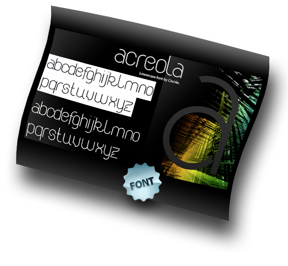
Oh, before I forget, that’s a font I had to make for modular typography class. “Acreola”. I’m so carried away in this whole rant that I forgot all about that. What should I do with it? Burn it? Eat it? Give it with every odd copy of my software?

comments off
13 Apr
   Filed Under: Design, Personal Work   

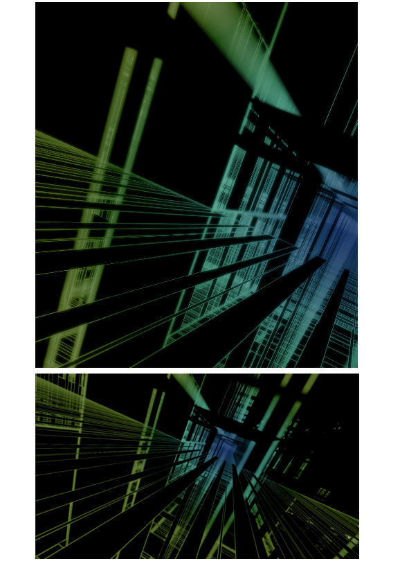
Building further on my experiments with OpenGL.

abstract.jpg

As you can see, some color modulation and a post-process blur with additive blending does give it an edge. It’s nice, soft, and scenic. It can output a cool 40 images per minute, in it’s current, raw form. I may push it out, once I get things working like ‘true’ 3d scenics with shading.

Because xyz (Nate) asked for some details on this, I’ll happily disclose some. My ‘script’ (it used Python first, now most of it is just bare C++ or Objective-C) receives random input from any source (say, you could pipe your chat log into it, or the contents of your favorite MP3) and processes it into various arrays of data. It then randomly selects values to assign to properties of a hard-coded array of 3d objects, e.g. cubes, planes, and lines and their X, Y, Z positions and distortions. Most data, not being really random, create interesting patterns from strange perspectives. It uses basic lighting for every (simplified), depth testing for overlapping shapes, and depth-of-field (limited and simple). Overall, it looks landscape-like, or like it’s some sort of room or space. I think most outputted images are pretty much industry-grade, I made a mock-up of one of the generated images as a book cover.

book.jpg

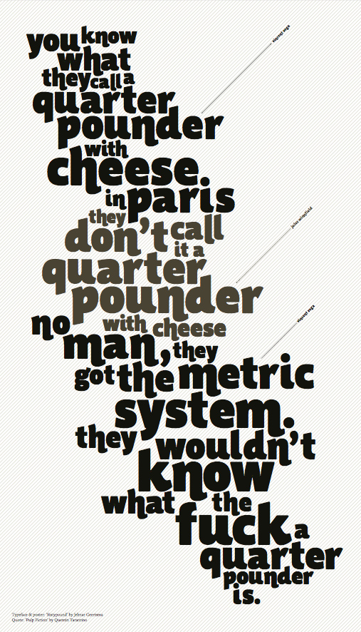
For now, it’s just an experiment. Some other cool graphic stuff from my classmate, Jelmar. He’s working on ‘Sixty Pounder’, a great characteristic ‘fat face’ for expressive messages. As quoted from Jules & co;

jelmar.jpg

Jelmar, and me, of course, enjoy feedback like Nate’s. Please, let us know what you want to know, or what you want to see! I’ll upload some wallpaper-sized images (any idea on sizes? I already have 1920×1200 written down). Email me!

01 Apr
   Filed Under: Design, Personal Work   

No, I didn’t feel like an April’s fool joke. It’s one of the reasons why I didn’t re-skin the blog on this day. Anyway, I couldn’t possibly trump the Google jokes. Brilliant stuff. This post will just be a blurb of some off-topic stuff and a bit of thoughts on icon design. I hope to be a bit more faithful in my monthlies, as the last wednesday and two fridays had to go without real graphics or typography.

On a side note; why the hell doesn’t Aperture start up if you have Bonjour disabled? It starts peppering you with all sorts of vague, opaque error messages if mDNSResponder isn’t running.

When I design icons for an application, I always heed critique from ‘ignorant’ users, fellow graphic designers, and developers. It’s important that icons are identifying, aesthetically pleasing, discerning, and comply to guidelines (and having read and hopefully grokked the Apple HIG, I think this is good, but anyone has the right and ‘duty’ to show me any erroneous design decisions made).

Conceptual design is always the first phase. I don’t just sketch in this phase, I think, and, Wil Shipley style, I think, and I think some more. Then, I rethink the whole thing. After that, I start sketching and thinking in parallel. After that, I start thinking and designing mockups on my Mac in parallel.
Mostly, I get incidental productions in Photoshop (or GIMP) and Illustrator (or Inkscape) and some design guidelines through my sketches. I start refining designs I like, and pick a final version. I often design other icons for the application in question along with the main icon, because there is often some sort of coherence or association going on. Finding inspiration in icons you like is good as well, because it’s always useful if your icon turns to be similar – you can get to work discerning your icon.

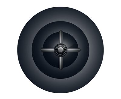
For example, after this phase in the design of the Praetorian app, this icon came out. It’s not compliant to the Tango icon guidelines, as it lacks a distinct silhouette, but this, I found less than important for the time being.
2radvocateicon.jpg

In this stage, the application wasn’t even called ‘Praetorian’, it had an absolutely stupid name I won’t tell anyway. What isn’t entirely clear in this image, is that it has transparency, all of the grey in the sphere apart from the center. That really didn’t work – on a black background, it was completely black.

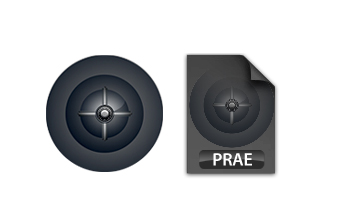
I decided to fix that, give it a bit more contrast (for depth) and make a document icon out of it.
2-two.jpg
Now, by this time, you can see there are already color theme issues in the document icon and the application icon. Color themes allow us to associate application icons even more easily and intuitively. I also got some feedback from people; some things that lack (which I saw too), was that there wasn’t a ‘realistic’ outline (dark / light, with shadow) of the application icon, the icon lacked texture, and color. What isn’t obvious here, is that the application icon also used the full 128 pixels, which made it too big in the dock. Aperture’s icon (also round) is actually smaller than that, leaving some ‘air’ for the icon, which is good.

2-3.jpg
As you can see, the amount of depth and the texture of the icon changes dramatically. The icons are now visually related, and convey much more atmosphere with more color. The result? A nice dock icon, and a fine document icon to work with.
30 Mar
   Filed Under: Announcement, Design, Personal Work   

So long, dark black glossy design of March. The Cocoia Blog april design is here! Expect a black and white theme switcher soon, as I am just too lazy and occupied to do that right now. What strikes me most right now is how legible my blog has become with this black on white scheme. Like it? Dislike it? Give me a line.

Rest in peace, March Design.
Cocoia Blog (20070331) 1.jpg

19 Mar
   Filed Under: Design, Personal Work   

forti-ad.jpg

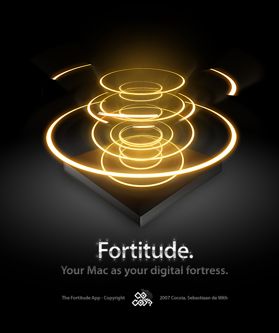
More information soon on this exciting new application by yours truly…

07 Mar
   Filed Under: Design   

It’s the first typographic Wednesday, a wednesday selection of what has been going on in typography last week. Two new releases, and some nice imagery – let’s take a look.

The biggest news, of course, was March second – the first glimpse at Meta Serif on Erik Spiekermann’s blog.

)meta_serif.gif

I found it somewhat disappointing to hear Erik isn’t designing the serif version of this splendorous sans-serif. It raises many questions. Did Erik do Officina Serif, or did he also outsource it? I really can’t be bothered to look that all up now, but still, it’s intriguing.

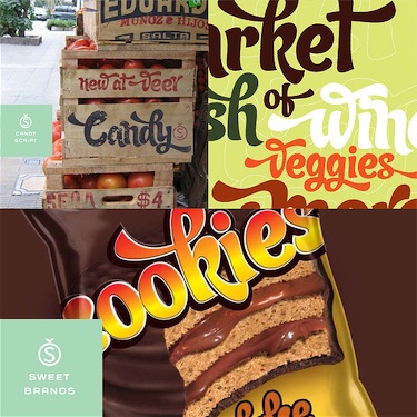
A little less known — but certainly not the least – Alejandro Paul has also come forward with a new font at Veer. It’s got a whole user guide (PDF) to go with it, with all the glyphs the greatmaster of ‘Letras Latinas’ put into it this time.

412697062_351900b646 1.jpg

(simulated images depicted above)

On to the visuals.
Via TypeForYou, the Typography blog, some time ago featured “Text, Space, and Time”, from the “Chronotext” software expiriments. Programmer and designer Ariel Marka, who, as he says it, “doesn’t see a | between art and technology”. Well, heads up Ariel, me neither. Too bad your java code that make these pretty pictures work only on Windows PC’s, and art’s cross-platform in most of the cases.
4A_512.jpg
Feh, It’s true, I am biased. I hate the amount of biblical content on that website, but it’s not for me to judge people for what they belief in. I just think we shouldn’t wear all of our religions with pride.
On a (slightly bouncy) sidenote, did you know American Creationists and general fundamentalists made their own wikipedia? It’s full of abberant lies and nonsense, like the dinosaur who really isn’t older than 4000 years. Scary, isn’t it? If you want to see how far this is stretching, check out Jezus Camp – a non-free movie. It’s quite gripping.

Anyways, back on topic. Keith Chi-hang Tam has a very nice collection of writings like ‘Digital Typography Primer’, ‘Baseline Grid’, and some other, very nice and important resources that any type designer should read. It’s excellent. He even has an interview with one of my typographic idols on there – Gerard Unger.

Other discoveries (eye-candy, software) of this week include my latest del.icio.us additions; Modanokia (beautiful dynamic site about Nokia, link to English version), the for OS X users essential TextExtras, which allow you a lot more control over fonts, text, indentation and other essential little tweaks for text fields and input fields.

That’s it for this typographic wednesday post. See you next week :>.