


It’s the first typographic Wednesday, a wednesday selection of what has been going on in typography last week. Two new releases, and some nice imagery – let’s take a look.
The biggest news, of course, was March second – the first glimpse at Meta Serif on Erik Spiekermann’s blog.
meta_serif.gif)
I found it somewhat disappointing to hear Erik isn’t designing the serif version of this splendorous sans-serif. It raises many questions. Did Erik do Officina Serif, or did he also outsource it? I really can’t be bothered to look that all up now, but still, it’s intriguing.
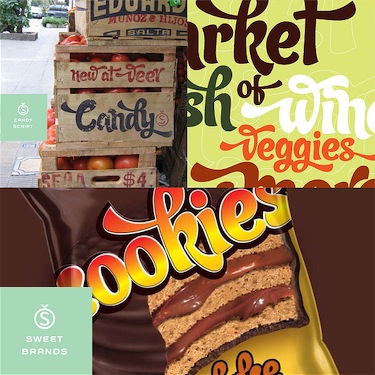
A little less known — but certainly not the least – Alejandro Paul has also come forward with a new font at Veer. It’s got a whole user guide (PDF) to go with it, with all the glyphs the greatmaster of ‘Letras Latinas’ put into it this time.
(simulated images depicted above)
On to the visuals.
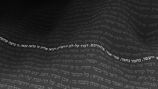
Via TypeForYou, the Typography blog, some time ago featured “Text, Space, and Time”, from the “Chronotext” software expiriments. Programmer and designer Ariel Marka, who, as he says it, “doesn’t see a | between art and technology”. Well, heads up Ariel, me neither. Too bad your java code that make these pretty pictures work only on Windows PC’s, and art’s cross-platform in most of the cases.
Feh, It’s true, I am biased. I hate the amount of biblical content on that website, but it’s not for me to judge people for what they belief in. I just think we shouldn’t wear all of our religions with pride.
On a (slightly bouncy) sidenote, did you know American Creationists and general fundamentalists made their own wikipedia? It’s full of abberant lies and nonsense, like the dinosaur who really isn’t older than 4000 years. Scary, isn’t it? If you want to see how far this is stretching, check out Jezus Camp – a non-free movie. It’s quite gripping.
Anyways, back on topic. Keith Chi-hang Tam has a very nice collection of writings like ‘Digital Typography Primer’, ‘Baseline Grid’, and some other, very nice and important resources that any type designer should read. It’s excellent. He even has an interview with one of my typographic idols on there – Gerard Unger.
Other discoveries (eye-candy, software) of this week include my latest del.icio.us additions; Modanokia (beautiful dynamic site about Nokia, link to English version), the for OS X users essential TextExtras, which allow you a lot more control over fonts, text, indentation and other essential little tweaks for text fields and input fields.
That’s it for this typographic wednesday post. See you next week :>.
I’m using a Mac and got the Chronotext stuff to work great. It’s really beautiful. The jnlp file is downloaded to the desktop, then it runs automatically using the “Java Cache Viewer.app” program (or “Java web start.app”, both worked).