I’ll be going places this August, combining holiday with my favorite pass-time (that’s work, in case you’re wondering), and I’d love to meet blog readers, clients, and other familiar faces when I’m in their vicinity! I’ve got two places that I’ll be attending for a significant amount of time, and if you’d like to meet me, be sure to drop me a line!
So where will I be? As with last year, I’ll be attending the Dutch musical festival ‘A Campingflight to Lowlands Paradise 2008’ (links to last.fm); I can’t reveal my share of the custom design work I did until the festival’s commencement date, but if you’re attending, I can guarantee you’ll like it! The festival is split up in three days, and if you’re there, be sure to email, text, or call me to set up a meet (details can be found in my vcard on Icon Designer) – it’s always fun to get together.
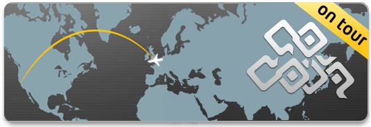
More exciting (and outlandish) is my prolonged visit to the United States from August 21st to September 10th. I’ll have a week of vacation with my girlfriend from Sept. 3rd to Sept. 10th, and the rest of the days I’ll be working on something fantastic. I’ll be in San Francisco during that entire time period, so if you live near, or happen to travel there, be sure to contact me. I really look forward to seeing San Francisco (and the US in general, I’ve never been there before) and all the designers and great companies that take up residence there. Vacation tips are, of course, also appreciated!
It was a real challenge getting my girlfriend on a plane, as paper tickets are no longer used, and her surname is too long to fit on an e-ticket reservation, Expedia refused to offer her any service (any. Really, I’ve been told by an Expedia supervisor that she just flat out couldn’t travel at all), but fortunately it appears that the airline, BMI, has been very kind with us and solved all the issues with the reservation. We’ll even be on the same flight back, in two adjacent seats. In the end, it even saved me several hundred euro’s. So a tip for all of you; just don’t use Expedia.
That’s it for this short notice; I’ll be updating the blog soon with more released projects and work, and I’ll probably do a few posts from these two trips too, so you can stay informed of my adventures. I hope to see you there!