27 May
   Filed Under: Announcement   

Why 102? I don’t know, when I hit 100, I really had something to tell. And 102 is a nice number too, not too overused like the overrated 100. Wikipedia states: “The sum of Euler’s totient function φ(x) over the first eighteen integers is 102.” That’s great.

No, really, I just wanted to commemorate what this blog (and more specifically, the people reading and visiting) has done for me. It’s incredible. Before I started the Cocoia Blog, I was not really into blogs – in fact, the term gave me shivers. It sounded like an over-hyped term of people spewing completely irrelevant stuff on free accounts offered by many platforms boasting Google ads.

And although there is a truth in that, since I picked up blogging because I thought I had something to put my thoughts in for a select group of visitors. Alienbinary’s journal (something now long since offline) was a place where I read the thoughts of someone, just an American guy in young years, over a few years. It was a pretty well-kept journal, and he was very elaborate and well-articulated in expressing himself. His writing about a first-generation iPod made me save up cash and buy a third-gen; I didn’t have too much to do with Macs then. His writing really influenced my life and made me reconsider, for years, how important words can be on the internet. Finding a site through some long sessions at night, and feel like you really have a connection with the writing is fantastic.

And thus, I started the blog after a while. I expected minorities of like-minded people reading, and no input at all. My thirteenth post changed a lot. After being a passive digg user, I submitted my first how-to, and it got nearly a thousand diggs. I got featured on podcasts, the news was spread through a variety of sites, and people were generally amazed at the notion that Macs were secure, but the defaults weren’t inpenetrable. I’m not saying insecure; they simply weren’t limiting avenues for attack. The second large uproar came when I announced two applications of my making. I got featured on Ars Technica, another slew of podcasts, and after a short while, the third large wave of publicity hit. I reviewed security in Leopard, and apart from several legal emails, my digg account got blocked, the story pulled off the frontpage (and later restored).

Since these major ‘publications’, the Cocoia Blog has become a very well-visited website. I pull off an average of 9500 visitors per day. I get a lot of e-mail, I got a product launched that got me even more traffic, and comment spam is taking astronomical proportions. Large companies and institutions flatter me with visits, inquiries, and sometimes even phone calls on my home number. What am I getting at?

This blog changed my life.

I never, ever could have conceived when I started this that I would come out a whole different person. I don’t feel limited in my posting, I don’t feel a sudden urge to put ads on my blog, not in that way. I feel changed and enriched by the experiences that it has brought me. And that could only be attained by my readers. Thank you. I hope I can make you stay with me for another 102 posts.

26 May
   Filed Under: Personal   

The stripped version of the feed has been replaced with one containing images and line breaks. Don’t go off duplicating the site, please. Delete the feed in your reader to re-sync. Some RSS apps may pick up on the change, but Vienna doesn’t. Hope this fixes your problem, Jo.

26 May
   Filed Under: Personal Work   

I came, in my stumbling around for iPod innovation, across this neat snippet of code. It’s by Keith Wiley, who also has a method on his site for trapping fourdimensional objects and counting to 1023 on two hands, and 31 on one. I think he’s awesome already, big credit to him. Now, on to the code.


You will have to pick around some of the Mac-graphics-specific details, but the general math is the same. Note that my code produces final rgb values in the range [0-65535], not [0-1] or [0-255]. Adjust to your requirements. Sorry for the lack of commenting.

What does this do? Well, it essentially reverses everything iTunes does when it stores images on your iPod in the opaque ithmb format. This snippet of code ‘decodes’ the interlaced images of 720*480 (apparently, a TV format for the AV output), and there are a multitude of other sizes present in the files. What does this mean to me? Uh, I got to up the resolution of Timezones to let you be able to check it out in high resolution on a TV. You want that, right?

Now, actually, what I am going to do is reverse the coding of the tiniest thumbnail graphics – the one the iPod displays when you enter your Photo Library. You’ll see why, but it’s obvious that it’s usable for many cool things. I might open-source it.

Since the people at Macthemes already had the love, I have to share it with all my subscribers too. Man, I hope you buy in the next week, because you’ll get a beta invite for this;

timezonesonedotfive.jpg

Yeah, we’ve come a long way.

26 May
   Filed Under: Personal   

Random House, I don’t know why you are visiting, but I want to shout this at you guys.

donorshow.jpg

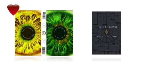
These books changed my life. First, I read House of Leaves when it came out (and I was a lot younger) and it shaked my world. It was the Dutch translation – which was disappointing to me, so I bought the American version for it’s incredible cover (shown above, right). Only Revolutions was the second instant buy. I got two versions of House of Leaves at home in the bookshelf and two copies of Only Revolutions. I was severely disdained when there was an artwork contest and it was limited to US citizens. Really, no, really, you guys hurt me with that.

Now, if you think about buying either one of these books, I’d go with House of Leaves first. If you aren’t interested after reading three chapters, drop the book, return it to the store. But I guarantee you, if this is your thing (I’d consider it a 60-40 chance in favor for the readers of my blog), you’ll be enveloped by it after a few pages. It’s a journey of a book, that I’ve researched and read with equal pleasure. It’s scared me out of my wits many times and sometimes made me become paranoid of the shadows in my house at night. Once you enjoy the book (I enjoyed it to a significant level after one read, but I have read it about six times now) I suggest buying Only Revolutions. It’s the first book I ever bought that made me cry.

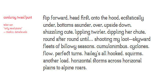
No, I’m absolutely serious. I don’t consider myself emotional or anything like that – I don’t cry for movies, never did, and generally don’t feel a lot for books either. And no, I didn’t cry because the letters get so small near the middle and you have to flip it over every 8 pages (if you follow the editor’s notes, that is… hint, hint), but because I truly got emotionally dragged along a fantastic tale, caught in the most incredibly beautiful words and phrases I have ever read. I used this line for a font specimen a lot (and damn, I just found out that all samples and source files of this font got corrupt and I got no backup!);

corduroy-onlyrevolutions.jpg

Corduroy was my first real font. It’s a sort of ‘poetry serif’; an aesthetic font for large text. I have a PDF sample still, you can download it here (4.3 megabytes). Unfortunately, as I said, I seem to have lost it for good. I never finished the capitals and some letterforms aren’t perfected either. If anyone is witty about it, you could notice the name is a reference to a mysterious object in the novel House of Leaves; Johnny Truant’s corduroy coat, of which buttons go missing at a certain moment (don’t want to spoil too much here). I’ve done a lot of work that has a theme of these books or one of them. I also had a series of posters made inspired by Only Revolutions, but alas, they too, are corrupt. Here’s one of them, the resource fork being the only thing a proof it ever existed (oh, and a print, yay)

Picture 5.png

Now, that’s it for Random House love. I really appreciate you guys publishing Mark’s work.

25 May
   Filed Under: Unfiled   

4 days overdue this month, but here we are.

To all people who are also developing for OS X, this may give some insight. I had gotten some emails of developers asking about the whole UI design and how it all works under the hood. Being a designer that also knows technique, I happily show some things that helped me a lot. Grab some coffee (or hot cocoa) and follow along in the exciting world of Mac UI design.

On the Mac, Apple is the leading party for developers to look at because they define the ‘rules’ – more than often, Apple comes with nice interface ‘standards’ that the aging years-old interface guidelines do not include. An example are the now ubiquitous ‘HUD’ panels. Black and transparent and known best as ‘the iPhoto adjust palettes’, Apple introduced then, and developers followed suit. If it comes to other things that spice up interfaces across the board, it’s not a bad thing to just go rummaging around the insides of the interface. F-Script Anywhere is just built for this.

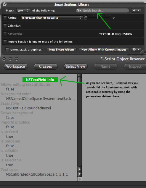
As an example (and request), I will take the dark search box in Praetorian. Most OS X search boxes have the same look; the black loupe, grey or black text on a white round beveled text field. There is an obvious class whose documentation is worth looking at, namely NSTextField. You can define a lot of parameters on the NSTextField, but it’s much more fun to take a look at how Apple does it. Time to whip out Aperture, the dark interface-toting chunk of UI goodness for RAW workflows and other photography work.

aperture.jpg

Apple does some nice things here. They have made some custom classes for this, subclassing NSTextField and doing a really nice job making it all consistent. The same goes for the sometimes stingy NSTableViews – take a look at how people do it. There’s Google Code, the Mailing Lists, Cocoadev and open-source projects. Shiira, as I mentioned before, has an excellent open-source framework for HUD panels and everything that goes with it (also with a custom implementation of a black NSTableView). Apart from documentation, what is done in practice is often an excellent way to know how the experts do it, and where you can innovate or, even better, know what’s not worth your time.

Now, all this talking about interfaces could make you curious why another application I make, like iSight Expert, is very ‘conventional’; a unified interface with many features reminiscent of other Apple apps serving similar functions. That’s because it’s a very straightforward application oriented towards a casual purpose. People don’t use just -that- app, it would be a desktop citizen every now and then. Praetorian is a very primary app, it is a workplace that is prominent and serves an abstract purpose. When it comes to something so abstract and touching on the technological side of computers, it can scare your non-expert potential customers. A custom interface with unique features will help overcome a lot of the problems such applications are inherently confronted with.

interface.jpg

This custom interface is not only appealing, it incites curiosity and if it’s not too involved and complex-looking (like Praetorian), most users will be interested. It’s important to lower the bar when it comes to giving users control over their network and taking steps in securing their assets. Now, if it’s made easy, I am all the happier.

And that’s what UI design is all about. You need to find and embrace conventions, because users will be able to use their intuition. You can use or create the many standard third-party buttons and interface graphics because they are in the public domain and free to download, often with sample code. There are many things you can communicate with the interface and it’s graphics, and (especially on the Mac platform) for users, it’s the biggest part of the program. Arguably, functionality is the most important thing to a user; but it’s the interface that lets him gauge the functionality beneath.

In line with Leopard, I am doing a lot of work preparing application interfaces and graphics for the true resolution independence by system scale factor and redoing icons (or making totally new graphics) for the higher resolutions. Since I am a student, I’m happy to help out a lot of projects with this exciting time were are entering. Expect more details on this on the Cocoia Main site very soon.

24 May
   Filed Under: Personal   

You know, I actually made my first real own lolcat. It’s at the end of this post.

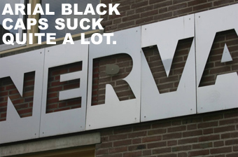
I study at an Art Academy, here in the Netherlands. I am sure that gives you a very glamorous idea of how things would look, stylish and thoughtful design and all – but I have to disappoint you. Take a look at this.

arialshit.jpg

First of all, it’s not just Arial Black we are using here. This facade actually cut plates of metal with a laser, for a lot of money, and out of a major list of typefaces, went to great lengths to pick… Arial Black? And what’s up with the CAPITALS? It’s absolutely horrid and disgraceful for any Art Academy. Because I hate it so much, I made a list of reasons why I hate it;

  • It’s Arial Black in capitals.
  • It’s Arial Black in capitals.
  • It’s Arial Black in capitals.
  • It’s Arial Black in capitals.
  • It’s Arial Black in capitals.
  • It’s Arial Black in capitals.
  • It’s Arial Black in capitals.
  • And, the most important reason of all…

  • It’s Arial Black in capitals.
  • Also, notice the beautiful dislocated inner negative space of the ‘R’. I have found many to agree with my opinion that this should be torn off the building overnight. I happily quote the most influential figure amongst them;

    VACUUMCAT.jpg