


4 days overdue this month, but here we are.
To all people who are also developing for OS X, this may give some insight. I had gotten some emails of developers asking about the whole UI design and how it all works under the hood. Being a designer that also knows technique, I happily show some things that helped me a lot. Grab some coffee (or hot cocoa) and follow along in the exciting world of Mac UI design.
On the Mac, Apple is the leading party for developers to look at because they define the ‘rules’ – more than often, Apple comes with nice interface ‘standards’ that the aging years-old interface guidelines do not include. An example are the now ubiquitous ‘HUD’ panels. Black and transparent and known best as ‘the iPhoto adjust palettes’, Apple introduced then, and developers followed suit. If it comes to other things that spice up interfaces across the board, it’s not a bad thing to just go rummaging around the insides of the interface. F-Script Anywhere is just built for this.
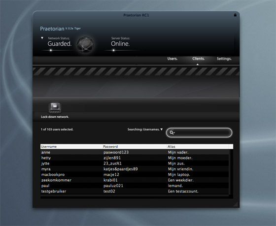
As an example (and request), I will take the dark search box in Praetorian. Most OS X search boxes have the same look; the black loupe, grey or black text on a white round beveled text field. There is an obvious class whose documentation is worth looking at, namely NSTextField. You can define a lot of parameters on the NSTextField, but it’s much more fun to take a look at how Apple does it. Time to whip out Aperture, the dark interface-toting chunk of UI goodness for RAW workflows and other photography work.
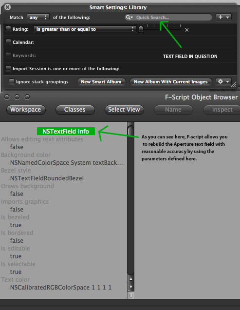
Apple does some nice things here. They have made some custom classes for this, subclassing NSTextField and doing a really nice job making it all consistent. The same goes for the sometimes stingy NSTableViews – take a look at how people do it. There’s Google Code, the Mailing Lists, Cocoadev and open-source projects. Shiira, as I mentioned before, has an excellent open-source framework for HUD panels and everything that goes with it (also with a custom implementation of a black NSTableView). Apart from documentation, what is done in practice is often an excellent way to know how the experts do it, and where you can innovate or, even better, know what’s not worth your time.
Now, all this talking about interfaces could make you curious why another application I make, like iSight Expert, is very ‘conventional’; a unified interface with many features reminiscent of other Apple apps serving similar functions. That’s because it’s a very straightforward application oriented towards a casual purpose. People don’t use just -that- app, it would be a desktop citizen every now and then. Praetorian is a very primary app, it is a workplace that is prominent and serves an abstract purpose. When it comes to something so abstract and touching on the technological side of computers, it can scare your non-expert potential customers. A custom interface with unique features will help overcome a lot of the problems such applications are inherently confronted with.
This custom interface is not only appealing, it incites curiosity and if it’s not too involved and complex-looking (like Praetorian), most users will be interested. It’s important to lower the bar when it comes to giving users control over their network and taking steps in securing their assets. Now, if it’s made easy, I am all the happier.
And that’s what UI design is all about. You need to find and embrace conventions, because users will be able to use their intuition. You can use or create the many standard third-party buttons and interface graphics because they are in the public domain and free to download, often with sample code. There are many things you can communicate with the interface and it’s graphics, and (especially on the Mac platform) for users, it’s the biggest part of the program. Arguably, functionality is the most important thing to a user; but it’s the interface that lets him gauge the functionality beneath.
In line with Leopard, I am doing a lot of work preparing application interfaces and graphics for the true resolution independence by system scale factor and redoing icons (or making totally new graphics) for the higher resolutions. Since I am a student, I’m happy to help out a lot of projects with this exciting time were are entering. Expect more details on this on the Cocoia Main site very soon.
Apart from the obvious blackness of it all – I’m sure I couldn’t convince you, at this point, that white on black is bad and tiring, but black on black in the title bar? – the thing that stands out most to me is actually the non-standard use of full stops at the end of captions. I suspect that users will tend to notice that there’s something odd, but not notice what. Was this a concious decision? (Obviously most of your decisions are very concious and deliberate, but – no offense intended – your English is a bit unpolished, so that could be an oversight. On that general topic, “Guarded†is a bit of a weird choice of words.)
From a functional point of view, the list of visible passwords bugs me. At the very least, seeing passwords should require an admin password to be entered, along the lines of Keychain Access. This at least reduces the chance that someone might walk past and see them.
But really, having user passwords available to the administrator at all is bad and wrong; all the admin needs is to be able to reset the password as necessary. Users tend to reuse passwords, no matter how much you tell them not to, and entrusting admins with access to users’ passwords is thus a clear security problem. I suppose this could be a flaw in the underlying protocol, though.
I wasn’t, at the time of taking the screenshot, able to reverse the title bar color. It is now, however.
The basic idea behind RADIUS is that it does store passwords in cleartext – therefore, most knowledgeable users will be able to read the users file with administrator-level privileges. However, I do not let Praetorian run with admin-level privileges, and I wouldn’t have come this far if I would put all sensitive material in a list.
Praetorian uses Core Data. The interface you see here, is the hard work done and the data views (the tableview, the search field, etc.) made with rapid prototyping. I have a special password assistant for the full version that takes all the work out of your hands and works with the regular system-wide ‘password assistant’ and keychain.
You might also notice the ‘clients’ section doesn’t work and is actually a copy of the ‘users’ custom view, but that’s beside the point. I wanted to illustrate the interface and put it out there.
However, my readers can convince me anything. I -do- have ethical questions not abiding by HIG’s. I have my doubts about my own dark tableviews (all previous builds had ‘normal’ tableviews). The interface also takes a generous slice of the time going into the project, but I don’t feel like it’s wasteful – if I ever have to dump it and go with unified metal, then ah, we’ll just make the assistants pretty ;).
On a side note, my awful English is hopefully something that will be resolved in the beta’s and localisations where I will be having a venerable army of grammar nazi’s to my disposal (not implying that you are a grammar nazi, but it’s come up before in contexts like ‘Stop using ‘it’s’ for possesive, for god’s sake!’).
Thanks a lot for the input based on solely a screenshot. If you want in on testing, just let me know. I appreciate your feedback a lot..