17 Jun
   Filed Under: Interface Design   

When I watched this movie earlier today, which Craig linked to on his Twitter page, I once again thought about how much it can hurt usability if you consider your users to be (far) more ‘intelligent’ than they actually are. Everyone who’s in the field of designing particular software interfaces (and even icons) requires at least one idiot to ‘proof’ his work.

Hire an idiot

If you take offense at the term ‘idiot’, I apologize. To clarify – if it hasn’t been clear to you from my first sentences – when I say ‘idiot’, I actually mean the least ‘intelligent’ and/or computer-familiar class of users this particular product has.

“This isn’t news,” you say, “Surely, everybody takes into account end-user stupidity, and Apple, for instance, is a nice shining example of making stuff everyone can use.”

Really? I invite you to a short look at of the wonderful app that is iPhoto ’09. Most user friendly software ever, right? I gave it to my parents in law so they could edit, manage and share their pictures. Sharing is obviously an important aspect. Personally, I love iPhoto. Makes stuff so much easier.

Let’s say I want to make a slideshow. “Bah, easy!”, says iPhoto, “you only have to click the self-descriptive icon in my toolbar from any collection of photos and off you go.”. Sweet! That makes for an awesome slideshow. Now I’d like to share this particular slideshow. Where do we go now?

My spouse, who is far from computer-illiterate or an actual idiot, had asked me how I could export slideshows, and although I hadn’t ever done it, I was sure it was possible. “Hah, that’s easy!”, I exclaimed, making a fool of myself. It took me a solid 10 minutes to find it. I was the idiot.

“Ah, the share menu!”, I thought. Bzzt. Wrong. Not there. Easy way out: I tried to use the Help menu to search for ‘Share’ and ‘Slideshow’. Bzzt. Sorry, no sharing here. A few of these harsh lessons later, I was still utterly stumped. I kept searching and trying seemingly unrelated things, fearing the worst for my perception of iPhoto as being so friendly to the computer-illiterate.

the dialog

Spoiler: the iPhoto slideshow exporting is hidden in… the File menu. Nope, not in Share, not part of any particular UI related to your current collection or slideshow, and not part of anything in the actual slideshow editing UI either. It’s in the ‘File’ menu. You have to click ‘Export’, and then select the rightmost tab, which reveals a quite nicely designed UI. Right next to ‘Import from Library’. I bet that doesn’t import slideshows, though. But who knows?

Everybody makes these mistakes. I won’t heckle any single party over this: this iPhoto annoyance is a mere example. It’s more important to acknowledge it when you made them, and rethink how you go about working with the extremely varied ways people interact with your product.

And perhaps Apple needs a few more idiots around.

06 May
   Filed Under: Commercial Work, iPhone, Software Releases   
groceries

With its .99 dollar sale price and upcoming 2.0 update, Groceries warrants a blog post. I’ve worked with Sophia to make a few icons for this great, polished iPhone app. I can’t go to the supermarket without it anymore.

If you’re not so sure about why you’d want to have a shopping list application on your iPhone, you can do what I did; go through your iPhone notes and discover a few dozen old shopping lists, and then reminisce about that last time you were in the store and wanted to add something to the list. Kind of annoying, isn’t it? Groceries has almost all possible items you can encounter while you’re out shopping in its database, and lets you add them to the list with but a few virtual keystrokes or taps.

Grab Groceries (link opens iTunes) for $ 0.99 during its sale.

And yeah, doing some testing of layout features of Cocoia Blog 3.1 here. If you see general weirdness ensue, please bear with me or report the weirdness to me via Twitter or email.

16 Apr

Currencies by iPhone app maker Edovia (known from Apple TV ads featuring Rocket Taxi) has been submitted to the App Store. It was a real joy working with Luc on this simple, straightforward, yet powerful currency converter.

blog

I’m not sure about you, but before I had a build of Currencies on my iPhone, I used Google for my conversions between ten and twenty times each day (thanks to American clients and my love for Japanese collectibles). I am very happy to have something much more elegant now, and I’m eager to see this application hit the App Store to read user feedback.

It’s available right now, for $0.99 in the App Store: Click here to go open iTunes and go straight to the application page.

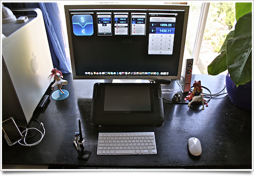
While working on Currencies, I also made some images of my new workspace. I get a lot of questions over email or twitter about the way I got my desk set up, and it’s been moved in such a way that I can now fully enjoy this year’s summer season without having to suffer ‘withdrawal symptoms’ from not being with my dear workstation. I got some really neat Japanese figures and mecha set up on it (some from Japanese clients), which I will blog about sooner or later.

workstation

Click here to go to Flickr and see more images of the figures and angles of the workspace. This setup with the Wacom Cintiq is really enjoyable; I can just put aside the bluetooth keyboard and (not-so-mighty) mouse and then just draw and doodle at my leisure. Splendid.

25 Feb
   Filed Under: Interface Design, Software Releases   

The future of web applications is bright. While I use Adobe’s applications a lot daily, I’m by no means a fan of their overpriced and badly designed products. That’s exactly why I am so pleased to see a product like 280North’s Atlas, a type of Xcode / Interface Builder for Cappuccino, their powerful web application framework.

Currently, very intensive, desktop-quality web applications either use Adobe’s Flash, or a very barebones interface that works using Javascript and HTML. I love the latter approach; standards compliant, plugin-less applications fills my heart with joy. It wasn’t really desktop-quality, though, and this is a huge step in the right direction.

I’d love to see web applications like Aviary’s created in this; the Flash plugin makes these great applications sadly unusable on a Mac.

24 Feb
   Filed Under: Apple, Interface Design, News   

Well, another day, another major browser beta; Safari 4 went public beta today, with a lot more UI changes and additions than we’d all expected from the limited developer preview that was released months ago.

picture-8

Notably, Safari adds tabs to the top of the window (seemingly ‘aping’ Google’s Chrome, which isn’t out for Mac yet) and several new features for visual browsing (nevermind my own ‘top sites’; I haven’t used Safari for months). It sort of took me back for a second to the time where I mocked up the ‘dream browser’.

Using it casually, I found there’s also some other, more subtle changes and additions that made me really enjoy giving this beta a spin, and perhaps will sway me into using Safari a lot more (provided I can find a working Adblock extension).

Continue reading…

26 Jan
   Filed Under: Commercial Work, Interface Design, iPhone, News   

How very awesome it is to see this on Apple’s website (and possibly on TV!). You can read about the design process of Classics here.