


I didn’t intend to write a single letter on my blog before the impending redesign of all my websites, but here I go anyway; today, Phill Ryu and Andrew Kaz opened the doors of the website of Classics, a great new iPhone application that will be out soon. I was honourably tasked with designing the interface, website, and a book together with the awesome David Lanham. Classics offers a gorgeous, tactile experience for reading some all-time literary classics (hence the name), with a sturdy collection of literature that will be expanded with updates in the future. Read on for some great images of how the interface (and icon) developed as time progressed, and some bonus images of my alternative Flatland cover designs.
It was the 12th of September of this year, when I was sitting at home designing a great user interface concept for a desktop app, and Phill contacted me. He told me all about this new project, and we soon found out we were definitely on the same frequency. It’s interesting to see how such an app starts out; at first, we had this clean slate to work off of, and after a mockup session for the ‘reading view’, the idea started to take wings.
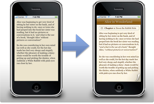
I designed a set of interface mockups for Classics right before I went on my trip to San Francisco. David Lanham took my mockups and created a beautiful, toned down color theme and a set of adjustments that made the interface a gorgeous whole that is very pleasant to read in. Real-life testing was an important part of the application; users could be lying in the park grass reading a book on their iPhone in the bright afternoon sun, and if they are, they should be able to still read pleasantly without having to squint an eye or going indoor and looking at an interface that’s completely black on white. In the end, we got a beautiful interface together that just worked beautifully on the high resolution iPhone screen, and I think I speak for everyone involved when I say that I’m very proud of the way the interface turned out.
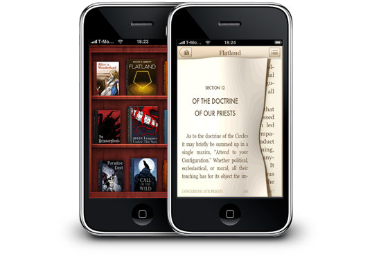
Then there’s also the part of the app most people contact me for, the icon. I only designed a suggested alternative icon for Classics (the middle icon in the image below), as David was creating a set of concepts. Here’s some of the icons we went through; we eventually settled with the bookshelf David designed (although a more polished version than the one shown here).

I really like the way the icon looks on my home screen, and I must admit that although I liked the simple concept of having just a book as the icon, the shelf works better as the bookshelf is really the ‘face’ of Classics. It’s also a joy to use; scrolling it up and down and rearranging all the books is a lot of fun, and it’s very snappy.
I also designed a set of covers for Edwin A. Abbott’s classic braintwister ‘Flatland’, one of my favorite mind-expanding books. Flatland is the life story of a square in a truly twodimensional world. He explains his world, and he eventually finds other worlds like ‘Lineland’, a one-dimensional world, and ‘Spaceland’, a three-dimensional world. It’s very powerful, as it can have you thinking about the possibility of a fourth spatial dimension or the implications of life in a world where there’s only two. Definitely a worthwhile addition to the Classics collection of books.

It was a lot of fun laying out the typography inside the book and designing these accompanying covers; While I got a lot of feedback about these covers, most people really liked the rightmost one, which is the one that made it onto the shelf. You can see it on the website now.
As you can see from the end result, Classics boasts an impressively subtle interface, that’s still very attractive, and is perfectly suited to reading text in any situation. The great aspect of reading in Classics is what Phill called the ‘tactile experience’; users can flip the pages with their fingers, making reading a book feel a lot more realistic and natural. It may sound gimmicky at first, but if you actually use the application, you’ll discover how pleasant it really is. I’ve been reading a lot for all of my life, and Classics is really the natural evolution of reading to me. Without having to lug around a bag of my favorite books, Classics offers me a gorgeous shelf of literature that I can read on the go, in line at the grocery store, or in the warmth of my home with the cat curled up on my lap. Even the most avid bookworms will find the iPhone a great platform to read books on now.
Classics will be available soon on the Apple App Store; you can take a look at the website me and David designed here to subscribe to the information newsletter and get notified when Classics is released! Also, don’t forget to digg it!
Very interesting and informative, although between you, me and the lamp post, I still prefer your app icon; it’s more rustic! I look forward to the release.
I’m so glad that Flatland is going to be in this! And it looks beautiful!
Kudos !
Gorgeous interface, classic books, I’ll definitely buy it as soon as it’s out !
Beautiful work; is there support for reading with your iphone turned 90 degrees?
Absolutely stunning. Great work. I especially love the page turn, the bookmark, your app icons and the shelf.
Great work as always.
Excellent job! Oh and can you make it possible for all and any ebooks I buy anywhere to be compatible with classics? After looking at this, any other ebook-reader feels completely obsolete!
: )
I may actually start reading again. Looks great!
Ha! That’s why we didn’t have any other blog posts for the past month :-P
Looking great man!
This looks application looks awesome. Great blog post. Looking forward to trying it out.
Classics looks impressive, with a more inviting interface than the conventional text readers on Apple’s App Store.
Looks good! I’d also like to see it be able to read the book to me. Maybe highlight the words as it goes and stop at the end of the page. I work in assistive technology and support kids who benefit by seeing the word while it is read to them.
Great design all around!
From everything I have been hearing, most people are not ready to read extensively on any ebook reader format. Maybe this interface will help.
I have been an early adopter of ebooks. I have an extensive collection of ebooks and have nearly eliminated paperback novels. Other books seem to require a larger format and color if they contain any images.
I started with the RCA REB1200 (color) and went to the effort to use independant tools for creating personal content that allowed me to reformat non-compatible formats for use in the REB1200. Fictionwise came along and provided formatted content so I gathered up many titles from them.
I also used Mobipocket on my iPac PDA and later my Treo. I really liked the mobipocket formatting and tools for adding contemt. I also used eReader but felt Mobi was better.
Now I have moved on to the best format, the iPhone. When Fictionwise brought the eReader to the iPhone, I now had the perfect access to my purchased content and a great reader. I do find the iPhone to work really well for reading and I never experience eye strain that some fear. I must admit that there are times that a larger format reader is preferable but it is hard to beat the convenience and the fact that it really does work well.
Back to your new app… the idea of classic books (from guttenberg I assume) really has limited appeal and use. At some point you also need to be able to use the reader for new works. Are you intending to create a program that will allow us to add our own content? It would need to be able to allow conversion of text or html format into epub at the very least? I will gladly buy one if it has as great a user interface as it appears you have been able to produce for Classics>
Bret
One thing I noticed- it looks like there’s a header displayed at all times, which means less space for text. On a screen as small as the iPhone’s every line of pixels counts.
Have you considered something like what Stanza does, where the header gets hidden while you read a given page?
I agree with Kim’s comment. Your preview movies show a very small number of words per screen. I stopped using the NYTimes reader app when I realized the web view of the same site showed twice as many words, which makes for far better reading and less flick, flick, flicking.
Also, I noticed the page animation, while nicely done, is going to teach thousands of people the wrong way to turn a page. The curling upper right corner is not a cliche, it’s the correct way to read a precious old book :)
This app may finally get me to buy an iPhone. It loooks magnificent. Finally a little elegance and style in the world of Apple.
The Flat Land book covers look amazing. It sounds like an interesting story as well, I’ll have to look it up. What’s this awesome user interface you were talking about first?
It’s great work beloved son! your dad
it looks awesome what you’ve made! Excellent as usual, I am proud of you! your mom
Eagerly awaiting for your product. But pretty please: Make text searchable! (and in lieu of copy-paste in the iPhone… how about “Mail this excerpt” feature?
love the icons and the page turn. great job!
Dag lieve broer! Ik doe het lekker in het nederlands, mag wel he? Wat ziet het er mooi uit wat je hebt gemaakt! Je vertelde er laatst al wat over en ik vind het heel mooi! Vooral dat icoontje met de boekjes erop vind ik mooi, ook al heb jij die niet gemaakt ;).
Kom je snel langs in Zwolle om mijn mooie huisje te bewonderen?
Liefs
If you liked Flatland, you should really check out the Planiverse. Same concept, infinitely better execution. Instead of having talking pentagons, Dewdney actually tries to design a plausible biological 2D organism. It’s fascinating. And it actually had a good plot. You can look inside at Google Book Search: http://books.google.com/books?id=wIzwyzHSrL4C
Beautiful design, but the first word of Paradise Lost is “of” not “if”. “If” makes no sense.
Ian
I use Stanza quite a bit, and have found that the simple “tap” interface makes using the application a lot easier than doing a swipe across the page.
While a swipe may be more in keeping with the feel of a real book, in actuality turning pages in a physical book can be one of the more exasperating aspects of it’s “interface”.
A single tap on the left or right side of the screen is simple, quick, and easy. It also makes it much easier to read one handed, like when you’re reading curled up in bed or eating lunch.
Further, on an iPhone the screen is relatively small, which means that the user is going to be “turning” pages a lot more frequently than would be normal with a real book. Which means that efficiency and speed should be a major consideration.
In short, there’s such a thing as carrying the metaphor too far, and failing to design for the device in hand.
If you’re that insistent on providing an actual book reading experience, why not make some pages need two or three swipes to turn the page? Or use the accelerometer to make a few pages flip back when you shift position?
Michael,
Thanks for your comment. We shared your ideas about tapping, so you can also tap the left or right regions of the screen to quickly advance to the next page. Sliding, however, is a fantastic experience, and is very pleasant for short reading breaks.
In regards to your ideas about device-specific multi-touch and accelerometer interface ideas; we’ve discussed them, but seeing we wanted to focus on getting this out there, and making sure its core functionality was superb, we have postponed any plans for that for a later release. Also, several of these ‘gestures’ might not be immediately obvious upon seeing or using the interface. No mystery meat here! :)
The last paragraph was meant to be humorous, as having pages stick together and/or having the book flop closed are some of the less pleasant parts of the real-world experience.
BTW, have you considered scalability? An open-faced real-world bookshelf metaphor works well for a dozen or so books. After that it simply becomes a pain.
I had a HP iPaq PDA that once had about a hundred ebooks on it. Stanza on the iPhone currently has 17. The Gutenberg library has thousands.
Searching, browsing and rearranging by type, title, author, all are advantages ebooks have over their real-world counterparts.
Many thanks for the latest version. What a pleasure.
The app works great and looks even better! Need more books though..
Great examples of great design. Thanks.
Nice post. Thank you for the info. Keep it up.
beautiful job on classics.
Correct the link to the http://www.classicsapp.com website. It currently points to a 404 of your own domain.
Great reader, but would it be possible to make it read PDs?? I can’t believe there’s no solution for that yet on the ipod/iphone.
Just writing to say how appalled I am that Apple completely stole the Classics user interface for the new iPad “iBooks” store. Classics set the standard for book readers on the iPhone. For Apple to have just lifted it without credit (or compensation) is very bad form.
— mm
Beautifully designed. It gives you the geuine feeling of reading a book. Suggestions: having the title page as the cover of the book.
The ability to add your own books.
Great work.