The day has come, and Icon Resource, the biggest project I’ve spearheaded since the start of my own company has gone live. You can now go to the Icon Resource website to watch a sample video, read more about the contents, or acquire your access to the polished Icon Resource member area.
Although a bit earlier than I wanted to announce this, an inside scoop on the latest Mac Developer Roundtable forced me to put up at least something. IconResource is my biggest new project.
What’s IconResource? It’s a video series aimed at intermediate computer users (no Photoshop knowledge required), and aims to teach you about the theory and techniques of icon design. Basically, it teaches you A-Z how to make icons, directly from the source. To get a good insight into its ‘features’, visit the preliminary website.
A select amount of individuals have already been invited to ‘sample’ the videos before release, and I will adhere to my March 26th release to the public. Pricing will also be announced at that time.
For now, don’t hesitate to leave your feedback on this great new endeavour Cocoia is embarking upon!
I had some Q&A on Latitude, my Dream Browser, on Bernie Zimmerman’s site, Browsersphere. Check it out if you want to read the answers to some questions and misconceptions people have.
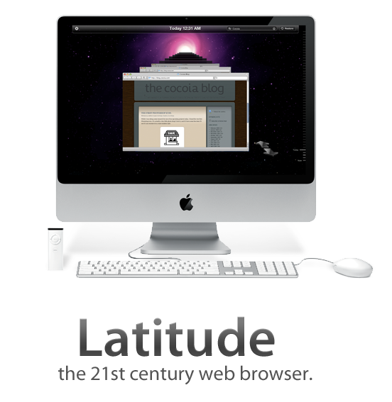
It’s been a while since I released the first mockups and some explanation behind my ‘Dream Browser’. Several developers have contacted me with the desire to develop it, and some have already actively begun programming whole aspects of it. I’m very pleased with the activity, and to help the efforts, I have decided to create a design document and a centralised website to manage the project development. There’s also a working name; Latitude.
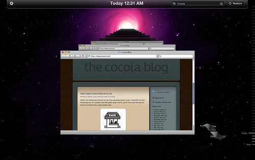
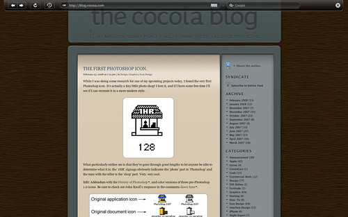
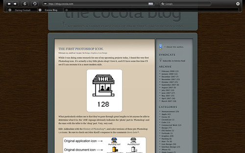
For now, I have created some mockups of the full-screen browsing mode, with an automatically hiding toolbar and an image with a roughly mocked up set of tabs for the full-screen mode. Additionally, I’ve made a mockup for the history feature, activated with the ‘Time Machine’-like, which also shows the ‘expanded’ mode, which is quite similar to how Safari looks.
To get some critique and mostly misunderstanding out of the way; one of my primary goals in this browser interface is to minimalise the amount interface clutter, although it may not seem that way. I don’t want to eliminate tabs or add some sort of permanent sidebar; a browser should still be usable as we use it today. However, having multiple sidebars, menu’s, or even full overlapping views that are opened with widgets that are in wildly varying positions in the interface. This browser, as I outlined in the previous post, uses a sidebar to consolidate various features that are now scattered throughout a browser, and helps to reduce clutter by also adding elements like the conventional ‘tabs’ to the sidebar. The ‘expanded’ viewing mode, as shown in the ‘history’ interface mockup without a sidebar active, will be your preferred state for viewing content.
I’ll update this new category when the document finishes or to keep tabs on community activity. Thanks for all the input and hard work so far!
I got inspired by the iTunes sidebar today to mock up a browser interface that I had thought about for the last few weeks. In iTunes, a ‘hub application’ approach is taken to music and video content, simplifying and streamlining the experience from acquiring content, to organising and viewing it. I am aware of several ‘new generation’ browser projects, but none really line up with my ideas.
Let me show you what I came up with.
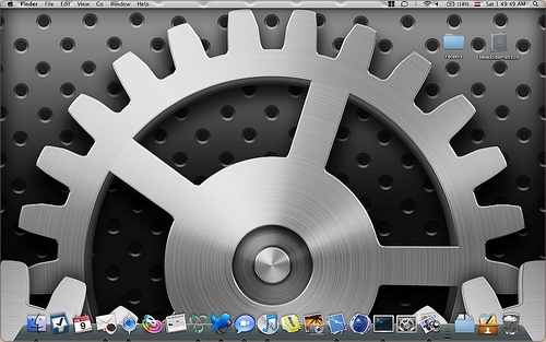
Since my office walls are awfully empty, I decided to design one of my favorite Mac OS X icons by Apple at 2 by 2 meters. Although the Photoshop file got awfully big (the original is rendered, but I redid it in Photoshop), it works pretty well as a wallpaper. Making it took about a day and a half (I haven’t worked on it ‘full-time’, as I’ve got client work too) I’ll post new pictures in this post next Tuesday when I expect the print to be put up in the office.
For now, check out the wallpaper version preview at Flickr.


