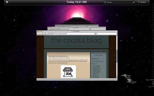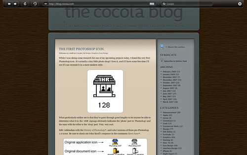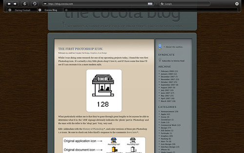
It’s been a while since I released the first mockups and some explanation behind my ‘Dream Browser’. Several developers have contacted me with the desire to develop it, and some have already actively begun programming whole aspects of it. I’m very pleased with the activity, and to help the efforts, I have decided to create a design document and a centralised website to manage the project development. There’s also a working name; Latitude.
For now, I have created some mockups of the full-screen browsing mode, with an automatically hiding toolbar and an image with a roughly mocked up set of tabs for the full-screen mode. Additionally, I’ve made a mockup for the history feature, activated with the ‘Time Machine’-like, which also shows the ‘expanded’ mode, which is quite similar to how Safari looks.
To get some critique and mostly misunderstanding out of the way; one of my primary goals in this browser interface is to minimalise the amount interface clutter, although it may not seem that way. I don’t want to eliminate tabs or add some sort of permanent sidebar; a browser should still be usable as we use it today. However, having multiple sidebars, menu’s, or even full overlapping views that are opened with widgets that are in wildly varying positions in the interface. This browser, as I outlined in the previous post, uses a sidebar to consolidate various features that are now scattered throughout a browser, and helps to reduce clutter by also adding elements like the conventional ‘tabs’ to the sidebar. The ‘expanded’ viewing mode, as shown in the ‘history’ interface mockup without a sidebar active, will be your preferred state for viewing content.
I’ll update this new category when the document finishes or to keep tabs on community activity. Thanks for all the input and hard work so far!


That looks really great. Good work!!
One word: Wow.
I really hope something comes out of this.
Ooooh, very nice!
Imagine though, if the “Time Machine” view tied in with the Wayback Machine AKA archive.org – that would certainly be a killer feature :)
Speaking of, at the moment I use it through this simple, clickable bookmarklet:
javascript:location.href=’http://web.archive.org/web/*/’+document.location.href;
Gorgeous !
A witty name, a desirable full-screen, a sober look, clearly simple… just perfect.
Well, now, will it be run by Webkit, Gecko or something else ?
Will it be affordable (since browsers are strongly needed piece of software as stated in “my dream Browser” post), even free ?
It seems like a full-screen browser history could be rather annoying, and I don’t really think the time-machine UI would work well for display browser-history..
I’ve only been browsing for 30 minutes, and my history already had about 100 pages in it. Having to flick though hundreds of pointlessly animated windows in TimeMachine will be really slow.
The hierarchal history makes far more sense (although displaying thumbnails of the pages would improve this) for anything more than the previous few pages.. And using a full screen TimeMachine view for the browser back/forwards buttons would be.. rather obnoxious.
One other thing – a feature people never seem to know about, but is fairly useful – If you click-and-hold on the Back button, you get a list of sites in the back-buffer (rather than having to click back 10 times).
Firefox displays this by splitting edge of the button, Camino displays a tiny little triangle, Safari completely hides it (as does your mockup)
Sorry this isn’t a “OMGWOWHAVEMYBABIES”-ish post, but hopefully some of the suggestions are of some vague use..
I think CoverFlow would work better for browser history.
time machine interface will be nice to see the history with ease
It seems like a full-screen browser history could be rather annoying, and I don’t really think the time-machine UI would work well for display browser-history..
I’ve only been browsing for 30 minutes, and my history already had about 100 pages in it. Having to flick though hundreds of pointlessly animated windows in TimeMachine will be really slow.
The hierarchal history makes far more sense (although displaying thumbnails of the pages would improve this) for anything more than the previous few pages.. And using a full screen TimeMachine view for the browser back/forwards buttons would be.. rather obnoxious.
Agreed. I am working on a mockup of ‘unfiltered’ history, which obviously requires some sort of categorisation. I think history within a single site or event works pretty well with this ‘linear’ interface, however, a more open interface is required for all the browser history. Coverflow would be just as useless, as the prime point is that you can see where that site you were at yesterday is, instead of having thumbnails overlap each other.
One other thing – a feature people never seem to know about, but is fairly useful – If you click-and-hold on the Back button, you get a list of sites in the back-buffer (rather than having to click back 10 times).
Firefox displays this by splitting edge of the button, Camino displays a tiny little triangle, Safari completely hides it (as does your mockup)
Yes, this should be more emphasised. It’s a very useful feature.
I would like de-attachable toolbars. That way you could drag some toolbar to another area of the screen instead of having to see it always up.
You really should find developer(s) to collaborate on this to make a real end-product.
It going to be a big hit, I think !
There is just so much Safari lacks. Safari is one piece of great browser but it’s not perfect !
god gawd, this is soooo sexy!!!
Dear Sebastiaan,
can you give us a rough roadmap of a first release (alpha, beta, etc.)…and….i would then really like to beta test the browser :)
Best regards,
Michel
You know, I just had an amazing idea? What if there was a browser history tool that keeps track of how pages change over time… I think I want to build such a tool!
The full screen mock ups are a revelation. I love the iTunes inspired side bar too.
I wonder, though, about the way the so many websites use a left sidebar, mostly to accomplish the same concept in much uglier and less effective manner. I wonder how the iTunes interface will make the entire frame appear with a site designed with a left sidebar. Will the nested left sidebars (the browser’s and the site’s) appear almost redundant and give it a off balanced ‘left-heavy’ feel?
Also, and this is just a plea from a dedicated Google Reader user, is there any way to allow syncing with Google Reader? So many poor souls are stuck with Windows and Firefox, or even worse, for a good chunk of the day.
I like the direction that you are going here.
I hope something comes of it!
In apple’s human interface guidelines, it talks about not reusing system icons in a toolbar in order to avoid confusing users as to what the actual system icon means. I like your idea for a more visual history, but I think using time machine as a foundation could be a mistake.
However, I really like your iPhoto-like full screen. I have actually been hoping someone would come up with that for a while.
Hi, you must work on apple design.. it’s perfectly what i like. Cool work.
MMMMMM, Could you hurry up and make it? I want it now! lol :-P
WOW! Almost similar concept of what I had visualized a year back (for, ahem, ‘windows’ though).
I would love to see this happen. :-)
Intelligent… Hope it will be developped… Bravo !
I want this browser! Apple! Pay attention! THIS is the way to go!
I think a web browser should be seen as a future information platform, and should be as easy use as a TV channel remote.
it’s really cool, and the side bar must be a revolution of web bowers, because lots of people are sick of tabs now…
Awesome. It’s great to see someone working hard on creative ideas that push the boundaries of what’s possible and further expanding our productivity and aesthetic comfort.
Lets hope it works as good as it looks.
impressive both visually and conceptually.
i’ve tried just about every browser released since the original mosaic. i’m looking forward to seeing this one released; it has the promise to revolutionize web browsers.
sign me up if you’d like someone to test this.
I love the autohide feature incorporated in the full screen mode; it would even be nice to have such a feature exist within the standard window as well that would give a seamless/borderless web viewing experience much like NicePlayer does with video.
Rolling over the reveal the titlebar/status bar.
Very cool seeing all these concepts mocked up, lts all hope this leaves the drawingboard.
Those mockups are incredibly cool. When this is released, I’ll have to think about dropping Safari altogether.
One thing I would like to see is searchable history. Perhaps you could have the browser capture meta tags from each site the user visits, the page title, and the search engine query used to find the site (if applicable), and have the user able to search all of these.
Wow, That was your dream Browser.. Nice look and feel.. Now its in My dream too !
If you need a tester. I would love to help you as i can. :)
The Timemachine look is just incredible. Hopefully there will be a beta out soon :)
Franky
This site is really a stroll-via for the entire information you wanted about this and didnÃt know who to ask. Glimpse here, and also youÃll undoubtedly uncover it.
I love this idea.
I too have some mockups of the “perfect” browser. I sat down and realised that safari has some nice features like reading list and history cover flow. Chrome is fast. Firefox is beautiful.
I really like your Full-Screen browser mockup ideas.
Want to see this developed!!
-regards Macuseri686