13 Apr
   Filed Under: Design, Personal Work   

Building further on my experiments with OpenGL.

abstract.jpg

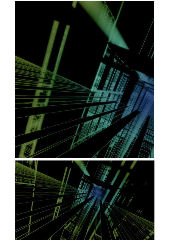
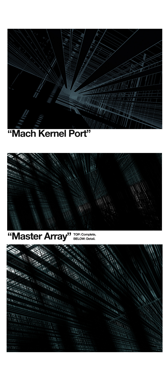
As you can see, some color modulation and a post-process blur with additive blending does give it an edge. It’s nice, soft, and scenic. It can output a cool 40 images per minute, in it’s current, raw form. I may push it out, once I get things working like ‘true’ 3d scenics with shading.

Because xyz (Nate) asked for some details on this, I’ll happily disclose some. My ‘script’ (it used Python first, now most of it is just bare C++ or Objective-C) receives random input from any source (say, you could pipe your chat log into it, or the contents of your favorite MP3) and processes it into various arrays of data. It then randomly selects values to assign to properties of a hard-coded array of 3d objects, e.g. cubes, planes, and lines and their X, Y, Z positions and distortions. Most data, not being really random, create interesting patterns from strange perspectives. It uses basic lighting for every (simplified), depth testing for overlapping shapes, and depth-of-field (limited and simple). Overall, it looks landscape-like, or like it’s some sort of room or space. I think most outputted images are pretty much industry-grade, I made a mock-up of one of the generated images as a book cover.

book.jpg

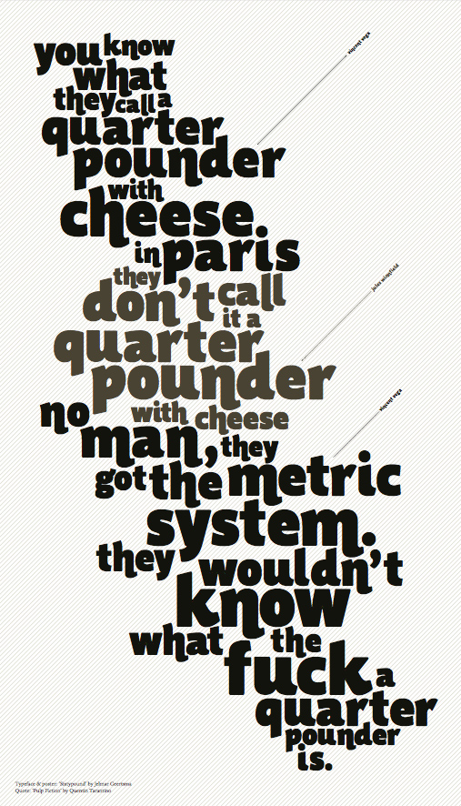
For now, it’s just an experiment. Some other cool graphic stuff from my classmate, Jelmar. He’s working on ‘Sixty Pounder’, a great characteristic ‘fat face’ for expressive messages. As quoted from Jules & co;

jelmar.jpg

Jelmar, and me, of course, enjoy feedback like Nate’s. Please, let us know what you want to know, or what you want to see! I’ll upload some wallpaper-sized images (any idea on sizes? I already have 1920×1200 written down). Email me!

12 Apr
   Filed Under: Personal Work   

Generated with ‘random’ data and the scripts that will soon replace digital abstract artists.

eatyourheart.jpg

This just rendered for ages. It didn’t have any progress, because, hey, I’m not going to write a specific raytrace renderer in OpenGL, I have no idea how to do that. But this is fun stuff.

Edit: I feel like requests! Send me your ‘idea’ (it can be a few words, like I did here) and I’ll try to generate a random image out of it that is somewhat related. It would be fun to make a weekly out of this.

comments off
01 Apr
   Filed Under: Design, Personal Work   

No, I didn’t feel like an April’s fool joke. It’s one of the reasons why I didn’t re-skin the blog on this day. Anyway, I couldn’t possibly trump the Google jokes. Brilliant stuff. This post will just be a blurb of some off-topic stuff and a bit of thoughts on icon design. I hope to be a bit more faithful in my monthlies, as the last wednesday and two fridays had to go without real graphics or typography.

On a side note; why the hell doesn’t Aperture start up if you have Bonjour disabled? It starts peppering you with all sorts of vague, opaque error messages if mDNSResponder isn’t running.

When I design icons for an application, I always heed critique from ‘ignorant’ users, fellow graphic designers, and developers. It’s important that icons are identifying, aesthetically pleasing, discerning, and comply to guidelines (and having read and hopefully grokked the Apple HIG, I think this is good, but anyone has the right and ‘duty’ to show me any erroneous design decisions made).

Conceptual design is always the first phase. I don’t just sketch in this phase, I think, and, Wil Shipley style, I think, and I think some more. Then, I rethink the whole thing. After that, I start sketching and thinking in parallel. After that, I start thinking and designing mockups on my Mac in parallel.
Mostly, I get incidental productions in Photoshop (or GIMP) and Illustrator (or Inkscape) and some design guidelines through my sketches. I start refining designs I like, and pick a final version. I often design other icons for the application in question along with the main icon, because there is often some sort of coherence or association going on. Finding inspiration in icons you like is good as well, because it’s always useful if your icon turns to be similar – you can get to work discerning your icon.

For example, after this phase in the design of the Praetorian app, this icon came out. It’s not compliant to the Tango icon guidelines, as it lacks a distinct silhouette, but this, I found less than important for the time being.

2radvocateicon.jpg

In this stage, the application wasn’t even called ‘Praetorian’, it had an absolutely stupid name I won’t tell anyway. What isn’t entirely clear in this image, is that it has transparency, all of the grey in the sphere apart from the center. That really didn’t work – on a black background, it was completely black.

I decided to fix that, give it a bit more contrast (for depth) and make a document icon out of it.

2-two.jpg
Now, by this time, you can see there are already color theme issues in the document icon and the application icon. Color themes allow us to associate application icons even more easily and intuitively. I also got some feedback from people; some things that lack (which I saw too), was that there wasn’t a ‘realistic’ outline (dark / light, with shadow) of the application icon, the icon lacked texture, and color. What isn’t obvious here, is that the application icon also used the full 128 pixels, which made it too big in the dock. Aperture’s icon (also round) is actually smaller than that, leaving some ‘air’ for the icon, which is good.

2-3.jpg
As you can see, the amount of depth and the texture of the icon changes dramatically. The icons are now visually related, and convey much more atmosphere with more color. The result? A nice dock icon, and a fine document icon to work with.

30 Mar
   Filed Under: Announcement, Design, Personal Work   

So long, dark black glossy design of March. The Cocoia Blog april design is here! Expect a black and white theme switcher soon, as I am just too lazy and occupied to do that right now. What strikes me most right now is how legible my blog has become with this black on white scheme. Like it? Dislike it? Give me a line.

Rest in peace, March Design.
Cocoia Blog (20070331) 1.jpg

19 Mar
   Filed Under: Design, Personal Work   

forti-ad.jpg

More information soon on this exciting new application by yours truly…