


Uli Kusterer remarks how this week was full of visual UI goodness; from the blog post by Sean Patrick about designing and implementing resolution-independent Leopard-style buttons in Mac OS X, to the release of Icon Resource (featuring Alastair’s interesting thoughts on the videos in the package) and a podcast about making custom views.
I also found John Gruber’s ‘Firefox vs. Safari’ post interesting, being in my Latitude browser state of mind, as he prefers Safari over Firefox for its, yes, superior UI. I’ve complained about this before on the blog, and it seems I am not the only one.
Also, talking about interface design and resolution-independence, I hope you have not missed the video of Cabel Sasser’s C4[1] talk – he posted the slides and a Photoshop file used in the presentation on his blog this week. Be sure to view the video if you haven’t seen it yet!
What may sound like the title of a horror movie directed by Ed Wood is really a fantastic application of motion design disciplines to create public installation art. An absolutely engrossing, almost hypnotic installation.
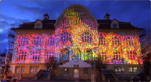
Check out some video’s here, stills don’t do it justice.
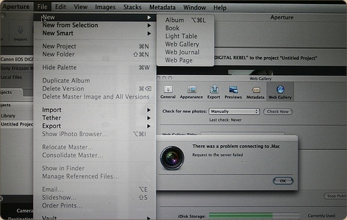
Following up on my previous post showing a few design novelties in OS X 10.5.2, here are some quick observations on novelties in Aperture 2.0, which Apple released just today, on flickr. The Apple Pro Apps design team has gone far on customizing the look and feel – you’ll barely recognize the Aqua interface!
After playing around a bit in the newest version of Mac OS X Leopard, I was delighted to hear that there were several nice improvements to icons and interface elements. Here’s what I’ve found and seen so far;
– Time Machine menu bar icon; when backing up, shows a beautiful animated clock with hands turning backwards, or when unable to back up, presents a tiny caution sign. Very nicely designed, clean, clear, and a great way to keep tabs on Time Machine’s activity.
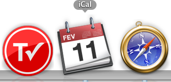
– iCal icon now localized; whereas the iCal icon got a new feature in 10.5, namely, dynamically showing the correct date on the icon, in 10.5.2, the three letter initials for the month in the top-left corner of the icon is also changed according to your locale. Via Fernando Lins.
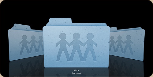
– Sharepoint icon debacle; And then there’s the uglyness. The Share Point icon, first a folder with a globe overlaid, has been changed to a rather cheesy lineup of weird child-human-like shapes.
Apart from that, I’m glad that we now have an option to turn the menubar non-transparent (although I like transparency and would like to see that design concept mature like it did on the iPhone, i.e. a contextual menubar) and that drop-down menu’s are now slightly more opaque. Overall, this update brings some very nice new designs and details to grace your Mac interface.
Although already out for a solid four days, I just got around to listening to the lastest episode of the Mac Developer Roundtable, in which Scotty, Andy Matuschak, Dave Symonds, Dave Nanian, Rich Siegel and Marcus Zarra discuss interfaces and interface design. Some interesting related experiences and opinions are also thrown over the table.
A listening recommendation for any developer. Grab it here, or subscribe to iTunes while you’re at it.
Fortunately, not the Mac kind, but these prints for a security company by digital artist Alex Dragulescu are interesting generated visualisations of software that wreaks havoc on Windows systems.