How very awesome it is to see this on Apple’s website (and possibly on TV!). You can read about the design process of Classics here.

I didn’t intend to write a single letter on my blog before the impending redesign of all my websites, but here I go anyway; today, Phill Ryu and Andrew Kaz opened the doors of the website of Classics, a great new iPhone application that will be out soon. I was honourably tasked with designing the interface, website, and a book together with the awesome David Lanham. Classics offers a gorgeous, tactile experience for reading some all-time literary classics (hence the name), with a sturdy collection of literature that will be expanded with updates in the future. Read on for some great images of how the interface (and icon) developed as time progressed, and some bonus images of my alternative Flatland cover designs.
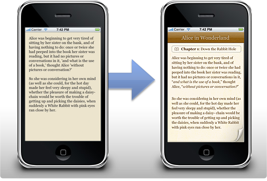
It was the 12th of September of this year, when I was sitting at home designing a great user interface concept for a desktop app, and Phill contacted me. He told me all about this new project, and we soon found out we were definitely on the same frequency. It’s interesting to see how such an app starts out; at first, we had this clean slate to work off of, and after a mockup session for the ‘reading view’, the idea started to take wings.

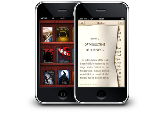
I designed a set of interface mockups for Classics right before I went on my trip to San Francisco. David Lanham took my mockups and created a beautiful, toned down color theme and a set of adjustments that made the interface a gorgeous whole that is very pleasant to read in. Real-life testing was an important part of the application; users could be lying in the park grass reading a book on their iPhone in the bright afternoon sun, and if they are, they should be able to still read pleasantly without having to squint an eye or going indoor and looking at an interface that’s completely black on white. In the end, we got a beautiful interface together that just worked beautifully on the high resolution iPhone screen, and I think I speak for everyone involved when I say that I’m very proud of the way the interface turned out.
Then there’s also the part of the app most people contact me for, the icon. I only designed a suggested alternative icon for Classics (the middle icon in the image below), as David was creating a set of concepts. Here’s some of the icons we went through; we eventually settled with the bookshelf David designed (although a more polished version than the one shown here).
![]()
I really like the way the icon looks on my home screen, and I must admit that although I liked the simple concept of having just a book as the icon, the shelf works better as the bookshelf is really the ‘face’ of Classics. It’s also a joy to use; scrolling it up and down and rearranging all the books is a lot of fun, and it’s very snappy.
I also designed a set of covers for Edwin A. Abbott’s classic braintwister ‘Flatland’, one of my favorite mind-expanding books. Flatland is the life story of a square in a truly twodimensional world. He explains his world, and he eventually finds other worlds like ‘Lineland’, a one-dimensional world, and ‘Spaceland’, a three-dimensional world. It’s very powerful, as it can have you thinking about the possibility of a fourth spatial dimension or the implications of life in a world where there’s only two. Definitely a worthwhile addition to the Classics collection of books.

It was a lot of fun laying out the typography inside the book and designing these accompanying covers; While I got a lot of feedback about these covers, most people really liked the rightmost one, which is the one that made it onto the shelf. You can see it on the website now.
As you can see from the end result, Classics boasts an impressively subtle interface, that’s still very attractive, and is perfectly suited to reading text in any situation. The great aspect of reading in Classics is what Phill called the ‘tactile experience’; users can flip the pages with their fingers, making reading a book feel a lot more realistic and natural. It may sound gimmicky at first, but if you actually use the application, you’ll discover how pleasant it really is. I’ve been reading a lot for all of my life, and Classics is really the natural evolution of reading to me. Without having to lug around a bag of my favorite books, Classics offers me a gorgeous shelf of literature that I can read on the go, in line at the grocery store, or in the warmth of my home with the cat curled up on my lap. Even the most avid bookworms will find the iPhone a great platform to read books on now.
Classics will be available soon on the Apple App Store; you can take a look at the website me and David designed here to subscribe to the information newsletter and get notified when Classics is released! Also, don’t forget to digg it!


Well, it’s that time of the year again, I’ve packed my bags and me and my girlfriend are off to celebrate 3 days of guaranteed fun at Lowlands 2008. Lowlands is a musical festival, with a huge line-up of artists, cultural events, and great food and people. It’s the third year I’m attending.
This year’ll be quite different than the last, as I’ll be taking my iPhone 3G, and I’ve also taken some time apart to make a beautiful and well-optimized web application for all attendees with iPhones and iPod Touches; LL4iPhone. With permission of the festival organisers, I could use some of their decals and branding in the app to give it a consistent feel. It was quite an interesting personal assignment to flex my poorly trained Javascript and PHP muscles, but it worked out quite nicely in the end. You can check it out at LL08.com (you’ll be automatically taken to the web app if you’re on an iPhone); it’s entirely free to use.
I will also try to update with pictures and text from twitter and perhaps even this blog post by using iPhone applications, if my battery levels allow it. If you’re at Lowlands, give me a call or email so we can meet up!
Priidu Zilmer, of zilmer.com famehas a nice post and Photoshop sample file available for those of you that want to make crisp Webclip icons for your website. Webclip icons are the images iPhones and iPod touches use when adding a website to the home screen. Since I can’t use a web application for iPhone when the icon sucks, I urge those to whom it may concern to check it out.
Incidentally, this is my first blogpost made with the iPhone native application ‘WordPress’. I like it so far!
Just under 20 hours before the official release of the new iPhone 3G, Apple’s opened the doors to the App Store. A lot of great apps are already available, and I wanted to share my selection of fantastically designed and useful apps that you can grab when you update your current iPhone (or even better, get a new 3G iPhone).
All of these applications are linked to the iTunes Store, so click the link to proceed to their iTunes page with screenshots and other information.
 Apple has just revealed the new, open Software Development Kit for the iPhone. It’s an exceptional program, which had been pre-seeded to developers. It allows developers to create native applications for the device, which had been highly desired since the start.
I was reasonably tight-lipped about this because I got a stash of email from companies a while before the keynote of today. I’ve been working on iPhone apps with developers for a few weeks now, and as such, I had been expecting a reasonably fully fledged SDK to appear. A device that already astonished people worldwide will now perform almost any desirable function, in a beautiful and revolutionary way. We truly stand at the brink of a user experience and software development revolution.
An online friend, Leonardo Cassarani, said:
Imagine something like Delicious Library’s barcode scanning on iPhones. You could read users’ reviews of the product you’re considering buying. Or auto-update your delicious library via the web. How about keeping a wishlist as you go out for shopping, maybe record the store names and addresses so you can get back to it and buy it or integrate it with something like Amazon’s wishlist?
This is a perfect example of why this is going to change a lot of things in the software industry. Not to mention, the target audience of people owning an iPhone will soon be much larger than the audience of desktop software – especially Mac software.
Although it’s not looking great for application icons, currently (the ones in the presentation were mediocre at best), you can imagine my enthusiasm about creating interfaces for all these great new applications, with a more interactive usage model than ever before. New applications are even promised a way to poll the iPhone for its location, it’s acceleration and tilt – making a game that responds to the way you hold the device an ‘obvious idea’. Where there was a limited model of development first, it seems the only boundary right now is the creativity of the designers and developers working with this.
I would say I expect to see a lot of cool apps coming out in June, but fortunately, I won’t. I know for sure that we’ll see a lot of great apps in June.
Edit: Thomas made this funny point:
Your shopping-oriented examples are really just slightly modified versions of the same hoary old “imagine if you could buy a soda..with your phone†that we’ve been hearing forever… (entire comment)
I think that if you feel this way, you’re failing to see the implications to anything in the web and desktop application spectrum today. Social networking, content exchange, collaboration, and more of such concepts in software are about to be reinvented in ways oriented at the most pleasant interaction model in existence. There’s bound to be some great rethinking of rusty conventions and repairing of broken implementations of good ideas.


