06 Nov
   Filed Under: Interface Design, iPhone, News   

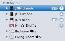
Very nice new feature of iTunes 7.5, which perhaps the new 1.1.2 iPhone update will also address;

5.jpg

I have always been a huge fan of Apple’s battery indicator art (no, this is not a joke, I find them genuinely impressive icons) and these ‘sidebar-styled’ icons don’t deviate from the norm. I’m just keeping my fingers crossed to see this in the next update of the iPhone / iPod Touch. Via iLounge’s full writeup on new iTunes 7.5 features.

04 Nov
   Filed Under: Interface Design   

I have been working on a few technical things over the course of the weekend; first meshing my home wireless network by letting two routers form a single network, and after I was done, setting up MRTG (Multi-Router Traffic Grapher) for my Airport Extreme, which is the border gateway.

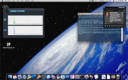
MRTG produces pretty graphs of networks statistics, and I integrated them into my Leopard desktop using a space station icon I am working on, a bit of Photoshopping and Geektool 2.1.2 (since the website is down, I’ll host it here for the interested). Geektool, in turn, is a preference pane that lets you show console output or images on your desktop, refreshed at a certain interval.

I’ll let the result speak for itself (click for larger version over at flickr);

Picture 1.jpg

If there’s any interest for it, I’m willing to write a nice how-to for setting all of this up easily. Drop a comment if you want to see such a post.

30 Oct
   Filed Under: Interface Design   

This is a demonstration of Skyrails, a new visualisation system for datasets. It struck me that this is awfully similar to the scene from Hackers where they flew through that ‘city’ of ‘databases’ with all sorts of fancy eyecandy going on, but this is actually useful in plotting data and navigating it (or so it seems, judging from the short demo). Edit; Jelmar of Typehigh pointed out it’s eerily similar to EVE Online’s ingame star chart and overall camera work. Perhaps it was an inspiration.

If you’re pleased by what you see, you might be interested in checking out some of those fancy fantasy interfaces for the silver screen over at Mark Coleran’s portfolio.

29 Oct
   Filed Under: Apple, Design, Icon Design, Interface Design   

Poorly designed folder icons aren’t the end of the world, but it’s the context that’s so maddening. Here’s an interface element that maybe could have used some freshening up, but it was far from broken. Apple’s gone and made it worse in a way that’s obvious in seconds to anyone who’s ever given any thought to interface design. It boggles the mind. The rumor is that Jobs likes them. Great.

Some people on flickr apparently thought the same and quoted a recent article from me. I still think Apple is well aware of this; they went as far as to make alternative icons when you drag these ‘mundane’ folders into the 16-pixel only Finder sidebar;

sidebartononsidebar.png

I don’t think it was such a thing that ‘Steve liked them’; I think Apple’s engineers liked them in Coverflow, and much less so any other generic folder or icon. When you look around the entire interface, it’s obvious the focus is on Coverflow and large icon view; heck, Coverflow actually comes with a list view to help you drop the standard list view. What do you think?

Read the rest of Siracusa’s in-depth review of Leopard here

.

comments off
24 Oct
   Filed Under: Interface Design, iPhone   

devcenter.jpg

Apple opened the doors of its new ‘iPhone Dev Center‘ website, mainly an ADC on iTunes page where you can download several high-quality video sessions for developing rich web applications tailored to the iPhone.

You can whine about native applications all you want, but this is very interesting to people even looking to just make a second stylesheet for MobileSafari viewing (like me) and get some good pointers on the difference of desktop and iPhone / iPod interaction.

Edit; Jimmy from Gosquared has now registered the (iphonedevcenter.com) domain name.

24 Oct
   Filed Under: Apple, Interface Design, Personal   

When I heard (saw) that Apple did the U-turn thing yesterday on the Dock, I was a bit astonished. First, they haven’t given developers access to the final build of OS X Leopard, so nobody can test their products until Leopard is up for sale. Now they’ve essentially done the same to icon designers like me, by going flip-flop on the Dock. Fortunately, all my time spent on work with clients to make their icon look good in Tiger and the new ‘glassy’ dock wasn’t completely wasted, but they still changed a pretty fundamental design element’s look without giving any type of advance notice.

“Surely,” you may argue, “it’s just the Tiger dock, dark, with some modifications”. Sure. Quick Look windows are just dark backgrounds too; the sidebar accepting just 16px icons are just small additions as well, and Coverflow ‘only distorts’ your icon. But they do define the design considerations and the places where you see the icon most often. I am not trying to imply that I’m in a situation even half as sad as the developers’ (with them not being able to test apps against the Golden Master and such) but it does matter, and there is no real reason to postpone this cosmetic change to the final build. In fact, there’s lots of arguments to introduce this in a quick build before the final one. I hope Apple learns from this, as although they’ve shown they are receptive to input, the time of introduction really couldn’t have been worse.

I just wish we won’t see a lot more of these “surprise surprise!” changes coming from Apple again.
comments off