Today, Photon was released by Green Volcano Software. Photon is basically the missing link in your photography workflow and a lot more; it helps you preview, arrange, sort and organize images, even when they are still on your camera or memory card. It’s exceptionally fast in handling large images in equally large quantities. I helped the developer, Michael, with a bit of testing and made the application icon. Read on for the process of making Photon’s icon.

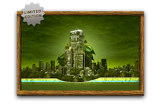
Coinciding with a new freeware icon release and a very large batch of client work, Cocoia will soon start selling a series of prints in line with the work I used to make before I started this blog. If you are unaware of what kind of graphic work I did, this might be a nice chance to explore the expressive prints in my ancient deviantART gallery (this work is not representative of my current quality standard, please keep that in mind).
The recurrent theme in the prints is nature conquering our technological leaps. The icons I shall be dealing out will remain shrouded in mystery, for now.
Poorly designed folder icons aren’t the end of the world, but it’s the context that’s so maddening. Here’s an interface element that maybe could have used some freshening up, but it was far from broken. Apple’s gone and made it worse in a way that’s obvious in seconds to anyone who’s ever given any thought to interface design. It boggles the mind. The rumor is that Jobs likes them. Great.
Some people on flickr apparently thought the same and quoted a recent article from me. I still think Apple is well aware of this; they went as far as to make alternative icons when you drag these ‘mundane’ folders into the 16-pixel only Finder sidebar;

I don’t think it was such a thing that ‘Steve liked them’; I think Apple’s engineers liked them in Coverflow, and much less so any other generic folder or icon. When you look around the entire interface, it’s obvious the focus is on Coverflow and large icon view; heck, Coverflow actually comes with a list view to help you drop the standard list view. What do you think?
Read the rest of Siracusa’s in-depth review of Leopard here
.
I must once again graciously bow and thank Apple for taking mundane work out of my hands. Via Matt Legend;
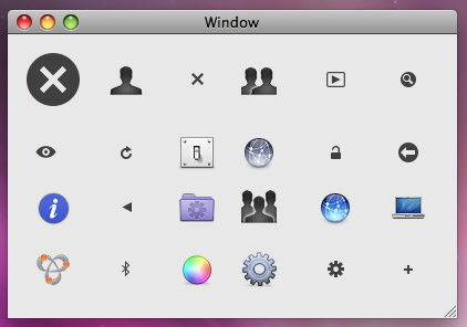
We’ve all stolen Apple’s icons for things; now we’re officially allowed to. There are lots of new standard images available via NSImage -imageNamed:, including the Safari bookmarks image, all kinds of arrows, the gear icon, the Computer icon, Bluetooth and Bonjour logos, user account icons, the Info icon, and many more. The size of your app could drop significantly, as could your icon-design expenditure.

As could my monthly income! But no, I’ve got more than enough interesting work on my hands. Matt has a fantastic (and that’s a horrible understatement) write-up of some highlights in the Leopard feature lineup of developer tools and API’s. Read his long and bookmark-worthy post here.
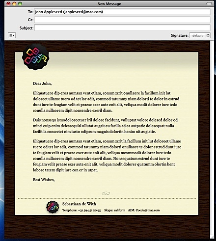
As a tangy addition to my services in the time Leopard is being released, I am offering all my current clients and clients, who book(ed) a case with me for OS X icons, between now and November 9th a complimentary HTML stationery template design for the new Mail.app. Some eye-candy (of course I’m an early adopter ;));
One of my favorite Leopard features by far; the new Mail.app.


