


Today, Photon was released by Green Volcano Software. Photon is basically the missing link in your photography workflow and a lot more; it helps you preview, arrange, sort and organize images, even when they are still on your camera or memory card. It’s exceptionally fast in handling large images in equally large quantities. I helped the developer, Michael, with a bit of testing and made the application icon. Read on for the process of making Photon’s icon.
When Michael approached me with his case, I expressed my interest in it as I had the annoying problem of always importing a lot of images from my dSLR that I simply didn’t want. He already had an icon for the application, but wasn’t content with the degree of representation the icon had; after all, in a perfect world, you can ‘read’ off an application icon what the application’s ‘core function’ and values (and virtues) are.

Michael’s old icon for Photon
Michael didn’t see this in his icon, but in it, I saw a solid base for an icon that would fit it very well; the parallel of the dark slides in the icon and the application interface look and objects were striking, and what really lacked was a sense of the raw speed and power Photon brought to it. The abstract name of the appplication also wasn’t prominently connected to the icon, which always helps the ‘branding’ of it and helps the user form a clear connection between application name, icon metaphor and application functions.
And thus, with these ideas in mind we started looking at some concepts for the improvement of the icon. I had a vivid image of a photon in my mind that I really wanted to see in the icon; it would truly convey the aforementioned values that we cherished in it. I did some work in Photoshop to see how such an element would work out, visually.
Early mockups.
The ‘blank’ slide with some images didn’t work as well, but such a vivid ‘photon’ interacting with the slides really had in it what we were looking for. Michael, who had some well-defined tastes and visions when it came to the icon, was nothing but a great help in defining the direction and helping the creative process by making very accurate sketches of new ideas. He was careful not to interfere with my creative process and often said in advance that whenever I considered my ideas over his, I should, but fortunately, nothing but elaborate quality input came from Michael’s address. Over the next few days, we made large advancements in the design of the icon; Michael sent me an occasional sketch, to clarify his ideas, and I implemented it.

From left to right; Mockup, sketch from Michael, implemented suggestions.
At this point, the icon was advancing at breakneck speeds; we were getting more and more content with each incarnation (you can see in the image above how fast the advancement from mockup to an actual, strong graphic went) and we soon found ourselves tweaking the last few things in the icon. At this stage, the icon only lacked the connotation of ‘blazing speed’; although the ‘Photon’ circling the slides was very dynamic, the speed it conveyed wasn’t very remarkable.
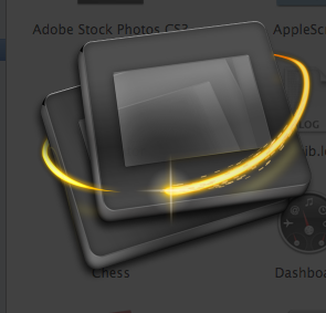
A few incarnations later.
I decided to add particles and a bit of a ‘head’ to the Photon, giving it a strong suggestion of motion and dynamics. We eventually decided, after a few twists, to ‘flip’ the Photon trail in three-dimensional space to add more depth to the icon, after which we cleared small details like the reflection of the trail in the slide, and I added minor touches of photorealism around the edges. After this small set of changes, the final Photon icon was a fact.
A few steps later, we were overjoyed to see the final icon.
For Michael and me, the result was incredibly satisfying; the icon communicated all the core values, struck a strong bridge between the name of the application, the icon’s metaphor and the functions of the application and it looked great, to boot. I still consider this a very fun case to have worked on, and Michael’s input was unique in its elaborateness and artistic value. It’s these cases that keep the fun in designing.
Check out Photon now, for a free trial, and check out the introductory pricing on the website.
I really love the icon; interesting to see that so many steps lead to such a simple but powerful mark.
I think the icon concept is good. However, it turned out way too black imho. Plus, Sebastiaan, you should know by now that using inner shadows as border gradients doesn’t work all that well ;)
Nice job.
Jonas
Nice work, but I think the photon has a bit weird moving trail. It’s not moving in a natural circle, so to say, but almost like it’s cutting through the bottom slide.
NOICE!
You’re a really great icon artist. Great work. Too bad I don’t have a Mac … yet. d[^ _ ^]b
i disagree with Jonas. the icon looks great! too black? i don’t think so at all. nice icon man. :)