18 Jan
   Filed Under: Gaming   

When I was about 11 years old, I used to read a Dutch gaming magazine called ‘PC Gameplay’. It introduced me to gaming in general, and it also brought me into the world of trying games out instead of dismissing them at first glance. I made a resolution not to assume anymore that something was not my type of game; after the astonishing experience that was Baldur’s Gate, you tend to start looking for other immersive and amazing gems in gameplay.

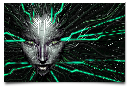
That same magazine ran a review of System Shock 2 in October 1999, and I was amazed. Not because I thought it’d be such a great game, but because just the pictures and the review scared the living daylights out of me. It took me almost 4 years to gather all the guts I could muster and try the demo. I never realized I was in for an experience that’d return to me repeatedly in the 5 years to come.

Continue reading…

06 Jan
   Filed Under: Interface Design, Personal   

Before you associate the following UI design with me or Cocoia, let me assure you that I have had no involvement in Picasa whatsoever. With that out of the way, the recently released Picasa Mac version is quite… unique when it comes to UI.

This image illustrates nicely how Picasa seems to use mixed sans and serif typography, wholly custom controls and strange, nonstandard color palettes throughout the app. I must admit I’d expected more from Google; I’ll stick with iPhoto for now.

Update: Michael J. Tsai reports that Google is using a cross-platform toolkit, which also prohibits Picasa from running on PowerPC Macs. Weak.

03 Jan
   Filed Under: Gaming   

Wipeout HD is an exclusively downloadable title for the PS3. I think that it’s actually the first title of such a large franchise to hit the Playstation Network (PSN in short) Store while not being available in regular brick-and-mortar retail outlets. You’d start to wonder why exactly, as there’s people like me who’d certainly pay for Wipeout HD on shiny Blu-Ray, the PS3’s defacto disc format.

Continue reading…

31 Dec
   Filed Under: News   

I don’t like year-in-review posts. That’s why I’m taking a different approach.

Continue reading…

19 Jun
   Filed Under: News, Personal   

Since we’re steadily moving towards fully appropriating and settling into our new studio (home/office), I’ve posted a few pictures of our new location.

If you’re Dutch, you may recognize the artistic direction of the building as ‘de Stijl’;

(… De Stijl sought to express a new utopian ideal of spiritual harmony and order. [It] advocated pure abstraction and universality by a reduction to the essentials of form and colour — [members of de Stijl] simplified visual compositions to the vertical and horizontal directions, and used only primary colors along with black and white. – wikipedia )

The similarity is not coincidental, as the entire block was designed by the founder of de Stijl, Theo van Doesburg. As such, we considered it to be the perfect location for such a graphic studio!

Feel free to check out more of the images on our flickr.

12 Apr
   Filed Under: Apple, Interface Design, Personal, Popular   

I have been noticing a disturbing trend in custom interface design of third party applications for Mac OS X. As it is no longer an exception for software developers to build interface elements that are entirely unique to their application, the threshold for customizing other, system-standard interface elements is also lowered significantly. The ghastly trend I am about to describe is in existence due to this lowered threshold. In fact, I think this particular deviation off the beaten interface path would have been far more frowned upon a few years ago, when Mac interface designers were more conservative in using custom UI elements in general, and Apple disapproved of it more fiercely. Today, however, it won’t even stand in the way of scoring a design award runner-up, as my examples will go to prove.

Continue reading…