15 Jun
   Filed Under: Announcement, Commercial Work, doubleTwist, News   

On March 30, I raised quite a few questions on Twitter when I changed my handle from the old @cocoia to @sdw — a shorthand for my full name, Sebastiaan de With. I also bought (and put some pages up for) domains like dewith.com and sebdw.com. I mentioned that I’d announce my motives sometime in the future. Some people speculated I was going to expand Cocoia, others (interestingly relevant today) assumed Cocoia was acquired.

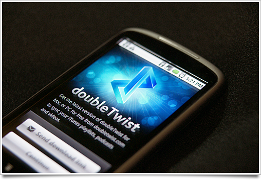
It’s none of the above. I’m putting Cocoia in carbonite for a while as I start my first full-time job in the United States: I will be joining doubleTwist as Chief Creative Officer, responsible for overseeing and working on the design, interaction and polish of all their apps and services. I’ve been working with the awesome people at doubleTwist as a freelancer for years now and I’m really, really stoked to give them my full attention. We’ve been working on some extremely cool stuff.

I’ve interviewed with over a dozen companies early this year, and my joining doubleTwist is the conclusion of a long period of weighing all the awesome opportunities I had. You may have seen me traverse all the valley campuses on social networks as I ‘shopped’ around. A luxury problem if there ever was one: picking a job from all these kickass companies. doubleTwist is undoubtedly the best choice, though: working with Jon (– of ‘DVD Jon‘ fame) and Monique has always been a pleasure, and the other staff are some of the most detail oriented and talented I’ve known in the industry.

In related news, I will be moving to San Francisco soon. As a city, it’s a fantastic place to live. As a place, it’s where I truly feel at home out of all the places in the world. I can’t wait to be living and working there.

What does this mean to you, my reader and / or customer, and my ‘behavior’ online? Icon Resource and other Cocoia products will still be supported and developed. I will still work on side projects, UI breakdowns, speak at conferences and (loudly) voice my opinion on things. I will be working more with Android (and possibly, as they emerge, more mobile OSes).

I will, however, no longer accept freelance work. After six years of freelance designing, this is truly the end of an era. Thanks to all my awesome clients, large and small, and my ‘competitors’ for being awesome inspiring designers I was proud to share a market with. You know who you are. I’m sure we’ll work together again in the future. For now, goodbye.

And, of course, I’ll be showing off some of the awesome things I’ve been working on for doubleTwist very soon.

28 Feb
   Filed Under: Apple, Design, News, webOS   

There’s some discussion on Apple-centric and tech news websites about a video that’s doing the rounds with a new approach to notifications for iOS. While the system in the video is really nothing new (there’s been at least one alternative notification system in the App-Store-for-jailbroken-phones “Cydia” since 2010) it is getting a lot of attention, presumably because iOS users are quite satisfied with almost all the interactions of the OS except those dang stacking modal dialogs that interrupt your game of Angry Birds every time you get a text message.

And I can relate: when I am abroad, with my three email accounts, whenever I open Mail on my iPhone, I have to dismiss three ‘data roaming is off’ dialogs, and three ‘cannot get mail’ dialogs ( — that’s one per mail account). On an iPad, it can be even more jarring, with a tiny alert disabling the whole 9.7″ screen until you act on it.

This is a real issue. I have no doubt Apple is aware of this, like they were aware of copy and paste and multi-tasking.

This is not a post about what Apple will or should do to improve notifications on iOS. It’s a post talking about what solutions other platforms currently use to notify the user, and why Apple is (possibly, probably) taking such a while to create an optimal solution to the notification problem.

Continue reading…

11 Feb
   Filed Under: Interface Design, News, Unfiled, webOS   

It’s not a big secret that I’m a big fan of webOS’ design and premise. While my primary phone for daily use is an iPhone, I’ve used Android and webOS phones alike for extended periods of time and I always miss some of webOS’ interface polish. It’s simply a delight to use intensively.

Yesterday, HP (fare ye well, Palm) announced its summer device lineup, far in advance of release. Presumably, to let developers start working on apps early and show consumers they might want to hold out on getting that Android or iOS tablet. Leaving discussion about the (lack of) wisdom of announcing now and tea-leaf reading of when we might see the competition show up out of things, I want to focus on the new devices’ hardware and share some thoughts on their user interface.

The TouchPad:

Gesture Area / “Home Button”: The TouchPad actually lacks the familiar (and brilliant) Pre / Pixi ‘gesture area’, which lets you swipe left or right and up to respectably go forward or back in navigation or open the launcher for opening apps. Several employees familiar with the matter told me that in the development phase of the TouchPad, the gesture area (or having even four of them on each side of the screen) didn’t hold up as a usable solution. The real question for developers and interface designers is how going back and forth in apps is handled now. I suspect it would be a button in the UI, much like in iOS.

Panes: While some bloggers are quick to dismiss parts of the TouchPad UI as ‘rip offs’ of iPad’s, more study reveals there’s a lot of clever work in there. Personally, I never use my iPad in portrait because Mail, for instance, is barely usable without a list of emails to easily jump back and forth for triage.

The TouchPad solves this problem with ‘grabbers’ on the toolbars of each pane. The user can easily rearrange the UI layout, either showing the email content completely, or showing a both the source list and the content. Further scrolling the email content away reveals the Mail accounts, similar to the navigation stack of the emails column on iPad. It’s a clever solution that’s implemented in all multi-pane apps on the system and never locks you in to a layout.

Notifications: Obviously, the notifications UI is one of webOS’ core strengths. Not even Android handles incoming information and user notifications this elegantly. On the tablet, they settled with bringing them up in the status bar. Android (on phones) also puts notification icons in the status bar, and with the status (wifi, battery, network, alarm) icons, it quickly turns into a bar literally filled with icons and badges. This made me a bit pessimistic about the notification handling on webOS for tablets.

Fortunately, it’s actually quite great. Notifications slide in from the top, separate from the clock and status information: something like an email would come in, show sender and subject and then slide right and fade out into a subtle white email icon. The notifications get their own, clearly demarcated area in the status bar and some can even be swiped through from there:

Overall, a very nicely designed experience. Once again, iOS looks rather bad with either only using badges or tiny, yet modal dialogs interrupting your workflow.

The Pre 3: (image by Engadget)

The Pre 3 has an IPS LCD (valuable information I got loose yesterday) screen at 800×480. I am very happy that it doesn’t use (SAM)OLED technology, as in my opinion they’re a bad stopgap to solve the LCD pixel density and power usage problem. You start to wonder what kind of contracts Apple has with Sharp, considering only Sharp and Apple currently ship devices with 960×640 pixel IPS LCD displays. I bet some of the billions in cash they spend was used to buy a lot — if not all — of Sharp’s manufacturing capacity for these extremely advanced screen panels.

That out of the way, the panel on the Pre 3 is beautiful. Its viewing angles are great, the colors pop, and it has a great black point. Representatives from Palm were very pressing in letting me know the hardware wasn’t completely final, but I believe we won’t see changes to the display quality at this point.

Size-wise (I wasn’t allowed to take pictures of it next to my iPhone) it’s almost the same size as the iPhone. It’s slightly thicker but quite slim, which is a feat considering the built-in keyboard. The screen is slightly larger (3.6″) than the iPhone 4’s. There are no plans to enable an on-screen keyboard.

The Veer:

At the hands-on area it seemed the Veer is pretty much done. It’s an impressive device: it has absolutely no lagginess, the build quality is extremely impressive. Not much to say on designing for it, as it’s the device I am least interested in, but the display quality looked good: standard density (comparable to, say, the Pre / Pixi) but nice viewing angles. Nothing to write home about.

Miscellaneous Design Thoughts and answers to Twitter questions:

When you dock your webOS device (wirelessly), it goes into ‘Exhibition’ mode, which can show things like a clock, upcoming events, notifications and photo slideshows. It’s said webOS will include a feature to intelligently switch between what to show in Exhibition based on your physical location.

Touching a webOS phone and tablet lets them ‘push’ information to each other, like sharing a webpage. This is an impressive technology — I couldn’t get any answers on what is being used for this. Presumably NFC.

TouchPad can take calls and texts from webOS phones thanks to Bluetooth pairing.

No official word on it, but HP aims for ‘global availability’ of new webOS products.

No word on UI conventions for PC / Laptop webOS.

App dock icons (and dock height) for the TouchPad / Pre 3 are 63 pixels. They’re smaller on the screen of the Pre 3, obviously, due to the much higher pixel density, but an interesting bit regardless.

It seems current icon guidelines call for realistically rendered (OS X-style) app icons, glyphs in circles for toolbar icons and colored, more detailed icons for source lists and source panes.

Designing for various screen sizes is made easier through Palm’s development model and tools, which are obviously based on web technologies like CSS. With non-pixel units it’s quite easy to ensure widgets and text scale right. Apps can be built with Palm’s new ‘Enyo’ framework to scale a multi-pane tablet view to a simple one-column view on phones. Truly a ‘universal’ approach to developing applications.

And that’s all. Feel free to leave more questions in the comments.

09 Jun
   Filed Under: Apple, Design, Goodies, Icon Design, Personal Work   

I’ve updated the iPhone / iPad icon PSD I released not too long ago with some fixes and a 114×114 pixel icon template for designing icons for Apple’s hottest new device.

Download it here. I cannot be held responsible for inaccuracies, flaws and errors in this this PSD I might have overlooked, but if you notice anything please let me know in the comments.

Again, if you appreciate it, tweet this to help your fellow designers and developers make nicer icons for iPhone 4 (and beyond).

03 Jun

It’s always a huge leap for a designer to come up with designs for a platform you’re not familiar with. I remember feeling extremely uncomfortable at first when I designed my first iPhone icons and interfaces, and while the iPad was a logical extension of the iPhone UI, it still felt like a significant step to take.

Androids and doubleTwist

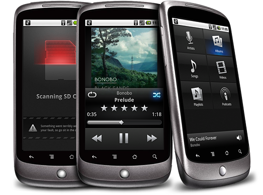
Imagine how I felt when I was sitting at my desk, Nexus One in one hand and pen in the other, after being asked to design doubleTwist’s media player for Android. Android doesn’t have a very nice media player in terms of design (I’m carefully picking my words here – I don’t want to offend the undoubtedly hard working people at Google) and it was easy to just go the way some developers go: make an iPhone app, shoehorn it into Android, and call it a day.

We wanted something that actually advanced the state of the art. I sure as hell wasn’t going to use an entirely new platform for months just to ape another. It was a mixed blessing to have so little limitations on what constituted a ‘native’ user interface.

Android has its guidelines, but most apps (even the Google-sanctioned Twitter app) have a very ‘custom’ appearance. We opted for a look that works well on the various devices and custom ‘shells’ (notably, HTC’s terrible “Sense” interface) and arrived at this muted, native-looking yet polished visual scheme, which also helps users navigate the app in direct sunlight, where OLED screens like the Nexus One’s tend to be hard to read. Subtle usage of textured surfaces in the application also help prevent color banding on the color-limited OLED screens.

I’m happy to have this in the hands of Android users. It’s sometimes depressing to read comments on tech websites of people exclaiming: “Why would you even care about how a media player looks or works? You play music and turn off the screen!”, but I am sure there’s a lot of people who will appreciate the thought and details that went into this app. And that makes it all worth it.

The player is available on the Android Marketplace for free for a limited time.

16 Mar
   Filed Under: Commercial Work, Design, Icon Design, News   

Interarchy is a Mac app that’s almost as old as I am: it was first created in 1993 as one of the first FTP clients for the Mac, and in 2007 it was sold to its current owner and long-time developer of Interarchy, Matthew Drayton of Nolobe. Matthew contacted me with a request for new icons for the big upcoming version 10. This was no small release, so it had to be worth it.

Like several other FTP clients, Interarchy has always been known and discerned by its icon. By now, it’s a powerful brand. Matthew also expressed his desire to maintain the filing cabinet metaphor in the application icon, and I agreed. Changing the icon now would mean neglecting its long history and evolution.

Continue reading…