01
Jun
Filed Under: Announcement, Design, Drawing, Personal Work
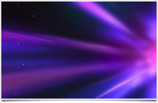
It’s official: I never had as much giggles in an evening designing this poster for Cocoaheads WWDC. Scott asked me if I’d like to speak at the well-known Mac developer event, and I happily obliged. I also did a bit of poster art for the presentation screen and for, well, fun.

The lineup of speakers:
- Delicious Monster‘s Wil Shipley
- 280 North‘s Francisco Tolmasky
- Â Dirk Stoop from Sofa
- Joachim Bondo of Cocoa Stuff
- and me. Perhaps an excellent chance to give away a shirt?
.
It’ll be held Wednesday June 10th, 7-9PM, at the Stockton St. Apple Store in San Francisco.
I’m really looking forward to WWDC this year. Hope to see you all at Cocoaheads or elsewhere during the week!
And yes, those are little Xcode hammers in the smoke.