16 Mar
   Filed Under: Commercial Work, Design, Icon Design, News   

Interarchy is a Mac app that’s almost as old as I am: it was first created in 1993 as one of the first FTP clients for the Mac, and in 2007 it was sold to its current owner and long-time developer of Interarchy, Matthew Drayton of Nolobe. Matthew contacted me with a request for new icons for the big upcoming version 10. This was no small release, so it had to be worth it.

Like several other FTP clients, Interarchy has always been known and discerned by its icon. By now, it’s a powerful brand. Matthew also expressed his desire to maintain the filing cabinet metaphor in the application icon, and I agreed. Changing the icon now would mean neglecting its long history and evolution.

Continue reading…

11 Mar
   Filed Under: News, Personal Work   

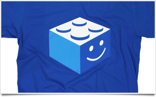
Bricky, my shirt advocating a life without Flash on iPad and iPhone (or perhaps open video itself – or happy plugins? I guess everyone can make up their own meaning) is now ready to be delivered to your doorstep.

Bricky is a very limited run. There will be no re-prints, so get it now. Printed once more at very high quality by the fine lads of BuyOlympia on genuine American Apparel shirts.

28 Jan
   Filed Under: Apple, Icon Design, Interface Design, iPad, News   

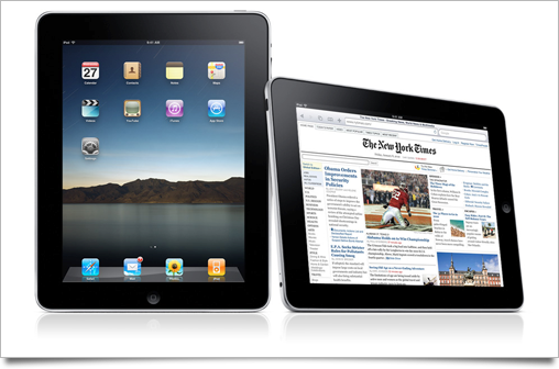
Unless you’ve been living under in a multitude of nuclear holocaust-proofed rocks, you’ve heard all about Apple’s new tablet, the iPad.

As usual with a large Apple product launch, I’ve written up this post to round up the good, the bad, and the ugly of all the new interface and interaction designs that were set loose on the world by the company that’s regarded as the most influential and skilled when it comes to designing experiences. The usual disclaimer applies: iPad hasn’t hit the market yet, and thus its UI may still be subject to change or improvement.

Continue reading…

19 Jan
   Filed Under: Icon Design, News   

Armin Vit posted about the now-in-beta Office 2010 on Brand New, a blog about branding. Naturally, they showed off the new(-ish) Office 2010 branding, and, unsurprisingly, the application icons of Microsoft’s latest version of Office.

office

I wanted to share a few of my observations on the new icons and the history of Microsoft Office and its icons.

Continue reading…

17 Dec
   Filed Under: News, Software Releases   

I featured Billings on my blog before, and it’s still my one and only application for time-tracking, invoicing, and pretty much everything in my workflow that isn’t about designing. When Alykhan Jetha of Marketcircle contacted me to join the beta of their iPhone companion application, I jumped at the opportunity. Now I can proudly display the first public images of this amazingly well-designed iPhone app, which will be available soon.

As a disclaimer: I did not design any aspect of Billings Touch.

Billings-Touch-Icon

As you can see, it has a sharp icon that resembles its desktop counterpart. Upon opening the app, you are greeted by its gorgeous main screen.
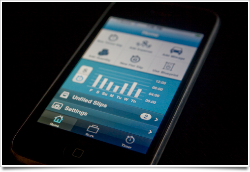
Billings Touch Main screen

I can’t divulge much about it yet, but the app does pretty much everything I ever dreamed of having in my pocket for my on-the-go demands. I’ve even come to use its timer as a punch clock next to my computer so I can even more effortlessly pause or resume my time tracking when I go off to brew a nice cappuccino.
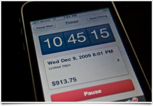
Billings Touch Timer

In short: the app syncs with your Mac database of Billings (and vice-versa, new slips and invoices you created and tick off on your iPhone get synced back to your Mac over the air), and every single nook and cranny is wonderfully designed, as I’ve come to expect from Marketcircle.

It also works great without the desktop app: as a standalone app, it’s already a very powerful set of tools to add to your workflow. You can follow Marketcircle or me on twitter if you want to know when Billings Touch hits the App Store.

12 Dec

Warships, a game designed by me and developed by the Canadian Edovia is now available on the App Store. It’s a great, simple game of naval conflict, and I had a lot of fun designing it. You should get it (while it’s still a mere $1!) here.

warships-the-game

However, I won’t be doing a lengthy post on its design process this time around. Instead, I made a video in which I tell you a bit about the process and show off some timelapses of the game graphics and icon. Consider this an experiment, and let me know what you think!

Viewing in HD at Vimeo is recommended!