29 Oct
   Filed Under: Apple, Design, Icon Design, Interface Design   

Poorly designed folder icons aren’t the end of the world, but it’s the context that’s so maddening. Here’s an interface element that maybe could have used some freshening up, but it was far from broken. Apple’s gone and made it worse in a way that’s obvious in seconds to anyone who’s ever given any thought to interface design. It boggles the mind. The rumor is that Jobs likes them. Great.

Some people on flickr apparently thought the same and quoted a recent article from me. I still think Apple is well aware of this; they went as far as to make alternative icons when you drag these ‘mundane’ folders into the 16-pixel only Finder sidebar;

sidebartononsidebar.png

I don’t think it was such a thing that ‘Steve liked them’; I think Apple’s engineers liked them in Coverflow, and much less so any other generic folder or icon. When you look around the entire interface, it’s obvious the focus is on Coverflow and large icon view; heck, Coverflow actually comes with a list view to help you drop the standard list view. What do you think?

Read the rest of Siracusa’s in-depth review of Leopard here

.

comments off
28 Oct
   Filed Under: Apple, Design, Icon Design, News   

I must once again graciously bow and thank Apple for taking mundane work out of my hands. Via Matt Legend;

We’ve all stolen Apple’s icons for things; now we’re officially allowed to. There are lots of new standard images available via NSImage -imageNamed:, including the Safari bookmarks image, all kinds of arrows, the gear icon, the Computer icon, Bluetooth and Bonjour logos, user account icons, the Info icon, and many more. The size of your app could drop significantly, as could your icon-design expenditure.

picture5.png

As could my monthly income! But no, I’ve got more than enough interesting work on my hands. Matt has a fantastic (and that’s a horrible understatement) write-up of some highlights in the Leopard feature lineup of developer tools and API’s. Read his long and bookmark-worthy post here.

21 Oct
   Filed Under: Apple, Design, Icon Design   

Final Cut Server, Apple’s solution for a centralized video workflow has been highly anticipated since the unveiling of the revamped Final Cut Studio 2. I’ve found an article on unflyingobject with several screenshots and information about the program, so I decided to share my thoughts on the graphical (icon / UI) side of the app with you. In case you want to know what Final Cut Server does and if it’s good at it, I recommend the linked article.

Continue reading…

20 Oct
   Filed Under: Apple, Design, Icon Design   

Apple has announced the release of Leopard, the newest incarnation of Mac OS X. Amongst 300+ new features, it also boasts several graphic enhancements like resolution independence, 512 pixel icons, a reflective dock and new a unified ‘theme’ for application windows. Now, only days before the release, I want to show you some of the major improvements and additions to the Mac software aesthetic.

Continue reading…

05 Sep
   Filed Under: Design, Icon Design, Personal Work   

In all the recent blogging about the Leopard dock, mostly negative, I decided to see if i could come up with some icons that go well with the new dock’s look. For the uninformed, the Leopard dock has a reflective ‘table’ underneath, which stirred a lot of commotion into the Mac community as being way over the top, too inspired by project ‘Looking Glass’ by Sun, and being very ugly when pinned to the left or right side of the screen.

Personally, I’ve been a bit quiet about the interface and icon developments in Leopard for the simple reason that I now have Leopard complete with the NDA that comes with it and I can’t disclose much, let alone make elaborate reviews on its (not even finished) interface elements. But honestly, I dig the Dock. In response to all the negative input, I much rather dislike the Tiger default dock, with the odd semi-opaque white rectangle behind it and the unclear separators. The Tiger dock has a very big issue with seeming ‘cluttered’ when either non-Apple icons or more than 9 icons are in it. Apple seems to have noticed, and put icons on a plane, extending the natural ‘tabletop’ perspetive. The Rogue Amoeba blog pointed out that this table perspective placed on the side of the screen doesn’t work, but I’d like to respond to that that in general, as icons are developed for the particular ‘tabletop’ perspective, that any dock doesn’t really work well when placed sideways. According to the guidelines, icons are just not meant to be placed on top of each other, but next to each other. We also read from left to right, not from the top to the bottom, so placing the Dock at the bottom is a natural thing to do, and I rarely see people doing otherwise.

Of course, redundant shadows bug me too. Of course, I think reflecting window contents and the desktop background goes a bit far. But has it bugged me since using Leopard? No, it hasn’t. With the new default wallpaper, you never notice the extra shadows (which is why I suspect Apple plans to take them out, and if they aren’t, there’ll be tools to do so faster than you can say ‘ihateit’) and the whole looks very unified and beautiful. Here’s a shot of my dock on Leopard;

Picture 1.png

As you can notice, a few icons stand out as seeming to be made for this new Dock. I’d say the Time Machine icon looks really good on it. But I want to point out that the four-legged assault droid that I use as my dock separator actually uses it as a design element. It’s been made specifically for the Leopard dock, and it strengthens the look of the icon. I created this very small new icon set to explore the possibilities. You can download the set now, on Icon Designer.

WoBD-Terminal_256x256.png

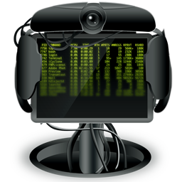
Notice how these two icons wouldn’t have been as strong in the Tiger dock, but really gain in power and meaning in the new dock. The conclusion? Adapting to the changes in the interface of Leopard can only be done by icon designers who find creative solutions. You can always make things look good, as long as you are creative.

comments off
02 Sep
   Filed Under: Design, Icon Design   

When John Gruber pointed out that there was a preview of Nokia’s new *cough*original*cough* design for a phone, I looked at the photo’s, I watched the small, low-res video, and I fell on the floor and died. At least, part of me died.

Picture 9.png

This little shot above is not the icon design of the latest and greatest just-over-a-hundred-dollar (or euro) MP3 player with color screen. It is also not the PSP’s icon design. It’s actually Nokia’s idea of ‘cutting edge design’ which is supposed to compete with, uh, this. Let’s make a bit of fun and guess what the icons are for, from left to right. Starting left… uhh? I think I can make out vaguely that it is a rectangle with text smeared on it. One would logically assume this is the most important ‘thing’ you can click, as it’s way on the left, where your eyes start scanning the row of icons. Can’t make that out. Next to it; music. Way to go not copying Apple’s general grouping of ‘entertainment’, as Nokia has done in previous phones like the N95. A lot of icons follow that are either crystal clear (uh, a TV screen), completely unclear (a file? A person?) and completely ripped off (a compass??).

I am having the feeling that Nokia, who hasn’t been a great choice for people who like nice icons on their phone until now, doesn’t really hire the right people for the job here. I mean, general opinion is one thing here, and you may or may not like such mashups of the PSP and iPhone icon design, but there’s something you can see easily here; The iPhone’s icons are not only a lot more discerning (in general and from each other), they actually have more factors to discern by. They have color, for one, and they are also logically separated.

I live in Europe, and as such, the Nokia phone is the phone you see most often. I always amaze myself at the incredibly complex hierarchy of menu’s and the placement of functions. Me, and I think about every ex-Nokia user over the ocean is eagerly tapping fingers until the iPhone arrives, waiting for the horror of searching through 10 menu’s to find that one application or bluetooth setup utility.

This may seem like a huge rant about Nokia gone bad, but I’d rather want to show you what makes Apple special. It’s knowing what people you hire and even then, checking them and running them by a design philosophy that’s proven and about as simple as it can get. I want to thank Nokia, even, for a great example of where we don’t want to go when it comes to icon design.

ps. Yes, I know September 5th is close. The work is killing me but it’s proving to be quite an awesome release soon. Stay tuned!