I didn’t intend to write a single letter on my blog before the impending redesign of all my websites, but here I go anyway; today, Phill Ryu and Andrew Kaz opened the doors of the website of Classics, a great new iPhone application that will be out soon. I was honourably tasked with designing the interface, website, and a book together with the awesome David Lanham. Classics offers a gorgeous, tactile experience for reading some all-time literary classics (hence the name), with a sturdy collection of literature that will be expanded with updates in the future. Read on for some great images of how the interface (and icon) developed as time progressed, and some bonus images of my alternative Flatland cover designs.
It was the 12th of September of this year, when I was sitting at home designing a great user interface concept for a desktop app, and Phill contacted me. He told me all about this new project, and we soon found out we were definitely on the same frequency. It’s interesting to see how such an app starts out; at first, we had this clean slate to work off of, and after a mockup session for the ‘reading view’, the idea started to take wings.
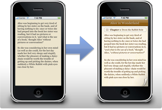
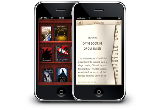
I designed a set of interface mockups for Classics right before I went on my trip to San Francisco. David Lanham took my mockups and created a beautiful, toned down color theme and a set of adjustments that made the interface a gorgeous whole that is very pleasant to read in. Real-life testing was an important part of the application; users could be lying in the park grass reading a book on their iPhone in the bright afternoon sun, and if they are, they should be able to still read pleasantly without having to squint an eye or going indoor and looking at an interface that’s completely black on white. In the end, we got a beautiful interface together that just worked beautifully on the high resolution iPhone screen, and I think I speak for everyone involved when I say that I’m very proud of the way the interface turned out.
…
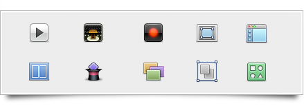
Then there’s also the part of the app most people contact me for, the icon. I only designed a suggested alternative icon for Classics (the middle icon in the image below), as David was creating a set of concepts. Here’s some of the icons we went through; we eventually settled with the bookshelf David designed (although a more polished version than the one shown here).

I really like the way the icon looks on my home screen, and I must admit that although I liked the simple concept of having just a book as the icon, the shelf works better as the bookshelf is really the ‘face’ of Classics. It’s also a joy to use; scrolling it up and down and rearranging all the books is a lot of fun, and it’s very snappy.
…
I also designed a set of covers for Edwin A. Abbott’s classic braintwister ‘Flatland’, one of my favorite mind-expanding books. Flatland is the life story of a square in a truly twodimensional world. He explains his world, and he eventually finds other worlds like ‘Lineland’, a one-dimensional world, and ‘Spaceland’, a three-dimensional world. It’s very powerful, as it can have you thinking about the possibility of a fourth spatial dimension or the implications of life in a world where there’s only two. Definitely a worthwhile addition to the Classics collection of books.

It was a lot of fun laying out the typography inside the book and designing these accompanying covers; While I got a lot of feedback about these covers, most people really liked the rightmost one, which is the one that made it onto the shelf. You can see it on the website now.
…
As you can see from the end result, Classics boasts an impressively subtle interface, that’s still very attractive, and is perfectly suited to reading text in any situation. The great aspect of reading in Classics is what Phill called the ‘tactile experience’; users can flip the pages with their fingers, making reading a book feel a lot more realistic and natural. It may sound gimmicky at first, but if you actually use the application, you’ll discover how pleasant it really is. I’ve been reading a lot for all of my life, and Classics is really the natural evolution of reading to me. Without having to lug around a bag of my favorite books, Classics offers me a gorgeous shelf of literature that I can read on the go, in line at the grocery store, or in the warmth of my home with the cat curled up on my lap. Even the most avid bookworms will find the iPhone a great platform to read books on now.
Classics will be available soon on the Apple App Store; you can take a look at the website me and David designed here to subscribe to the information newsletter and get notified when Classics is released! Also, don’t forget to digg it!