I got some astonishing material in my hands today. It’s Apple’s material, and it is quite old – but I can assure you that the images are no less revealing and eye-opening. What I can’t figure out, for the life of me, is why Apple did not include this in the latest incarnation of their Human Interface Guidelines, as it is probably the best insight into the design of Aqua icons ever. Get a glimpse of the inception of Aqua inside.
I was contacted by Acqualia – the creators of the Apple Design Award-winning application Picturesque – to design a new icon. Picturesque, an application I already use on my blog, is stunningly simple in its purpose and product; it beautifies images, but not in the typical Core Image-filter like fashion you see most of the time. The true power is the simplicity; there’s no ugly distorting filters to get in your way, but a few tools catered to your needs which provide instant satisfaction.
Read on for the inside process in this ‘Making the Icon’ post.
I’m not sure how I missed this, but it’s… unique.

Brand New has a nice writeup, but there’s an equally nice equation to the logotype in the article you simply cannot miss. x + x + x (III) = ?
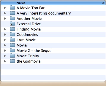
Whether you have purchased movies online, made digital backups, or simply have movies stored on your Mac or on an external drive, it tends to turn into a rather dull folder tree with a list of movie titles. Quick look or Cover Flow won’t help me out – I put my movies in directories.

Ouch, this isn’t exactly visual browsing.
Since I had this problem with my digitalized movie collection and I wanted to browse them casually, while at parties and with friends on my Macbook Pro, or simply at home on a dull afternoon, I figured something out to make everything a lot more appealing. Dive on in.
In icon-related news, the latest Skype beta, with address book integration and other goodies, has ditched gloss in its (also 512 pixel) icon. A welcome change, in my opinion, although they could have actually made resources for 128 pixels; the downscaled version looks a bit weird.

Get the new beta here.


