It’s been an exciting day for me; apart from rounding up some client work, I went out and bought an Airport Extreme router and upgraded my hacked iPhone to the latest firmware (1.1.1), which is notorious in ‘bricking’ iPhones.Â
Continue reading…
When I heard (saw) that Apple did the U-turn thing yesterday on the Dock, I was a bit astonished. First, they haven’t given developers access to the final build of OS X Leopard, so nobody can test their products until Leopard is up for sale. Now they’ve essentially done the same to icon designers like me, by going flip-flop on the Dock. Fortunately, all my time spent on work with clients to make their icon look good in Tiger and the new ‘glassy’ dock wasn’t completely wasted, but they still changed a pretty fundamental design element’s look without giving any type of advance notice.
“Surely,” you may argue, “it’s just the Tiger dock, dark, with some modifications”. Sure. Quick Look windows are just dark backgrounds too; the sidebar accepting just 16px icons are just small additions as well, and Coverflow ‘only distorts’ your icon. But they do define the design considerations and the places where you see the icon most often. I am not trying to imply that I’m in a situation even half as sad as the developers’ (with them not being able to test apps against the Golden Master and such) but it does matter, and there is no real reason to postpone this cosmetic change to the final build. In fact, there’s lots of arguments to introduce this in a quick build before the final one. I hope Apple learns from this, as although they’ve shown they are receptive to input, the time of introduction really couldn’t have been worse.
I just wish we won’t see a lot more of these “surprise surprise!” changes coming from Apple again.
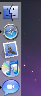
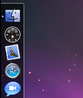
It seems Apple listened to the wave of critique, introducing ‘aesthetic tweaks’ and Dock-on-the-side alternate mode (via Macrumors);


(Tiger on the left, new Leopard dock on the right) I must say this had me sighing out loud. What a relief that our input hasn’t been completely unheard. Just a few more days to the next big cat, fortunately!
Edit; show Apple how much you liked them listening to you and digg this
Edit 2; Thanks to Brendan for the comparison image of the Tiger dock.
I have been watching a few TED video’s today (in case you’ve been living under a rock, TED is the Technology, Entertainment, Design conference with some of the brightest and coolest people of this planet attending or ‘lecturing’) which I hadn’t seen before because they didn’t relate directly to me, and what struck me most was a combination of two videos; One, Richard Dawkins’ ‘The Universe is Queerer than we Suppose”, which handled the universe as we see it and the way we are and how these things relate to one each other (you should just watch it, I’m raping it by putting this in my words, I am a great fan of Dawkins’ writing and speech) and Will Wright’s “Toys that Make Worlds”, which is a presentation by Will Wright (-the- Will Wright, the guy who made Simcity, the Sims, and now Spore) about games, specifically Spore, but it made me relate by the games he made previously; Simcity in particular.
A brief writeup of an interview, with Steve Jobs on the New York Times website, stated;
In contrast, Mr. Jobs said that multitouch drastically simplified the process of controlling a computer.
There are no “verbs†in the iPhone interface, he said, alluding to the way a standard mouse or stylus system works. In those systems, users select an object, like a photo, and then separately select an action, or “verb,†to do something to it.
The Apple development team worried constantly that the approach might fail during the years they were creating the iPhone, he said.
This is easily noticeable when you use the iPhone, everything seems much more ‘complex’ and ‘fussy’ on the desktop after you’ve used it for hours on end. For example, I started to scroll the wrong way when I came back to my Macbook Pro (something I heard more people have had); everything in the iPhone interface feels like it’s how a ‘physical object’ would react. This only proves how far Apple has went to establish a new, even more user-friendly interface paradigm where they went as far as to challenge existing conventions .
Final Cut Server, Apple’s solution for a centralized video workflow has been highly anticipated since the unveiling of the revamped Final Cut Studio 2. I’ve found an article on unflyingobject with several screenshots and information about the program, so I decided to share my thoughts on the graphical (icon / UI) side of the app with you. In case you want to know what Final Cut Server does and if it’s good at it, I recommend the linked article.


