


I’m a big fan of virtual desktops. Essentially, they expand your working field by providing more ‘screens’ to distribute your windows over. In Tiger, when Leopard’s Spaces application wasn’t in the picture, there were several solutions; my favorite one being VirtueDesktops by Tony Arnold. VirtueDesktops, or more shortly ‘Virtue’, was abandoned when Spaces came out, and I’m using Spaces ever since. I did miss several features that the virtual desktops of yore offered, but the new features made up for it.
You can imagine I was thrilled when Tony approached me to design the icon for his new Spaces-enhancing application, Hyperspaces. The name, purpose, and features of the application instantly appealed to me, and we set off to make a great icon for it.
When Tony and I were discussing the application and what artistic direction we could take, we both expressed our love for the existing popular culture representations of ‘hyperspace’. Since we both knew enough Star Trek and other science-fiction, we threw a few ideas back and forth about what hyperspace looks like.
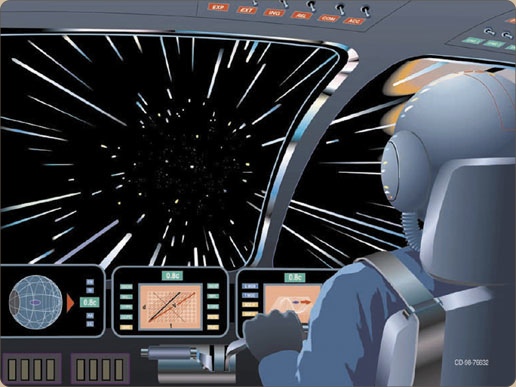
Star Wars-y hyperspace. Those panels look suspiciously much like iPhones.
We concluded that we’d like concepts that relate to hyperspace, but that the icon should remain pretty close to the purpose of the application as well; the icon should convey its relation to desktops, to the Spaces application, and the Leopard look and feel.
There was enough conceptual reference; in mathematics, hyperspace has been quite well defined. We were also looking at the existing design of Spaces; although the Leopard spaces icon isn’t really that appealing, the basic shape is a great design.
With space and hyperspace, there’s more than enough to be inspired by.
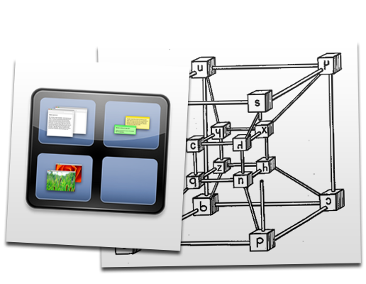
I kicked off the sketch phase with a concept that had been lingering in my mind since I got the first email from Tony. I showed off a few other concepts too; although I had discussed tesseracts and other, more abstract concepts, I really wanted to propose the icon designs that I’d be most happy with; relating to all the intended concepts, with a clear ‘Spaces’ symbolism.
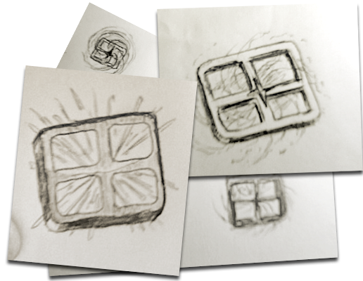
My sketched vision of the Hyperspaces icon.
I mocked up two designs; a ‘warp’-like field of stars as shown in popular culture, and a Leopard-like ‘galaxy’ behind a spaces screen. I figured it would be best to use this ‘spaces’ shape, as it’s iconic for the purpose and working of the application. Making a galaxy and warp effect from scratch isn’t easy, but I had a bit of prior experience, having made spacey wallpapers in my younger years.

After varying with the nebula version, and trying a version with the ‘warp’ effect, we decided we preferred the warp-y version, in a color theme that matched the default Leopard desktop background. This icon was communicative of the application purpose, its relation to Spaces, the OS X desktop, and it would look futuristic enough for our needs. Polishing the design took a while, as rendering a truly convincing ‘warp’ effect and shading a proper glassy ‘spaces’-shape was a process of refining this design iteratively. I’ve made a quicktime movie that shows a few steps from mockup to final design. You can see that the background and the shading are radically transformed with each step.
The outcome was incredibly pleasing. After nailing the warp effect, the shading started coming together. The unconventional color and suggested motion of the background effect gives the icon a very dynamic feeling.
In the late hours of the last working evening, I wrestled with the exact perspective and visual weight, and following some good balancing, I generated the icon. A quick application of the icon with Candybar later, and I there it was. I knew it was right; I wouldn’t want to get it out of my dock any more. And thus ended our journey through time and space.
![]()
Hey Seb! Its good to see your still working hard on your icons. Well done with this, it looks absolutely fantastic. I’m looking forward to getting my hands on Hyperspaces, it seems to have some nice features that I could really use.
new theme looks nice, but it doesn’t fit the width on actual iPhone, also I was unable to find a back to home page button.. Hope you can make the design better with my feedbacks and look at the button in the comment form .. Its usualy says ‘post’ or ‘publish comment’ but yours says ‘Search’
Thanks for sharing this Seb. It’s an awesome icon.
Also, glad to see you’re using Wp-Touch. Looks great.
test post from iPhone, lookong good, the icondesign aswell!
Grtz tom
love these icon design breakdowns, very interesting reading.
I agree, Hyperspace looks to bring some of the things I miss from the old virtual desktops back to spaces, nice!
wow, sure is looking wonderful over here on iPhone, great work!
Wow, yet another awesome icon design… nice work!
I’m really looking forward to Hyperspaces, I must say. Glad to see that there’s people whose judgment I’m sure of involved in at least some of the aesthetics of this one!
Very cool icon, I’m impressed; also it’s very nice to read the back-story and why/how you designed it.