It’s always a huge leap for a designer to come up with designs for a platform you’re not familiar with. I remember feeling extremely uncomfortable at first when I designed my first iPhone icons and interfaces, and while the iPad was a logical extension of the iPhone UI, it still felt like a significant step to take.

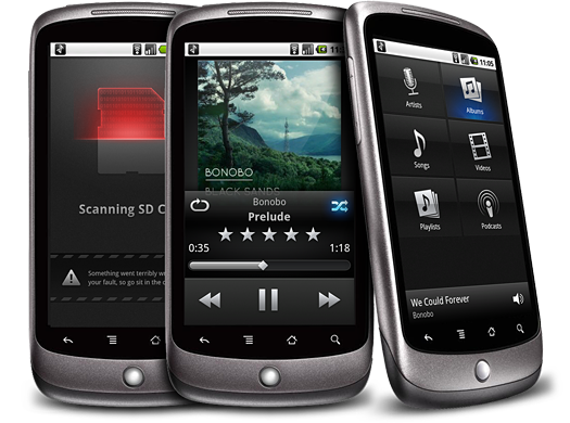
Imagine how I felt when I was sitting at my desk, Nexus One in one hand and pen in the other, after being asked to design doubleTwist’s media player for Android. Android doesn’t have a very nice media player in terms of design (I’m carefully picking my words here – I don’t want to offend the undoubtedly hard working people at Google) and it was easy to just go the way some developers go: make an iPhone app, shoehorn it into Android, and call it a day.

We wanted something that actually advanced the state of the art. I sure as hell wasn’t going to use an entirely new platform for months just to ape another. It was a mixed blessing to have so little limitations on what constituted a ‘native’ user interface.
Android has its guidelines, but most apps (even the Google-sanctioned Twitter app) have a very ‘custom’ appearance. We opted for a look that works well on the various devices and custom ‘shells’ (notably, HTC’s terrible “Sense†interface) and arrived at this muted, native-looking yet polished visual scheme, which also helps users navigate the app in direct sunlight, where OLED screens like the Nexus One’s tend to be hard to read. Subtle usage of textured surfaces in the application also help prevent color banding on the color-limited OLED screens.

I’m happy to have this in the hands of Android users. It’s sometimes depressing to read comments on tech websites of people exclaiming: “Why would you even care about how a media player looks or works? You play music and turn off the screen!â€, but I am sure there’s a lot of people who will appreciate the thought and details that went into this app. And that makes it all worth it.
The player is available on the Android Marketplace for free for a limited time.


