28 Feb
   Filed Under: Apple, Design, News, webOS   

There’s some discussion on Apple-centric and tech news websites about a video that’s doing the rounds with a new approach to notifications for iOS. While the system in the video is really nothing new (there’s been at least one alternative notification system in the App-Store-for-jailbroken-phones “Cydia” since 2010) it is getting a lot of attention, presumably because iOS users are quite satisfied with almost all the interactions of the OS except those dang stacking modal dialogs that interrupt your game of Angry Birds every time you get a text message.

And I can relate: when I am abroad, with my three email accounts, whenever I open Mail on my iPhone, I have to dismiss three ‘data roaming is off’ dialogs, and three ‘cannot get mail’ dialogs ( — that’s one per mail account). On an iPad, it can be even more jarring, with a tiny alert disabling the whole 9.7″ screen until you act on it.

This is a real issue. I have no doubt Apple is aware of this, like they were aware of copy and paste and multi-tasking.

This is not a post about what Apple will or should do to improve notifications on iOS. It’s a post talking about what solutions other platforms currently use to notify the user, and why Apple is (possibly, probably) taking such a while to create an optimal solution to the notification problem.

Continue reading…

27 Jan
   Filed Under: Interface Design, News   

When Sony presented its “Next Generation Portable” device (which I’ll refer to as ‘PSP2’ for the rest of the post) and other plans for portable gaming yesterday, they proudly started their presentation with a bold slide: (images courtesy of Engadget)

Now, when Sony does a bold claim like this, I get very excited. The interface they introduced in 2003 with the mediocre “PSX” product and later used as the main UI for their flagship consoles like the PlayStation 3 and PlayStation Portable was known as the “XrossMediaBar“, and despite its awkward — ‘X-treme marketing’ — name, it was (and still is) an amazing piece of work. In fact, Sony managed to innovate in the stale and extremely unfriendly gaming console interface and create something that was devoid of useless flashy crap, extremely scalable, discoverable, elegant and intuitive.

That’s why it’s no surprise that Sony has decided to outright kill the XMB in its PSP2 console and replace it with an absolute train-wreck UI that shows they lost all sense of what a good interface looks like.

Continue reading…

05 May
   Filed Under: Interface Design, Personal Work   

Steam for Mac will be available for download in a week’s time. Steam, for the uninitiated, is the world’s largest gaming platform, serving in essence as an ‘iTunes for games’. Steam lets you buy, try, and play games, stay connected with other gamers and friends, and much more. I’ve enjoyed testing the beta release of it for the last few weeks.

However, the part I disliked about Steam on the Mac is the (understandably) less-than-native looking and feeling UI. While the entire application was recently redesigned (and re-engineered to utilize Webkit as its rendering engine), it still feels less than at home between the system apps.

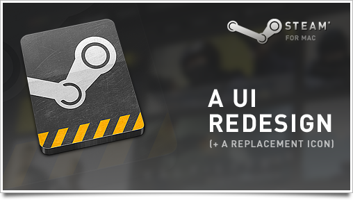
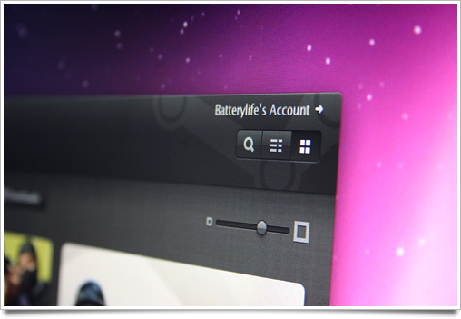
As a fun exercise, I’ve redesigned Steam in a way that maintains consistency with its own UI conventions and values, while changing look and feel to make it more native to the Mac platform.

You can see a comparison between Steam for Mac’s UI and my redesign on flickr here.

I won’t tease you with only vapid mockups, though. While you’re here, grab my Steam replacement icon for OS X.

Of course, if you have input on the mockups, sound off in the comments. Meanwhile, I am currently considering sending my thoughts to Gabe for further consideration.