29 Apr
   Filed Under: Announcement, IconResource, Personal   

Some doubted it would ever come. Some said it had been seen riding unicorns in misty valleys in the Scottish highlands. Others had seen it teaching design techniques to Duke Nukem, seemingly Forever. But today, the vapor has condensed.

Icon Resource 2 is actually here.

It’s great, because today is also my birthday. The best present I could give myself is bringing Icon Resource 2 to all existing members and welcome new members to the website.

As interest for techniques in iOS icon design has grown considerably, Icon Resource now has a small sibling in iOS Resource, which (for now) teaches you iOS icon design techniques, but will soon rise up next to its brother with full fledged tracks on scalable UI design and other techniques that are essential in designing for iOS.

If you are an existing members, you will get several new advanced level courses in icon design for free. You should get an email soon with new login information that gives you access to the member area. If you have not received an email by tomorrow, do drop me a line (twitter also works). I hope you enjoy all the new content, and I will update this new platform more this year with free new content.

16 Mar
   Filed Under: Commercial Work, Design, Icon Design, News   

Interarchy is a Mac app that’s almost as old as I am: it was first created in 1993 as one of the first FTP clients for the Mac, and in 2007 it was sold to its current owner and long-time developer of Interarchy, Matthew Drayton of Nolobe. Matthew contacted me with a request for new icons for the big upcoming version 10. This was no small release, so it had to be worth it.

Like several other FTP clients, Interarchy has always been known and discerned by its icon. By now, it’s a powerful brand. Matthew also expressed his desire to maintain the filing cabinet metaphor in the application icon, and I agreed. Changing the icon now would mean neglecting its long history and evolution.

Continue reading…

13 Mar
   Filed Under: Commercial Work, Design, Icon Design, iPhone   

A while ago Buck Wilson, the designer in a small team of Portland-bound guys, contacted me about icon design for Here, File File!, an iPhone app that lets you connect back to your Mac from anywhere and read, view, and stream your files. As opposed to the popular Dropbox and iDisk apps, it allows full access to all the files on your Mac, instead of just a few hand-picked ones.

I happily started working for them to make a kick-ass icon. There was an additional challenge as multiple icons were required: a Mac icon, a menubar icon, and an iPhone icon, which required a metaphorical connection between all of them. Buck mentioned they had an idea for using a doghouse for the Mac app and a dog with files on the iPhone, but I recommended against using animal motifs. Not only do we have the classic divide between ‘dog people’ and ‘cat people’ to worry about; animal motifs are just not very suitable in iPhone icons.

Continue reading…

16 May
   Filed Under: Goodies, Icon Design, Personal Work   

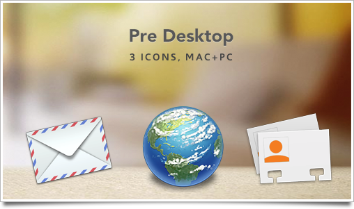
Sometimes, I like to do a little bit of icon speed drawing. Like with my iWork.com icon goodie, I completed these icons in a short time of about 2 hours total. I really like the Palm Pre‘s web browser icon, so I speed-designed 3 of the nice-looking icons on the Pre’s launcher screen for usage on your Mac or PC.

predesk

They’re not amazingly detailed or even polished at their maximum size of 512 pixels, but that wasn’t my intention, either. Consider that a disclaimer before you start commenting that they don’t look nice enough to you at that size ;).

These icons are intended for personal usage and desktop customization only. Palm Pre, the Palm branding and its icons are © 2008-2009, Palm.