


Following up on the hugely popular icon set, the successor of the War on Bad Design icon pack is quickly advancing. As it will be released hand-in-hand with the biggest release on Icon Designer so far, I anticipate the reception will be quite good. Are you looking forward to it? Let me show you what’s in store for you; not just folders with shrubs and trees and sheen, but four-legged assault droids and hypermodern covert-ops hardware!

There’s a whole new touch of magic realism to the latest sets. I am, as always, looking forward to suggestions for the next sets, and your input. I’ll see you all again in September with the new release!
I’ll be out starting tomorrow and you can get Noble with 70% discount starting now. Grab it at the Icon Store if you need some icons. Do note that I won’t be able to email out the icon sets and licenses until I am back, but I’ll send them as soon as I get home.
Now for something to keep you sweet all the days that I am away; a little new preview of the folderset. Unorthodox nature motives! Check out the preliminary unpolished Aqua, Anodized and Wood variants;

Input very welcome! Now, I’ll see you all again August 20th – I’ll be sure to enjoy myself with the music, atmosphere and people.
From the experience I have had with clients and input I had on the blog, I get the feeling people are starting to get frustrated with the notion that globes equal the internet. A while back I was chatting with someone in the late hours and he pointed out that icons in general are taking a turn for more conceptual graphics, deviating from the ‘norm’ – that is, the pre-established metaphorical conventions like globes representing internet, documents with a pen representing document-based applications, or a metallic rounded rectangle with a screen on it for single-window applications. There are a lot of exceptions to the conventions; some icons, as someone pointed out in the comments of my article on designing the Flow icon, just jump out of the convention without clashing with the aesthetics of the OS.
![]()

![]()
These are three examples of sound icons that have everything to do with the internet and, praise the heavens, feature no globe. If Craig Hockenberry’s article is anywhere near complete, the Icon Factory hasn’t even considered icon designs with globes for Coda (rather, a forklift, which I thought was a very nice concept). The Safari icon, as an additional example, has what you could consider a map of sorts reminiscent of a globe but I can’t say the strong metaphor in the icon is a globe. The point that I am getting here is that a globe is a visual convention for anything having to do with either network or internet (which, themselves, are closely semantically tied). Conventions have the advantage of being good for end-users; we once decided on making the Delete symbol in toolbars resemble a “No Smoking” sign without the cigarette in the interface, which doesn’t make a lot of sense, but these days, people expect it to be there – that, or you have to use another convention like a trash bucket.
In icons, it is worth separating the toolbar and application icons for obvious reasons. In the light of this article, they are distinctly different as well; application icons tend to benefit of innovation rather than convention, using either adaptations of conventions or none at all, whereas toolbar icons often strive to conform to all conventions, but still having an own style; be it in colors or slight stylistic adjustments – one could compare them to pictograms, being purely symbolic for functions. This increase of visual innovation in application icons has been quite steady and lately, even more unique icons have followed one another in the fight for your attention and curiosity. As we see this trend increasing, and more applications geared towards the same purpose come out for the Mac, it will become a lot harder for designers to come up with clever new metaphors. It’s only logical to assume that today’s innovations could be tomorrow’s conventions. Ideas, like any resource, are limited.
Perhaps the trend we are seeing is caused by developers and developing companies in general getting the concept that you cannot sell something without marketing it. Making your product stand out from the crowd is essential in the exponentially expanding software market for the Mac. Stock icons for applications (example; toolbar icons) are sold less and less because many a developer is glad to pay for an icon designer making it as beautiful as it can be. Developers really love their products, and most importantly; they want users, as it often means money or exposure. Now, I am sure Disco hasn’t gotten so popular due to its great icon design – however, it would have been a lot less popular with a bad icon. Also, people who don’t know Disco (i.e. cavedwellers) can get the idea that it is an edgy, new and innovative application from the icon conveying those messages. Look at it this way, and you can see how icon design matters, even with the greatest marketing campaigns.
![]()
It’s true; more innovating applications re-inventing the wheel but “doing it right™” means reinvented icons. Personally, regardless of the degree of innovation in the application, in my process with clients I aim for a great multitude of ideas and push for finding new metaphors and clever connections to use in an icon. In no way, however, do I stand in the way of using conventions in an icon if the client, or even me, desires it. But I must admit, globes get me itching a bit by now when it comes to application icons. Are you as curious as I am about tomorrow’s visual conventions?
No, it’s not gone that far that I have pushed 944 icons so far. Perhaps I have, I don’t know, but that’s beside the point. What matters is the future. The time after 9:44 UTC.
Having gotten enthusiastic responses to the Iconizement plan I set forward in a few posts, I have been able to get ‘sponsoring’ for at least two icon sets. I have a whole road ahead of me when it comes to the freeware icon sets I am producing.
 This is, basically, the timeline for my upcoming icon sets. The three in the ‘hot zone’ above (the Designer Icons set 2, the War on Bad Design icons set 2 and the Designer Folders) are coming up very quickly, very possibly at the same time, when the brand new version of Icon Designer will be unveiled.
But there is more, a lot more. 944, the enigmatic number, stands for 512, 256, 128, 32, and 16; the new sizes that I will be releasing my icons in. You read that right, all new icon sets will feature super-hi res icons a month before Leopard. If anyone’s even been ready for Leopard, I am.
Apart from that, not only Mac users will rejoice. Icon Designer’s new releases come in all formats; for Windows in .ico, for Mac in ICNS, and for Linux users, PNG’s for all sizes. The growing popularity of this website has shown me that there is a righteous demand for these extra formats, and as such, you are getting them!
This wouldn’t be the Cocoia Blog if you would get out of this blog post without being peppered by desire-inducing preview images. The Designer Folders set, which will contain anodized metal, standard aqua and wooden folders with the following interesting motives;

Slight touches of reflection in the anodized steel folders (which are depicted here) are among the fine details in the new sets. The folder set is truly a showcase of new, unique ideas in folders and overflows with gimmicks and eye candy. Since there was a lot of ado going on at Macthemes over Susumu’s latest folder set release “Cats 2” being ‘inspired’ by other sets, I set to inspire this set by cats as well. In fact, since they have always been so supportive in my life, I included a cat – he’s not so comfortable in folders, though, or so it seems.
I wanted to put a solid date on this release, and although it is highly dependent on my picky sense of perfectionism, I expect to launch Icon Designer v. 3 by the beginning of September – ideally, the last day of August. I will keep you up to date with the developments!
‘Tis late, but it’s been quite a day.

Noble has gone on sale, finally, and this gorgeous 128-to -16 pixel sized icon set has quite a lot in (icon) store. As you can read on the website, various icons have been included for specific Leopard features, modern devices and in the tradition of Cocoia, requests will be honoured like the ones that will be announced with this conclusion of the contest that will give away four licenses of this great cornucopia of icons. The Noble Add-on set that will follow out of this will be free for the contest winners and all other license holders!
Contest Winner 1: Kyle Nilson
Nobody came close to Kyle’s excellent suggestion in terms of both originality and feasability;
(…)
One of the most under-catered fields in GUI is biology and the hard sciences in general. A great deal of developers homebrew apps to calculate annealing temperatures, enzyme digests, chemical compounds, and other technical mixes. In addition, one must often use small simple apps to program various tools to work properly, such as mixer tables, PCR machines, centrifuges, microscopy packages, and ultraviolet photoboxes.
All of these apps are simple to use if one knows where to click and what to do, but easy to use GUIs are rare. Very few scientists are effective at icon creation or design. If quality, royalty free icons existed for biology, chemistry, and physics, a great deal of apps would be improved and become easy to use, a great benefit for incoming students and up and coming researchers.
Various icons are needed for DNA, RNA, timers, enzymes, temperatures (both metric and imperial), forces, compounds, master mixes, and many other thoughts, ideas, and processes in the scientific world. (…)
It sure did, Kyle!
Contest Winners 2, 3, and 4; ;
Nicholas Brawn suggested a console / terminal icon, a (network) activity icon, and something that represents logs or log viewing. An excellent suggestion.
Leif Singer had a fantastic list of suggestions like Operation.Success, Operation.warning, User.login / User.logout, Clipboard.copy and Clipboard.paste, Document.print, Sort.descending and ascending and Document.SaveAs. Fantastic all around.
Last but not least, Zac Cohan offered suggestions for website functions like Home, Support, Downloads, Help documentation, user login, and various navigational elements. Thanks for the tip, Zac!
I hope the winners enjoy their licenses a lot and starting now, you’ll be able to support my endeavour for freeware icons and ad-less websites by buying yourself a set – it’s a lifetime of use and great karma. Good night, everyone!
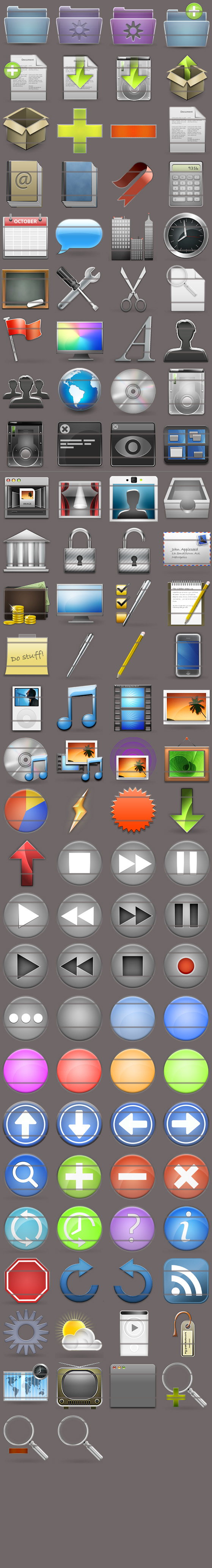
While my goal was to release my first stock icon set, Noble, today, problems with setting up the payment services have once again foiled my plans. I will now have to wait five to seven days to put it up. However, I found a use for the time we have to wait. First of all, you can now take a look for yourself.

Here are the 32 and 16 pixel versions. If you want, you can go take a look at the 48 pixel versions, and the very nice 128 pixel versions! (Big image alert!). Now, on to the contest.
Four free licenses for Noble, worth €99,- can be won in the contest.
I want to see what developers, stock icon enthousiasts and general audience needs in a stock icon set. What is missing that you want to see included? Send me your top requests and motivation at this address (be sure to put an “@” in there, eh, ’tis against the spambots), and in five days I will pick the four people who have hit the nail on the head.
A license constitutes royalty free use for life, with future requested icons (add-on packs) sent to you for free!. Of course, the requests will be honoured in the future and posted on the blog for people to enjoy (and verify that I did, in fact, give people the packages ). What are you waiting for? Send me some suggestions!
Edit: All submissions must be in before August 4rth, 2007. Submissions sent after this date will not be considered. Winners will be notified before August 7th.