31 May
   Filed Under: Apple, Design   

Looking back, the Iconfactory’s post on resolution-independence has some holes in it (and looking back now, this post has too – see the end of the post and the comments).

Why, you ask? They claimed that PDF’s in the user interface as a new format instead of the current TIFF files, the entire OS would come to a screeching halt, that icons would go beyond megabyte sizes and general mayhem would throw all resolution-independence craving Mac users into a purgatory. We knew different then, we know different now. A few months back, I posted about the ‘new’ Oxygen icon suite for KDE, being all SVG-vector based, and it didn’t wipe Linux off the face of the Earth. Instead, some optimized SVG files and rendering tricks made it work quite good, and these days, some ‘dock’-applications for GNU/Linux put the SVG’s to good use.

You can test this kind of stuff on OS X too, you know. First of all, as we all know from the rather public Resolution Independence segment of the “Leopard Features in Cocoa” session, free on the ADC Online iTunes page that we can define image resources of varying DPI values. You’d have the same size images if you open them in, say, Preview, but once zoomed in, it’s obvious that one contains four times as much pixel data. Assume that drawing units (points) are independent of screen pixels – if you take a 100*100 point image with 72 DPI, it’s 100*100 pixels. if you take a 100×100 image with 288 dpi, you get 400*400 pixels, but this 288 DPI image isn’t ‘larger’ on-screen; it would be as large as the 72 DPI image on a 288 DPI screen.

But you can be more flexible with vector resources. Now, I wouldn’t really use my own icons in vector format, because it -would- put the OS to a screeching halt, but we all know that there is no plan to make the Dock icons vector – instead, we are simply putting 512 pixel icon resources in all new ICNS files to keep the scaling possible. Toolbar icons, on the other hand, are often very simplified graphics. Take the GNOME Tango icon set’s trash icon as an example;

Unify-icon-elements.png

As you can see on the right, this SVG icon has a 72 dpi version in which the dark outline is exactly one pixel wide – we could compare this to toolbar icons, which generally have the same characteristics. One pixel-outlines, and often a lot of pixel-art to get it all looking proper in the 32*32 pixel space. No more! In OS X 10.5, we can do it the Tango way. It takes two to Tango, doesn’t it? In our case, one PDF vector resource (we don’t generally use SVG’s, OS X has a PDF graphics subsystem with Quartz) and either include a DPI-ready vector resource in the PDF (one that has a 1 pixel border on 72 DPI, for instance), or a separate file (a multi-representation TIFF) that is used with a little bit of Cocoa’s help. Apple has been kind enough to give you something to grab the screen’s DPI value and thus, do something with that. In the session, a solution like this was suggested;

NSImage (pointer) Name=Imagename Size={100,100} Reps=(
  NSBitmapImageRep (pointer) Size={100,100} Pixels=100x100
  NSBitmapImageRep (pointer) Size={100,100} Pixels=400x400
)

Of course, assumed here is that we are talking about our earlier resources; one 72-dpi 100*100 pixel image, and a 288 dpi 400*400 pixel image get put in place conditionally. Cocoa will chose the resource accordingly. If we can, however, we should use vector resources. They won’t ever give problems because they scale with our interface – you can set the PDF as the icon resource and as the workspace scale factor gets higher, the graphic scales accordingly and loss-less. I hear you say that perhaps, some high-end systems with high scale factors are able to render vector graphics of increased complexity without too much strain, and all systems with a smaller scale factor (I assume laptops and low-end desktop systems) don’t really want to render out vector graphics because they are both hard to parallelize and take battery life in the case of portables. Although there is an argument that rendering out vector resources smaller is faster anyway, representing vector graphics still is a lot more intensive than just displaying bitmap data. Perhaps an if switch is needed?

- (CGFloat)userSpaceScaleFactor;

This method returns the workspace’s scale factor and lets you act on it accordingly. It’s simple to set up this method and make a switch of resources (I will leave that as an exercise to anyone who has a ‘Leopard to build on’). Afraid this might make your application bigger? I wouldn’t worry about this too much. If you would upgrade your toolbar to this dual-resource system, all your 32*32 resources wouldn’t need the 128*128 resources, whereas the vector resources included are generally smaller than any bitmap data. It’s a small price to pay for a better looking app. Now go forth, and make sure I see some both efficient, pretty, and resolution-independence ready apps soon! If you need help, you can get information about my services at icondesigner.net.

Edit: Craig Hockeberry of the Iconfactory has commented on the whole matter, and after a bit of chatting I agree that it is overboard for an interface designer to talk about these matters of switching resources – however, it was meant in a ways of throwing around idea’s. I must say that I was wrong in a few other points; vector in PDF cannot yet be seen as a medium for all toolbar icons because it’s not efficient enough. I’d like to thank Craig for all the input.

30 May
   Filed Under: Announcement, Design   

A little showroom of icon design and an outlet for downloads – that’s what I wanted. Now, I found a nugget of a domain name; icondesigner.net. You should check it out, because I added a little new icon for Wireshark, the open-source network analyzer and protocol dissector. It has a -horrible- icon in OS X, and that’s now fixed. Enjoy!


yay2.jpg

comments off
20 May
   Filed Under: Design, Personal Work   

It’s one of those applications that you’ll always find in your dock on OS X; Preview. What does it do? Well, it gives you a way to check out a series of images and do lightweight modifications like cropping and rotating, all for low ‘cost’ (system resources). Needless to say, if it’s an app that will be around a lot, you’ll see it’s icon a lot. In Quicksilver, I see it all the time. It’s always in my dock; I thought, if you can’t live without it, then at least give it a place in your dock instead of always having it inactive on the right. Anyway, I got extremely annoyed with it’s default icon of a happy child on the beach with a sort of eyeglass. The application Mimiphoto makes it easy to put your own image below the eyeglass, so I took Magritte’s ‘Ceci N’est Pas une Pipe’, kind of turning it into a self-referencing ‘Ceci n’est pas un Preview’.

However, I didn’t like it still. First of all, it’s not clean at all, I disliked it in 32 pixels and below (icon sizes that require special care and pixel-pushing for clear images) and well, I started looking for replacements. I swear, once you’ve seen one, you’ve seen them all. I don’t like that damn loupe, eyeglass, whatever you want to call it. It’s stupid. So I made a new metaphor for previewing. Here you go, free for personal use. It’s got it’s own small webpage, a DMG download, and very clear terms stating no commercial use and attribution. If you want to be an ass and use it on your website or whatever anyway, I’ll just take the icon down. I’m that much of an asshole. Of course, you’ll also be in legal trouble.


previcon.jpg

But I trust my loyal readers to just enjoy this, adhere to my terms, and respect the extreme amount of time that went into it (this lamp doesn’t exist, I just made it up along the way) and provide feedback. I hope you enjoy it as much as I did making it and having it done now.

02 May
   Filed Under: Design   

— Non-Glossy version (with code) —

0-Mh-White-Big-code.png
0-MHBLack-Big-code.png

— Non-Glossy version (without code) —

0-Mh-White-Big-nocode.png
0-MHBlack-Big-nocode.png

— Glossy Versions (with code) —

0-Mh-White-Big-code-gloss.png
0-MHBLack-Big-code-gloss.png

— Glossy Versions (without code) —

0-Mh-White-Big-nocode-gloss.png
0-MHBLack-Big-nocode-gloss.png

Want it bigger? Right-click and download these PNG’s to disk! They are a decent 324 pixels wide (for reference, these shown are 117 pixels wide).
To show how these images look resized and serving suggestions (I suggest a 1 px grey border at 72 px), please look at the previous post (for now, see sidebar, “recent posts”). Enjoy, and there is no need to provide credit for these badges if you don’t feel like it. Much rather, help spread the liberty of speech, fair use, and the downfall of DRM and Digg. I am leaving digg with the reaching of a pinnacle in censorship on this ‘democratic’ news site, whose userbase has given me many great and many awful moments. I have been with digg for a long time now, a year, almost – but I have grown increasingly frustrated with it’s management, and today finally saw the end of tolerance of digg’s users for censorship.

Bye, digg. It’s been good. You might be able to notice the loss of the buttons on the site too.

01 May
   Filed Under: Design   

Hey, I decided to make some badges in the vein of the ‘hacker’ badge I saw on the dmiessler blog. They could be more specific (and bigger!). Free for use and consumption in any way;

0-mhblack.png0-mhwhite.png

27 Apr
   Filed Under: Design   

intel.jpg

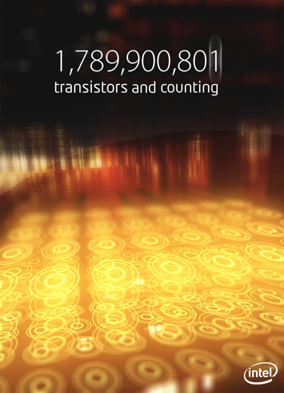
When I think more about the concept of automating design and art in our times, it comes to mind that the applications are endless; we are essentially stepping into a world where we can delegate any work, even the most ridiculously redundant and repetitive activity can be automated and performed by computers, and it’s getting exponentially easier to formulate these tasks. It’s important to realize that, like any major innovation in man’s tools and technology, this will be reflected in our cultural references; arts and design.

We have seen arts and design take various directions as the time with this computerized technology increased; the reaction: technologically looking graphics, the emphasis on the ‘Mankind we can Make’, digital letterforms and printing, abstraction of common designs; the counter-reaction: ‘crafts’ in art becoming more popular as a means to diverge with current technologies and trends, or even to accessorize them. As the digital pinnacle hasn’t been reached yet, there are lots of developments in the wake of the computer revolution that are over the horizon, but approaching fast. What can we expect?

Austin started a campaign about 7 months back in California that used RFID-chips (Radio-Frequency Identification) supplied with the Austin Mini’s keychain that would send it’s owners’ credentials when near a special billboard, promptly displaying an enormous line with his or her name. This is an obvious example of a stupid attempt at doing something new. First, RFID tags can be tracked (especially if they contain user information, or have a unique ID) by location, and form a threat to privacy. Second, it’s a total heap of money to stuff into something that will only shift the conveyed corporate identity by a bit. There -are- smart ways to do this.

It’s a smart age. Computers will start doing more ‘on their own’ as humanity wants to be supplemented with supportive ‘wares’; software and hardware that becomes an extension in day-to day life. Information Architecture becoming more open and accessible, while being forced into new paradigms because on virtually any medium (including the real world), visual saturation has been reached. It’s time for new media. It’s time for smart media.
Representing it’s age like no other, ‘smart’ and ‘intelligent’ designs (no pun intended) in graphics, logotypes, and typography, are dynamic products that are able to make ‘decisions’ themselves. You could take a 24/7 grocery shop as an example. Let’s say the shop is called XYZ, and it’s logo looks somewhat like a small store with a sky in the background. It’s branding could cohesively change on conditions like time of the day, time of the year, sale strategy, product inventory per shop.

varlogo.jpg

The visual rules (the branding guide and it’s visual identity) can be applied in a computerized fashion, creating freedom for a logotype or graphic to modify itself within existing boundaries. A ‘fallback’ logo type is a real thing here; the new, ‘dynamic’ logotype (actually, the company’s identity) is ‘backward compatible’ with old media like print; after all, if the only thing the dynamic logo changes or controls is the appearance of graphics, the only thing one has to do is print the result. However, nobody is dependent on the maintenance of a corporate identity. Creating products in line with the graphic language and main message are done by an application instead of a designer.

Let’s go back to that shop. What if some of it’s stores sell vegetables in a special aisle and other stores in the chain do not? One could say that a green color addition or an otherwise notable modification in the branding could be used to communicate this. Graphics need to adjust themselves based on situations, and it’s possible today. Applications are only a step behind with e-paper, ubiquitous displays and computers (websites and computer graphics) to display new, dynamic, even animated identities.

You often see stores with massive displays used for nothing more than static flash or powerpoint loops. In a new, ideal ‘smart’ world of design, we could see logo’s and graphics being able to communicate the message framed in line with the visual identity; no longer do we need to establish guidelines or let nothing more than an urgent pamphlet be designed by the costly design agency; if applications are smart enough to produce the style, then they can apply new information and make it cohesive. The same goes for traffic signs; in the future, we could see computerized signs with display graphics that are dynamic enough to change. We wouldn’t possibly let humans design every possible combination of information so that we can display it; we need a design ‘language’ that a computer can natively ‘speak’; so the computer itself merely needs the information and formats it appropriately. Why limit this to such static applications? I feel there is a need for a new age in branding and graphic design. Look at the current pioneers in graphic design. They often surpass competition with sheer technique and style. This is because they are close to the tool. If designers truly understand the tool (in this case, the computer), the only logical thing to come out of it is innovation. The supreme ability of computers today is to create imaginary constructs and ‘living’ experiences. I suggest we let them do just that.

This, of course, calls for new media in the most literal sense; we need new file formats, new technologies to make these kind of graphics with a WYSIWYG (what-you-see-is-what-you-get) interface, new paradigms for how branding and visual profiling works. As I said, we need to rethink Information Architecture in a day where visual saturation has been reached, and new media are at the doorstep. We just need to ‘upgrade’ our visual and cultural paradigms to get in line with a new direction of communication – one that is as dynamic as the human race and rapidly shifting society of today. Our products can now evolve as we evolve.

I expect to roll out some samples of this soon.

edit; you wanted a bit of a sample eye-candy? You got it.