


From the experience I have had with clients and input I had on the blog, I get the feeling people are starting to get frustrated with the notion that globes equal the internet. A while back I was chatting with someone in the late hours and he pointed out that icons in general are taking a turn for more conceptual graphics, deviating from the ‘norm’ – that is, the pre-established metaphorical conventions like globes representing internet, documents with a pen representing document-based applications, or a metallic rounded rectangle with a screen on it for single-window applications. There are a lot of exceptions to the conventions; some icons, as someone pointed out in the comments of my article on designing the Flow icon, just jump out of the convention without clashing with the aesthetics of the OS.
![]()

![]()
These are three examples of sound icons that have everything to do with the internet and, praise the heavens, feature no globe. If Craig Hockenberry’s article is anywhere near complete, the Icon Factory hasn’t even considered icon designs with globes for Coda (rather, a forklift, which I thought was a very nice concept). The Safari icon, as an additional example, has what you could consider a map of sorts reminiscent of a globe but I can’t say the strong metaphor in the icon is a globe. The point that I am getting here is that a globe is a visual convention for anything having to do with either network or internet (which, themselves, are closely semantically tied). Conventions have the advantage of being good for end-users; we once decided on making the Delete symbol in toolbars resemble a “No Smoking” sign without the cigarette in the interface, which doesn’t make a lot of sense, but these days, people expect it to be there – that, or you have to use another convention like a trash bucket.
In icons, it is worth separating the toolbar and application icons for obvious reasons. In the light of this article, they are distinctly different as well; application icons tend to benefit of innovation rather than convention, using either adaptations of conventions or none at all, whereas toolbar icons often strive to conform to all conventions, but still having an own style; be it in colors or slight stylistic adjustments – one could compare them to pictograms, being purely symbolic for functions. This increase of visual innovation in application icons has been quite steady and lately, even more unique icons have followed one another in the fight for your attention and curiosity. As we see this trend increasing, and more applications geared towards the same purpose come out for the Mac, it will become a lot harder for designers to come up with clever new metaphors. It’s only logical to assume that today’s innovations could be tomorrow’s conventions. Ideas, like any resource, are limited.
Perhaps the trend we are seeing is caused by developers and developing companies in general getting the concept that you cannot sell something without marketing it. Making your product stand out from the crowd is essential in the exponentially expanding software market for the Mac. Stock icons for applications (example; toolbar icons) are sold less and less because many a developer is glad to pay for an icon designer making it as beautiful as it can be. Developers really love their products, and most importantly; they want users, as it often means money or exposure. Now, I am sure Disco hasn’t gotten so popular due to its great icon design – however, it would have been a lot less popular with a bad icon. Also, people who don’t know Disco (i.e. cavedwellers) can get the idea that it is an edgy, new and innovative application from the icon conveying those messages. Look at it this way, and you can see how icon design matters, even with the greatest marketing campaigns.
![]()
It’s true; more innovating applications re-inventing the wheel but “doing it right™” means reinvented icons. Personally, regardless of the degree of innovation in the application, in my process with clients I aim for a great multitude of ideas and push for finding new metaphors and clever connections to use in an icon. In no way, however, do I stand in the way of using conventions in an icon if the client, or even me, desires it. But I must admit, globes get me itching a bit by now when it comes to application icons. Are you as curious as I am about tomorrow’s visual conventions?
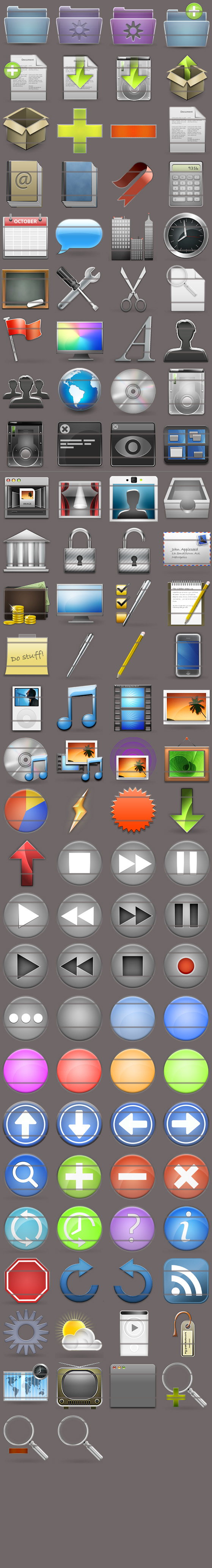
While my goal was to release my first stock icon set, Noble, today, problems with setting up the payment services have once again foiled my plans. I will now have to wait five to seven days to put it up. However, I found a use for the time we have to wait. First of all, you can now take a look for yourself.

Here are the 32 and 16 pixel versions. If you want, you can go take a look at the 48 pixel versions, and the very nice 128 pixel versions! (Big image alert!). Now, on to the contest.
Four free licenses for Noble, worth €99,- can be won in the contest.
I want to see what developers, stock icon enthousiasts and general audience needs in a stock icon set. What is missing that you want to see included? Send me your top requests and motivation at this address (be sure to put an “@” in there, eh, ’tis against the spambots), and in five days I will pick the four people who have hit the nail on the head.
A license constitutes royalty free use for life, with future requested icons (add-on packs) sent to you for free!. Of course, the requests will be honoured in the future and posted on the blog for people to enjoy (and verify that I did, in fact, give people the packages ). What are you waiting for? Send me some suggestions!
Edit: All submissions must be in before August 4rth, 2007. Submissions sent after this date will not be considered. Winners will be notified before August 7th.
Lately I have been showing a ‘hidden’ icon, prominently, on Icon Designer which has a veil on it. Some more very up-to-date people are quite aware what application it belongs to, others weren’t sure but excited. Now, all will be revealed. Prepare for a journey into the mind of an icon designer, and into the interesting process of this branch of graphic design.

It was a sunny afternoon in the end of my last term on the Academy when I got an email from Brian. His company, ExtendMac, was known to me for being on major portals and news-websites with a preview of the new FTP client Flow (check out the awesome website!). Back then it seemed promising to me, and it’s recognizable and catchy name had stayed in the back-alleys of my memory. Brian wanted me to show him what I had in store for his application in terms of icon design work.
As an icon designer, the primary interest you have is to be in line with your clients’ demands. This always means there are some factors that weigh in as the most important points anyone wants to see back in ‘their’ icon;
A good icon should;
– Be appealing and in line with platform style.
– Relate to the application in a metonymical or metaphorical way.
– Communicate application and company branding.
These three points are absolutely critical. It’s very possible to find a metaphor that works just right for your application, but then, you’ll have to put it in a form that everyone can understand (between all cultural differences and attributed meanings that have accumulated across the globe). I could have thought of a waterfall for Flow’s icon; however, waterfalls only relate to Flow in a metonymical way, ánd it’s very hard to produce an icon of a waterfall compliant with Apple’s interface guidelines and my own sense of ‘right’ that works in the dock, in your Finder and even in a 16×16 pixel rectangle, without losing the photoillustrative style that you all have grown so accustomed to in my work.
So as an icon designer, I was hit by the conceptual phase of working on the Flow icon. If you take a concept like “Flow”, it is so broad in nature that you are able to think of hundreds if not thousands of semi-related images and concepts. Many pages of sketchbook were penned full of notes, ideas and sketches up to the point where I figured I had enough. Making mental maps always helps, so you can sketch out all the words and bits that come up when you conceptualise, forcing you to push beyond your initial mental horizon.
After a few days of conceptualising I chatted with Brian online. I showed him some things that I had brainstormed about and were most interesting. I linked images of concepts from the internet, a few sketches and we spent the day talking about it.

I showed him images of M. C. Escher’s work, a great Dutch artist (perhaps one of the greatest) who had a splendid masterpiece in the form of his ‘waterfall’; a building carrying water upwards which falls down and up at the same time; an oddity of space. Images of complex flowcharts, fluid dynamics, and other physical constructs were thrown back and forth. It was our first real conceptual ‘meeting’, and it was incredibly fun and eye-opening for us both.
After the concave, we decided that it would be a good idea to start some digital work. Interestingly, my usual toolset of digital authoring applications was expanded with some mathematical applications for exploring such interesting topics as dynamics. One of the things I started graphing was the Lorentz Attractor. To quote Wikipedia;
[the Lorentz Attractor] is a 3-dimensional structure corresponding to the long-term behavior of a chaotic flow…
It’s quite noted for its butterfly-like shape, which appears elegant and corresponds to the noted “Butterfly Effect” of Chaos Theory. Brian, who just at the moment of writing asked me if that line on Wikipedia was my inspiration for using it as an icon (it wasn’t, I hadn’t even read the Wikipedia page, actually) also found the attractor a very intriguing object.
I made several mockups in the time that followed. Road traffic, fluids, mathematics, and electronics were themes in the elementary images I presented to Brian. A lot of ideas were discussed and some dismissed, while other were encouraged. In this conversation, I also sent Brian a few images and files I made with Grapher.app, a mathematical graphing tool that comes for free with OS X.

After a few of these images, I came to an angle (in three-dimensional space, like a viewport) of the Lorentz Attractor we both loved.

This version, beautified and cleaned up in Photoshop, was in the first set of mockups. I still think it’s remarkable how close we were to our current design. After playing around with the possibilities for the mockups and generating actual icon files, we decided it didn’t really work that well on white in this form and started exploring other ideas. We did find the concept behind it very fitting and the shape a gorgeous thing, so we kept it in mind.
In this phase, I send Brian an image of something that had just entered my mind and made in a short timeframe. We were playing more with other concepts in this stage, and hadn’t ruled out any mockup but the least promising ones. I bet you’ll recognize this particular icon I whipped up.

Yes, the War on Bad Design browser icon was once a one-of-many mockup (albeit a quite nice polished one) in this process. To further illustrate how we had explored in this stage, I dug up this image of another mockup, made with the icon I showed earlier.

Yeah, we’ve been a lot of places. The amount of visual material in the directory of this ‘design case’ is so much that I couldn’t even consider making a gallery out of it. We have explored many mockups with variations (and with the great input of Adam and Brian it was a joy to decide on new directions to go) and after experimenting with the ideas we had, and having made eight distinctively different icons I made another icon, which we all recognized and instantly loved;

What this image shows, already, is that the silhouette of this particular shape is very strong. I made a desktop image after the icon was made and it used the bare outline of the shape – although the ‘Flow’ wasn’t visible, it was immediately apparent that it was the icon in question. Such a unique outline shape is very favorable for an icon, and upon coloring the icon, we found it was truly an extraordinary icon, yet it managed to fit in with the rest of the system icons. The icon, once colored, is truly unique. If the Dock was a voliére (a birdhouse, in good English), the Flow icon would be a paradise bird.

It may seem the colors just jumped onto the icon, but quite the opposite is true. In designing the icon, we have been through possibly every color and color combination there is, always trying alternative or unseen ideas to find ‘the best thing’. The sweet spot was eventually found with our ‘hue wheel’ palette. The colors truly emphasize the motion of the icon in this form, and catch the eye. It’s a bright palette that matches the Mac aesthetic in many ways, yet still maintains an incredible richness of colors.
What we found so fitting in the attractor icon was that it is the most complex behaviour, formulated in simple symbols. It is, quite like Flow, a simple solution to a complex problem. Flow is an application that is fantastically straightforward in its user interface. There is nothing to be distracted by, and everything you see is geared to do what you want at that moment. First using it is almost uncanny because you simply won’t have to think before acting. It does what you want, when you want it.

The icon is tailor-made for Flow, and we are still very happy with it. While ‘mindless’ eye candy like the ‘war chart’ I made is very pleasing, both the depth and beauty of the Flow icon keep pleasing me far more. The many ways of visually adapting this concept to the application were enlightening for me, and eventually lead to something that I’m incredibly happy with.
So, apparently the latest seed of Leopard has a revamped System Preferences icon. Don’t go requesting the ADC members to upload it, that would be wrong. I have gone through the hassle of making a new icon based on the design. A little present, if you will!

Download it here.
Edit: TUAW hit :). Hello visitors, don’t forget to check out the other freeware icons for OS X at Icon Designer. Also, if you are interested in icons for use in Leopard applications, I have released a Leopard-ready stock icon set at the Icon Store.
It was quite an effort, and I am still tweaking and testing, but I am pleased to show one big thing releasing the 30th. Check out the brand spanking new Icon Store for a preview of Noble, my upcoming stock icon set. Noble has been made specifically for resolution independence and the Leopard aesthetic.

Very soon!
With a small Icon Designer update, I present to you without further ado, the seven first releases of the Designer Icons set. It will be split up into three consecutive releases to give me time to tweak every detail.

Click the preview above to go to the download page and send any of your desktop screenshots, warm input, or greetings to me via my vcard or email address on Icon Designer. I hope you enjoy it!